


Until relatively recently, websites could be built at a fixed width, such as 960 pixels, with the expectation that all end users would get a fairly consistent experience. This fixed width wasn't too wide for laptop screens, and users with large resolution monitors merely had an abundance of margin either side.
But now, there are smart phones. Apple's iPhone ushered in the first truly usable phone browsing experience, and many others have now followed that lead. Unlike the small-screen web browsing implementations of yesterday, that required the thumb dexterity of a Tiddlywinks world champion to use, people are now comfortably using their phones to browse the Web. In addition, there is a growing consumer trend of using small screen devices (tablets and netbooks, for example) in preference to their full screen brethren for content consumption in the home. The indisputable fact is that the number of people using these smaller screen devices to view the Internet is growing at an ever-increasing rate, whilst at the other end of the scale, 27 and 30 inch displays are now also commonplace. There is now a greater difference between the smallest screens browsing the Web and the largest than ever before.
Thankfully, there is a solution to this ever-expanding browser and device landscape. A responsive web design, built with HTML5 and CSS3, allows a website to 'just work' across multiple devices and screens. And the best part is that the techniques are all implemented without the need for server based/backend solutions.
In this chapter we shall:
Learn the importance of supporting small screen devices
Define "mobile website" design
Define "responsive website" design
Look at great examples of responsive web design
Learn the difference between viewport and screen sizes
Install and use viewport changing browser extensions
Use HTML5 to create cleaner and leaner markup
Use CSS3 to solve common design challenges
Whilst statistics should only ever be used as a rough guide, it's interesting to note that according to gs.statcounter.com, in the 12 months from July 2010 to July 2011, global mobile browser use had risen from 2.86 to 7.02 percent. The same statistics show that usage of Internet Explorer 6 fell from 8.79 to 3.42 percent. Even Internet Explorer 7 had fallen to 5.45 percent by July 2011. If clients often ask you to "make our site work in Internet Explorer 6 and 7", a fair riposte might be "maybe we should be concentrating our efforts elsewhere?" Far more people are now browsing websites on a mobile phone than with a desktop or laptop running Internet Explorer 6 or 7. That deafening noise you just heard is the collective celebratory whoops of frontend developers around the globe!
So, there are a growing number of people using small screen devices to browse the Internet, and the Internet browsers of these devices have typically been designed to handle existing websites without problems. They do this by shrinking a standard website to fit the viewable area (or viewport to give it the correct technical term) of the device. The user then zooms in on the area of content they are interested in. Excellent, so why do we, as frontend designers and developers, need to take any further action?

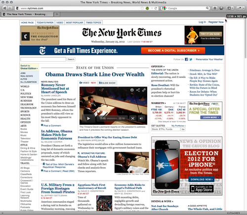
Well, the more you browse websites, such as the one shown in the preceding screenshot, on iPhones and Android powered handsets, the more apparent the reasons become. It's a tedious and frustrating task to constantly zoom in and out of page areas to see them at a readable size and then move the page left and right to read sentences that are hanging out of the viewport just enough to be annoying, whilst not inadvertently tapping a link you don't want to. Surely we can do better!
Where budgets allow, and the situation necessitates, a truly "mobile" version of a website could arguably be the preferred option. This could serve up different content, design, and interaction based upon the device, location, connection speed, and host of other variables including the technical capabilities of the device. As a practical example, imagine a pizza chain. It might have one "standard" website and a "mobile" version that adds an augmented reality feature based on your current GPS location to help you find the store. This kind of solution needs more than a responsive design alone can offer.
However, while not every project demands that level of sophistication, in almost all other instances, it would still be preferable to provide users with a tailored view of our content dependent upon the size of their viewport. For example, on most sites, although serving the same content, I'd like to vary the way it's displayed. On small screens, perhaps put elements of less importance beneath the main content, or as a worst-case scenario, hide them altogether. Maybe alter navigation buttons to accommodate finger presses, rather than only offering a usable experience to those able to proffer a precise mouse click! Typography should also be scaled for the sake of readability, allowing text to be read without necessitating constant swipes from side to side. By the same token, whilst catering for smaller viewports, we don't want to compromise the design for those using standard laptop and desktop screens. While we're being all inclusive, what about a few extra enhancements for those with large screens such as 1900 pixels wide and more? In short, I, and I suspect you too, need designs to respond to the entire gamut of viewport sizes that may be used to view them.
The term responsive web design was coined by Ethan Marcotte. In his seminal List Apart article (http://www.alistapart.com/articles/responsive-web-design/) he consolidated three existing techniques (flexible grid layout, flexible images, and media and media queries) into one unified approach and named it responsive web design. The term is often used to infer the same meaning as a number of other descriptions such as fluid design, elastic layout, rubber layout, liquid design, adaptive layout, cross-device design, and flexible design.
To name just a few! However, as Mr. Marcotte and others have eloquently argued, a truly responsive methodology is actually more than merely altering the layout of a site based upon viewport sizes. Instead, it is to invert our entire current approach to web design. Instead of beginning with a fixed width desktop site design and scaling it down and re-flowing the content for smaller viewports, we should design for the smallest viewport first and then progressively enhance the design and content for larger viewports.
Note
Responsive web design in a nutshell
To attempt to put the philosophy of responsive web design in a nutshell, I would say it's the presentation of content in the most accessible manner for any viewport that accesses it. Conversely, a truly "mobile website" is needed when an experience requires specific content and functionality based upon the device accessing it. In these cases, a mobile website presents an entirely different user experience to its desktop equivalent.
A responsive web design will handle the flow of our page content as viewports change but let's go further. HTML5 offers us more than HTML 4 ever could and it's more meaningful semantic elements will form the basis of our markup. CSS3 media queries are an essential ingredient to a responsive design but additional CSS3 modules empower us with previously unseen levels of flexibility. We'll be ditching swathes of background graphics and complicated JavaScript, replacing them with lean CSS3 gradients, shadows, typography, animations and transformations.
Before we get on with creating a responsive HTML5 and CSS3 powered web design, let's first look at some examples of what we should aspire to. Who is already doing a good job with all this new fangled responsive HTML5 and CSS3 malarkey and what can we learn from their pioneering efforts?
To test your own and others' responsive website designs fully would involve having separate systems set up for every device and screen size. Although nothing betters that practice, the majority of testing can be achieved simply by resizing the browser window. To further aid this method, there are various third-party plugins and browser extensions that display the current browser window or viewport size in pixels. Or in some cases, automatically switch the current window or viewport to a default screen size (1024 x 768 pixels, for example). This allows you to more easily test what happens as screen viewports change.
Note
Attached to pixels? Get over it!
Don't get very attached to pixels as a measurement unit because we will be abandoning them in many instances and moving to relative measurement units (typically, "em" or "ems" and percentages) instead, once we get into responsive web design proper. For reviewing the work of other responsive designs and where those designs change however, they provide a handy reference point.
Internet Explorer users should make sure that they have the Microsoft Internet Explorer Developer Toolbar . This can be downloaded from the following URL:
http://www.microsoft.com/download/en/details.aspx?id=18359
If you are using Safari, my personal favorite is Resize (http://resizeSafari.com/),ERROR PARSING ATTRIBUTE CONTENTalthough ResizeMe (http://web.me.com/aaronholla/Safari_Extensions/ResizeMe.html) is similar and free.
If you use Firefox, there is Firesizer (https://addons.mozilla.org/en-US/firefox/addon/firesizer/) and Chrome users should check out the aptly titled Windows Resizer (https://chrome.google.com/webstore/detail/kkelicaakdanhinjdeammmilcgefonfh).
Not a fan of extensions? Here's a further alternative: I wrote a simple HTML page to display the current viewport height and width of a browser window. Using a dab of the JavaScript library, jQuery (http://jquery.com), this page gets the current viewport height and width, and displays them. You can keep this page open in another browser tab, resize your window, and then flick back to the website in question to see how it fares. You can find the super simple "What size is my viewport page?" page at the following URL:
http://benfrain.com/easily-display-the-viewport-size-of-your-page-for-responsive-designs/
Note
Viewport or screen size?
It's important to understand that viewport and screen size are not the same thing. Viewport relates to the content area within the browser window, excluding the toolbars, tabs, and so on. More succinctly, it relates to the area where a website actually displays. Screen size refers to the physical display area of a device. Beware that some browser resizer tools display the size, including browser elements such as the URL bar, tabs, and search boxes, and others don't. In the following screenshot, the actual viewport size is shown at the top-right position (1156 x 921 px) whilst the Firesizer plugin shows the window size at the bottom-right position (1171 x 1023).
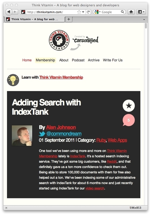
Now, we're armed with everything we need to start appreciating the best that the responsive web has to offer. Fire up your browser of choice, engage your screen size tool, and take a look at http://thinkvitamin.com/.
If you are viewing the page with a viewport larger than 1060 pixel wide, you will see a layout similar to the one shown in the following screenshot:
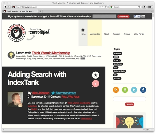
If however, you're viewing the site with a viewport larger than 930 pixels but lower than 1060 pixels, you will see a layout, as shown in the following screenshot:
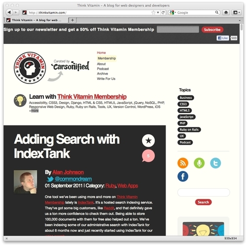
Notice how the main navigation to the side of the logo has changed? The icons to the right of the main content have been arranged to sit one under another. Everything is perfectly usable, and most importantly, isn't disappearing off the screen. Now, take a look with a viewport less than 880 pixels, in the following screenshot:
The header remains similar but notice that the right-hand sidebar is thinner still; the icons are now 2 by 2 whilst the text blocks have adjusted and the text is flowing accordingly within the block.
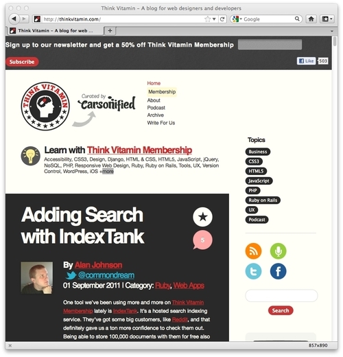
However, reduce your viewport to less than 600 pixel in width and you will notice a major change, as shown in the following screenshot:
How about that? The entire sidebar has responded to our new viewport, letting the most important part of the site, the content, enjoy the full width of the browser window. Notice also how the header links are now horizontal, as opposed to being at the side of the logo, and the logo itself has resized? All these changes help to create a better experience for the user based upon the viewport dimensions.
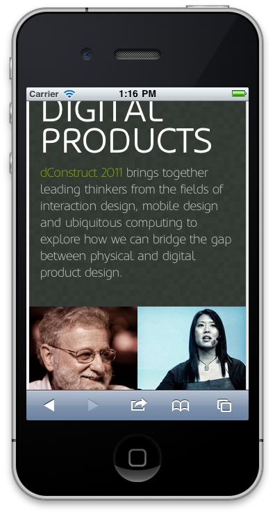
Let's look at another example, http://2011.dconstruct.org/. With a wide viewport (say, more than 1350 pixels) the site looks like the one shown in the following screenshot:

Notice particularly the grid of nine images. As you decrease the width of the viewport (to less than around 960 pixels), notice what happens? The grid of three rows of three images becomes three rows of two images and one row of three at the bottom, as shown in the following screenshot:

Decreasing the width of our viewport smaller still, at less than around 720 pixels we encounter another design "break point"; the header links switch to include images that provide a better target area for touchscreen navigation:

Smaller still, once we reduce the viewport to less than 480 pixels wide, the image grid changes again, now showing a row of two images, then three, and then four. These images continue to resize as the viewport is shrunk to around 300 pixels. To illustrate, the following screenshot shows how it looks on an iPhone:
One web destination that is useful for inspiration is http://mediaqueri.es. However, not all websites displayed there necessarily embrace the full responsive methodology of displaying content around small viewports first, and progressively enhancing for larger viewports. Regardless, at this early point, whilst considering the possibilities of what we can do with responsive web design, there are many great examples to draw ideas from. Although viewing these websites and resizing the viewport illustrates what a responsive web design can do, it doesn't demonstrate what's good about HTML5. The benefits of HTML5 occur "behind the scenes" as it were, so let's now turn our attention there and find out what's so great about HTML5.
HTML5 places some emphasis on streamlining the actual markup required to create a page that validates to W3C standards and link all our requisite CSS, JavaScript, and image files. For smart phone users, possibly viewing our pages with limited bandwidth, and a key target for our responsive designs, we want our website to not just respond to their more limited viewport but also load in the fastest possible time. Whilst removing superfluous markup elements represents only a tiny data saving, every little helps!
HTML5 offers further benefits and additional features over the previous iteration of HTML (HTML 4.01). Frontend web developers are likely to be primarily interested in the new semantic elements of HTML5 that provide more meaningful code to search engines. HTML5 also enables feedback to the user on basic site interactivity such as form submissions and so on, often negating the need for more resource heavy JavaScript form processing. Again, that's good news for our responsive design, allowing us to create a leaner and faster-loading code base.
The first line of any HTML document starts with the Doctype (Document Type Declaration) . This is the part that, if we are honest, gets added automatically by our code editor of choice or we can paste it from an existing boilerplate (nobody really enters the full HTML 4.01 Doctype out, do they?) Before HTML5, the Doctype for a standard HTML 4.01 page would have looked as follows:
<!DOCTYPE HTML PUBLIC "-//W3C//DTD HTML 4.01 Transitional//EN" "http://www.w3.org/TR/html4/loose.dtd">
Now, with HTML5, it's merely as follows:
<!DOCTYPE html>
Now, as I've already conceded, I don't physically type the Doctype every time I write a page, and I suspect you don't either. So, what's the big deal I hear you cry? Well, what about adding links to JavaScript or CSS in your pages? With existing HTML 4.01, the correct way of linking to a script file would be as follows:
<script src="js/jquery-1.6.2.js" type="text/javascript"></script>
HTML5 makes this easier:
<script src="js/jquery-1.6.2.js"></script>
As you can see, the need to specify the type attribute is no longer considered necessary. It's a similar case with linking to CSS files. HTML5 also accepts a far slacker syntax to be considered "valid". For example, <sCRipt SrC=js/jquery-1.6.2.js></script> is just as valid as the prior example. We've omitted the quotation marks around the script source as well as using a combination of upper and lower case characters in the tag and attribute names. But HTML5 doesn't care—it will still validate at the W3C HTML5 validator (http://validator.w3.org/). This is good news if you are sloppy with your code writing but also, more usefully, if you want to shave every possible surplus character from your markup. There are other specifics when it comes to the writing of code that make life easier. But I'm guessing you're not convinced this is all that exciting. So, let's take a quick peek at the new semantic elements of HTML5.
When you're structuring an HTML page, it's standard fare to mark up a header and navigation section something like this:
<div class="header">
  <div class="navigation">
    <ul class="nav-list">
      <li><a href="#" title="Home">Home</a></li>
      <li><a href="#" title="About">About</a></li>
    </ul>
  </div> <!—end of navigation -->
</div> <!—end of header -->
However, take a look at how we do it with HTML5:
<header>
  <nav>
      <ul id="nav-list">
        <li><a href="#" title="Home">Home</a></li>
        <li><a href="#" title="About">About</a></li>
      </ul>
  </nav>
</header>
How about that? Instead of faceless <div> tags for every structural element (albeit with added class names for styling purposes), HTML5 gives us some far more semantically meaningful elements to use instead. Common structural sections within pages such as header and navigation (and many more as we shall soon see) get their own element tags. Our code just became far more "semantic" with the <nav> tag telling browsers, "Hey, this section right here is for navigation". Good news for us but perhaps more importantly, good news for search engines, too. They'll now be able to understand our pages better than ever before and rank our content accordingly.
When I write HTML pages, I often do so knowing that they will in turn be passed to the backend crew (you know, those cool kids that deal with PHP, Ruby, .NET, ColdFusion, and so on) before the pages ultimately make it to the WWW. To stay on good terms with the backend folks, I often comment the closing </div> tags within the code to enable others (and often myself too) to easily establish where <div> elements end. HTML5 negates much of that task. When looking at HTML5 code, a closing element tag of </header> for example, instantly tells you what element is closing, without the need to add a comment.
We're just lifting the lid a little here on what semantic goodies HTML5 has for us in the toy box. Before we get carried away, we have one more friend to get acquainted with. If there's one thing this whole new era of web design can't exist without, it's CSS3.
If you've been in the web design trade from the mid-1990s, you'll remember that back then, all designs were table-based and the styling was entwined with content. Cascading Style Sheets (CSS ) were introduced as a way of separating design from the content. It took some time for web designers to step into the bold new world of CSS-based design but sites such as http://www.csszengarden.com paved the way, showing just what could be achieved, visually, with a CSS-based design. Since then, CSS has become the standard way of defining the presentational layer of a web page, with CSS 2.1 being the current ratified version of the CSS specification. CSS3 has yet to be fully ratified but that doesn't mean that large portions of it aren't fully usable today. The W3C working group note at http://www.w3.org/TR/CSS/#css3 is as follows:
CSS Level 3 builds on CSS Level 2 module by module, using the CSS2.1 specification as its core. Each module adds functionality and/or replaces part of the CSS2.1 specification. The CSS Working Group intends that the new CSS modules will not contradict the CSS2.1 specification: only that they will add functionality and refine definitions.
Much of the draft W3C specification reads (by necessity) like legalese. In simplistic terms, what matters to us is that CSS3 is built as a set of 'bolt-on' modules rather than a single consolidated whole. As CSS 2.1 is at the core, none of the techniques you use with CSS 2.1 today are abandoned. Instead, certain, more mature modules (as not all modules are at the same state of readiness) of CSS3 can be actively used today, without waiting for the entire specification to be ratified.
Perhaps the most empowering point of note is that there is no penalty in older browsers for including properties that they do not understand. Older browsers (including Internet Explorer 6, 7, and 8) will happily skip over CSS3 properties that they can't process. This gives us the ability to progressively enhance areas of a design for the better-equipped browsers, whilst ensuring a reasonable fall back for the older ones.
Let's consider a common design hurdle we all face on most projects—to create a rounded corner on a screen element, perhaps for a tabbed interface or corner of a boxed element such as a header for example. Using CSS 2.1 this could be achieved by using a sliding doors technique (http://www.alistapart.com/articles/slidingdoors/), whereby one background image sits behind another. The HTML could look as simple as this:
<a href="#"><span>Box Title</span></a>
We add a rounded background to the <a> element by creating two images. The first, called headerLeft.png
, would be 15 pixels wide and 40 pixels high and the second, called headerRight.png
in this example, would be made wider than we would ever anticipate the header being (280 pixels, here). Each would be one half of the "sliding door". As one element grows (the text within our <span> tags), the background fills the space creating a somewhat future proof rounded corner solution. Here is how the CSS in this example looks:
a {
  display: block;
  height: 40px;
  float: left;
  font-size: 1.2em;
  padding-right: 0.8em;
  background: url(images/headerRight.png) no-repeat scroll top right;
}
a span {
  background: url(images/headerLeft.png) no-repeat;
  display: block;
  line-height: 40px;
  padding-left: 0.8em;
}
The following screenshot shows how it looks in Google's Chrome (v16):

It solves the design problem but requires additional markup (semantically the <span> element has no value) and two additional HTTP requests (for the images) to the server to create the onscreen effect. Now, we could combine the two images into one to create a sprite and then use the background-position: CSS property to shift it around but even with the bandwidth economies that provides, it's still an inflexible solution. What happens if the client decides they want the corners to have a tighter radius? Or a different color? We'd need to re-make our image(s) again. Sadly, until CSS3, this has been the reality of the situation we, as frontend designers and developers have found ourselves in. Ladies and gentleman, I've seen the future, and it's CSS3 shaped! Let's revise the HTML to be only:
<a href="#">Box Title</a>
And, to begin with, the CSS can become the following:
a {
  float: left;
  height: 40px;
  line-height: 40px;
  padding-left: 0.8em;
  padding-right: 0.8em;
  border-top-left-radius: 8px;
  border-top-right-radius: 8px;
  background-image: url(images/headerTiny.png);
  background-repeat: repeat-x;
}
The following screenshot shows how the CSS3 version of the button looks in the same browser (Chrome v16):

In this example, the two previous images have been substituted for a single 1 pixel-wide image that is repeated along the x-axis. Although the image is only 1 pixel wide, it is 40 pixels high, hopefully higher than any contents that will be inserted. When using an image as a background, it's always necessary to "overshoot" the height, in anticipation of content overflowing, which sadly makes for bigger images and greater bandwidth requirements. Here, however, unlike the entirely image-based solution, CSS3 takes care of the corners for us with the border-radius and related properties. Client wants the corners to be a little rounder, say 12 pixels? No problem, just amend the border-radius property to 12px and your work is done. The CSS3 rounded corners property
is fast, flexible, and supported in Safari (v3+), Firefox (v1+), Opera (v10.5+), Chrome (v3+), and Internet Explorer 9. Microsoft are so excited about IE 9's support of the feature that (I hope you feel my slight sarcasm seeping through here) they have even designed an interactive page demonstrating the various effects that can be achieved with the border-radius property
. View this demonstration at the following URL:
http://ie.microsoft.com/testdrive/html5/borderradius/default.html
CSS3 can take things further by eliminating the need for a gradient background image by producing the effect in the browser instead. This property isn't as well supported but with something along the lines of linear-gradient(yellow, blue), the background of any element can enjoy a CSS3 generated gradient.
The gradient can be specified in solid colors, traditional HEX values (for example, #BFBFBF) or using one of the CSS3 color modes (more on these in Chapter 5, CSS3: Selectors, Typography, and Color Modes). If you're happy for users of older browsers to see a solid background instead of a gradient (as opposed to nothing), a CSS stack something like this would provide a solid color in the event of the browser being unable to handle the gradient:
background-color: #42c264;
background-image: -webkit-linear-gradient(#4fec50, #42c264);
background-image: -moz-linear-gradient(#4fec50, #42c264);
background-image: -o-linear-gradient(#4fec50, #42c264);
background-image: -ms-linear-gradient(#4fec50, #42c264);
background-image: -chrome-linear-gradient(#4fec50, #42c264);
background-image: linear-gradient(#4fec50, #42c264);
The linear-gradient property
instructs the browser to start with the first color value (#4fec50, in this example) and move to the second color value (#42c264).
You'll notice that in the CSS code, the
background-image
linear-gradient property has been repeated with a number of prefixes; for example, -webkit-. This allows different browser vendors (for example, -moz- for Mozilla Firefox, -ms- for Microsoft Internet Explorer, and so on) to experiment with their own implementation of the new CSS3 properties before introducing the finished article, at which point the prefixes are unneeded. As stylesheets by their nature cascade, we place the un-prefixed version last, meaning it will supersede the earlier declarations if available.
The following screenshot shows how the complete CSS3 button looks in the same browser:

I think you'll agree—any differences between the image version and the entirely CSS version are trivial. Building visual elements with CSS3 allows our responsive design to be far leaner than if we built it with images. Furthermore, image gradients are well supported in modern mobile browsers, the only trade-off being a lack of gradient support for browsers such as IE 9 and lower versions.
So far, we've looked at a very mundane example of where CSS3 can help in everyday development tasks. However, let's whet our appetite a little and see what real treats CSS3 allows us. Fire up Safari or Chrome and take a look at http://www.panic.com/blog/. Whilst sadly this design isn't responsive, the area of interest for us are the pinned notes at the top. Hover over them and watch as they float out. Nice, eh? In the past this kind of enhancement would have been the domain of resource heavy Flash or JavaScript. Here, it is being achieved entirely through CSS3 transformations. Using CSS3 rather than JavaScript or Flash makes the animation lightweight, maintainable, and therefore perfect for a responsive design. The browsers that support the feature get it, whilst others are none the wiser, merely seeing a static image in its place.

Another great example of CSS3 transformations is http://demo.marcofolio.net/3d_animation_css3/. Again, this isn't a responsive web design, we're just looking at the CSS tricks being employed. Take a look at this in Internet Explorer 9 or Firefox first (as of version 9.0, Firefox still didn't support the necessary CSS3 module). Now, take a look in Safari 5+ or Chrome 16+. The following screenshot doesn't do it much justice so if you're not going to take a look you'll have to take my word for it—it's good:

But great looking effects aren't solely the domain of the Webkit-based Safari and Chrome browsers. The following URL works in Firefox too and is another pure CSS3-based solution:
http://designlovr.com/examples/dynamic_stack_of_index_cards/

Obviously, these effects are not essential for any website. They are a perfect illustration of "progressive enhancement". In browsers that do not support the effects, they merely see the static images. However, users with more modern browsers can enjoy the visual enhancements. Whilst browser support for CSS3 3D Transformations is rather limited, support for CSS3 rules such as text-shadows, gradients, rounded borders, RGBA color, and multiple background images are all widely supported and provide flexible ways of providing solutions to common design problems that have had us all cursing and scratching our heads for years.
Any tool or technique should only be used if the application requires it. As frontend developer/designers, our projects typically come with a finite amount of time and resources available to make them financially viable.
As Internet Explorer 7 and 8 don't support the new semantic HTML5 elements or CSS3 properties as standard, if the vast majority of visitors to a site use Internet Explorer 7 or 8, it doesn't make a lot of sense to concentrate your resource on producing a responsive HTML5 and CSS3 based design for it. That doesn't mean doing so is an impossible task. As we shall see in Chapter 9, Solving Cross-browser Responsive Challenges, there are a growing number of tools (referred to as polyfills as they cover the cracks in older browsers) to patch browsers (mainly Old IE) lacking support for more recent browser features, but adopting a sensible approach to the implementation of a responsive web design from the outset is always the best policy.
In my own experience I typically ask the following from the outset:
Does the client want to support the largest growing market of Internet users? If yes, responsive methodology is suitable.
Does the client want the cleanest, fastest, and most maintainable code base? If yes, responsive methodology is suitable.
Does the client understand that experience can and should be subtly different across different browsers? If yes, responsive methodology is suitable.
Does the client require the design to look identical across all browsers, including IE 8 and lower versions? If yes, responsive design is not best suited.
Are 70 percent or more of the current or expected visitors to the site likely to use Internet Explorer 8 or lower versions? If yes, responsive design is not best suited.
It's also important to re-iterate that where the budget allows, there may be times when a fully bespoke "mobile" version of a website is a more relevant option than a responsive design. For the sake of clarification, I term entirely mobile focused solutions that provide different content/experiences to their mobile users as 'mobile websites'. I don't believe anyone advocating responsive web design techniques would argue that a responsive web design would be a suitable substitute for a 'mobile website' in every situation.
At the risk of "teaching Grandma to suck eggs", it's worth re-stating that a responsive HTML5 and CSS3 web design is not a "magic bullet" panacea for all design and content serving challenges. As ever with web design, the specifics of a project (namely budget, target demographic, and purpose) should dictate the implementation. However, in my experience, if the budget is limited and/or the programming of an entirely bespoke "mobile website" isn't a viable option, a responsive web design almost always provides a better and more inclusive user experience than a standard, fixed-width design.
The final hurdle to clear before embarking on a responsive design is often one of mindset. And in some ways, this is perhaps the most difficult to overcome. For example, I'm often asked to convert existing graphic designs into standards compliant HTML/CSS and jQuery-based web pages. In my own experience, it's rare (and when I say rare, I mean it's never happened) for graphic designers to have anything other than a fixed-width "desktop version" of a site in mind when producing their design composites. My remit is then to create a pixel perfect rendition of that design in every known browser. Failing or succeeding in this task defines success in the eyes of my client, the graphic designer. This mindset is especially entrenched in clients with a background in printed media design. It's easy to understand their reasoning; a composite of the design can be signed-off by their own clients, they hand it to the frontend designer/developer (you or I), and we then spend our time ensuring the finished code looks as close as humanly possible to that design in all the major browsers. What the client sees is what the client gets.
However, if you've ever tried to get a modern web design looking the same in Internet Explorer 6 and 7 as it does in a modern standards compliant browser such as Safari, Firefox, or Chrome, you will understand the inherent difficulties. It's often taken me as much as 30 percent of a project's allocated time/budget to fix the inherent flaws and failings in these older ailing browsers. That time could have been spent building on enhancements and economizing code for the growing number of users viewing sites in modern browsers, rather than patching and hacking the code base to provide rounded corners, transparent images, correctly aligned form elements, and so on for a shrinking number of Internet Explorer users.
Unfortunately, the only antidote to this scenario is education. The client needs an explanation as to why a responsive design would be worthwhile, what it entails, and why the finished design won't and shouldn't look the same across all viewports and browsers. Some clients get there, some don't. Unfortunately, some still want all the rounded corners and drop shadows to look identical in Internet Explorer 6 too!
When I approach a new project, whether a responsive design is applicable or not, I try and explain the following points to my client:
By allowing older browsers to display the pages slightly differently, it means that code is more maintainable and cheaper to update in the future.
Making all elements look the same, even on older browsers (for example, Internet Explorer 8 and lower versions) adds a significant amount of images to a website. This makes it slower, more expensive to produce and more difficult to maintain.
Leaner code that modern browsers understand equates to a faster website. A faster website ranks higher in search engines than a slow one.
The number of users with older browsers is shrinking, the number of users with modern browsers is growing—let's support them!
Most importantly, by supporting modern browsers, you can enjoy a responsive web design that responds to the differing viewports of browsers on different devices.
We've now established what we mean by a "responsive" design and examined great examples of responsive designs in the wild that make use of the tools and techniques we are about to cover. We've also acknowledged that we need to make a switch from a desktop-centric design mindset and move to a more device agnostic stance, planning our content around the smallest likely viewing area first and progressively enhancing the experience from there. Having taken a glimpse at the new HTML5 specification we've established that there are great portions of it we can use to our advantage today. Namely, the new semantic markup that will allow us to create pages with less code and more meaning than would have been possible previously.
The lynch pin in making a fully responsive web design is CSS3. Before we use CSS3 to add visual flair such as the gradients, rounded corners, text shadows, animations and transforms to our design, we will first use it to serve a more fundamental role. By using CSS3 media queries, we will be able to target specific CSS rules at specific viewports. The next chapter is where we will start our "responsive web design" quest in earnest.


