

As well as information about memory use in each data table and symbol table, we can recall that the Memory Statistics option will also export information about charts—both memory use and calculation time. This means that we can create a chart, especially one with multiple dimensions and expressions, and see how long the chart takes to calculate for different scenarios.
Let's load the Order Header and Order Line data with the Calendar information loaded inline (as in the first part of the last example) in the following manner:
Order:
LOAD AutoNumber(OrderID, 'Order') As OrderID,
     Floor(OrderDate) As DateID,
     Year(OrderDate) As Year,
     Month(OrderDate) As Month,
     Day(OrderDate) As Day,
     Date(MonthStart(OrderDate), 'YYYY-MM') As YearMonth,
     AutoNumber(CustomerID, 'Customer') As CustomerID,
     AutoNumber(EmployeeID, 'Employee') As EmployeeID,
     Freight
FROM
[..\Scripts\OrderHeader.qvd]
(qvd);


OrderLine:
LOAD AutoNumber(OrderID, 'Order') As OrderID,
     LineNo,
     ProductID,
     Quantity,
     SalesPrice,
     SalesCost,
     LineValue,
     LineCost
FROM
[..\Scripts\OrderLine.qvd]
(qvd);
Now we can add a chart to the document with several dimensions and expressions like this:
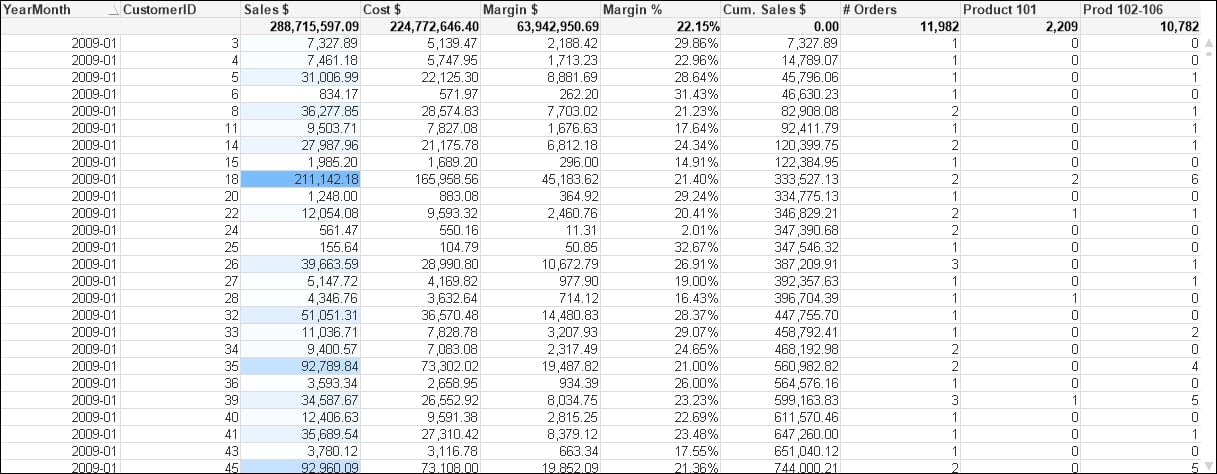
We have used YearMonth and CustomerID as dimensions. This is deliberate because these two fields will be in separate tables once we move the calendar fields into a separate table.
The expressions that we have used are shown in the following table:
|
Expression Label |
Expression |
|---|---|
|
|
|
|
|
|
|
|
|
|
|
|
|
|
|
|
|
|
|
|
|
|
|
|
|
|
|
The cache in QlikView is enormously important. Calculations and selections are cached as you work with a QlikView document. The next time you open a chart with the same selections, the chart will not be recalculated; you will get the cached answer instead. This really speeds up QlikView performance. Even within a chart, you might have multiple expressions using the same calculation (such as dividing two expressions by each other to obtain a ratio)—the results will make use of caching.
This caching is really useful for a working document, but a pain if we want to gather statistics on one or more charts. With the cache on, we need to close a document and the QlikView desktop, reopen the document in a new QlikView instance, and open the chart. To help us test the chart performance, it can therefore be a good idea to turn off the cache.
Note
Note that you need to be very careful with this dialog as you could break things in your QlikView installation. Turning off the cache is not recommended for normal use of the QlikView desktop as it can seriously interfere with the performance of QlikView. Turning off the cache to gather accurate statistics on chart performance is pretty much the only use case that one might ever come across for turning off the cache. There is a reason why it is a hidden setting!
Now that the cache is turned off, we can open our chart and it will always calculate at the maximum time. We can then export the memory information as usual and load it into another copy of QlikView (here, the Class of Sheetobject is selected):

What we could do now is make some selections and save them as bookmarks. By closing the QlikView desktop client and then reopening it, and then opening the document and running through the bookmarks, we can export the memory file and create a calculation for Avg Calc Time. Because there is no cache involved, this should be a valid representation.
Now, we can comment out the inline calendar and create the Calendar table (as we did in a previous exercise):
Order:
LOAD AutoNumber(OrderID, 'Order') As OrderID,
     Floor(OrderDate) As DateID,
//     Year(OrderDate) As Year,
//     Month(OrderDate) As Month,
//     Day(OrderDate) As Day,
//     Date(MonthStart(OrderDate), 'YYYY-MM') As YearMonth,
     AutoNumber(CustomerID, 'Customer') As CustomerID,
     AutoNumber(EmployeeID, 'Employee') As EmployeeID,
     Freight
FROM
[..\Scripts\OrderHeader.qvd]
(qvd);


OrderLine:
//Left Join (Order)
LOAD AutoNumber(OrderID, 'Order') As OrderID,
     LineNo,
     ProductID,
     Quantity,
     SalesPrice,
     SalesCost,
     LineValue,
     LineCost
FROM
[..\Scripts\OrderLine.qvd]
(qvd);

//exit Script;

Calendar:
Load Distinct
    DateID,
     Year(DateID) As Year,
     Month(DateID) As Month,
     Day(DateID) As Day,
     Date(MonthStart(DateID), 'YYYY-MM') As YearMonth
Resident
   Order;
For the dataset size that we are using, we should see no difference in calculation time between the two data structures. As previously established, the second option has a smaller in-memory data size, so that would always be the preferred option.
For many years, it has been a well-established fact among QlikView consultants that a Count() function with a Distinct clause is a very expensive calculation. Over the years, I have heard that Count can be up to 1000 times more expensive than Sum. Actually, since about Version 9 of QlikView, this is no longer true, and the Count function is a lot more efficient.
Note
See Henric Cronström's blog entry at http://community.qlik.com/blogs/qlikviewdesignblog/2013/10/22/a-myth-about-countdistinct for more information.
Count is still a more expensive operation, and the recommended solution is to create a counter field in the table that you wish to count, which has a value of 1. You can then sum this counter field to get the count of rows. This field can also be useful in advanced expressions like
Set Analysis.
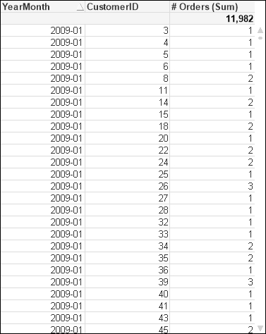
Using the same dataset as in the previous example, if we create a chart using similar dimensions (YearMonth and CustomerID) and the same expression for Order # as done previously:
Count(Distinct OrderID)
This gives us a chart like the following:
After running through the same bookmarks that we created earlier, we get a set of results like the following:

So, now we modify the Order table load as follows:
Order:
LOAD AutoNumber(OrderID, 'Order') As OrderID,
     1 As OrderCounter,
     Floor(OrderDate) As DateID,
     AutoNumber(CustomerID, 'Customer') As CustomerID,
     AutoNumber(EmployeeID, 'Employee') As EmployeeID,
     Freight
FROM
[..\Scripts\OrderHeader.qvd]
(qvd);
Once we reload, we can modify the expression for Order # to the following:
Sum(OrderCounter)
We close down the document, reopen it, and run through the bookmarks again. This is an example result:

And yes, we do see that there is an improvement in calculation time—it appears to be a factor of about twice as fast.
The amount of additional memory needed for this field is actually minimal. In the way we have loaded it previously, the OrderCounter field will add only a small amount in the symbol table and will only increase the size of the data table by a very small amount—it may, in fact, appear not to increase it at all! The only increase is in the core system tables, and this is minor.
Note
Recalling that data tables are bit-stuffed but stored as bytes, adding a one-bit value like this to the data table may not actually increase the number of bytes needed to store the value. At worst, only one additional byte will be needed.
In fact, we can reduce this minor change even further by making the following change:
     ...
     Floor(1) As OrderCounter,
     ...
This forces the single value to be treated as a sequential integer (a sequence of one) and the value therefore isn't stored in the symbol table.
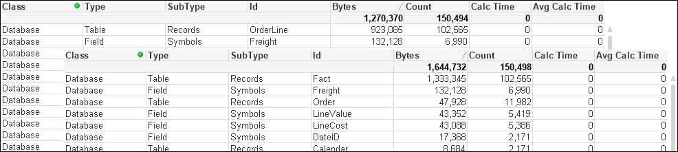
If we load all of our tables, the data structure may look something like the following:
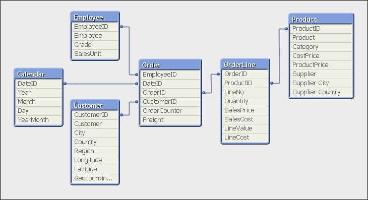
In this format, we have two fact tables—Order and OrderLine. For the small dataset that we have, we won't see any issues here. As the dataset gets larger, it is suggested that it is better to have fewer tables and fewer joins between tables. In this case, between Product and Employee, there are three joins. The best practice is to have only one fact table containing all our key fields and associated facts (measures).
In this model, most of the facts are in the OrderLine table, but there are two facts in the Order table—OrderCounter and Freight. We need to think about what we do with them. There are two options:
Move the
EmployeeID,DateID, andCustomerIDfields from theOrdertable into theOrderLinetable. Create a script based on an agreed business rule (for example, ratio of lineQuantity) to apportion theFreightvalue across all of the line values. TheOrderCounterfield is more difficult to deal with, but we could take the option of usingCount(Distinct OrderID)(knowing that it is less efficient) in the front end and disposing of theOrderCounterfield.This method is more in line with traditional data warehousing methods.
Move the
EmployeeID,DateID, andCustomerIDfields from theOrdertable into theOrderLinetable. Leave theOrdertable as is, as anOrderdimension table.This is more of a QlikView way of doing things. It works very well too.
Although we might be great fans of dimensional modeling methods (see Chapter 2, QlikView Data Modeling), we should also be a big fan of pragmatism and using what works.
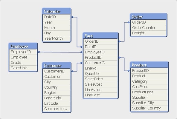
Let's see what happens if we go for option 2. The following is the addition to the script to move the key fields:
// Move DateID, CustomerID and EmployeeID to OrderLine
Join (OrderLine)
Load
   OrderID,
   DateID,
   CustomerID,
   EmployeeID
Resident
   Order;

Drop Fields DateID, CustomerID, EmployeeID From Order;

// Rename the OrderLine table
RENAME Table OrderLine to Fact;
So, how has that worked? The table structure now looks like the following:
Our expectation, as we have widened the biggest data table (OrderLine) and only narrowed a smaller table (Order), is that the total memory for the document will be increased. This is confirmed by taking memory snapshots before and after the change:
But have we improved the overall performance of the document?
To test this, we can create a new version of our original chart, except now using Customer instead of CustomerID and adding Product. This gives us fields (YearMonth, Customer, and Product) from across the dimension tables. If we use this new straight table to test the before and after state, the following is how the results might look:
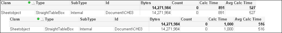
Interestingly, the average calculation has reduced slightly. This is not unexpected as we have reduced the number of joins needed across data tables.
QlikView has a great feature in that it can sometimes default to storing numbers as Dual values—the number along with text representing the default presentation of that number. This text is derived either by applying the default formats during load, or by the developer applying formats using functions such as Num(), Date(), Money(), or TimeStamp(). If you do apply the format functions with a format string (as the second parameter to Num, Date, and so on), the number will be stored as a Dual. If you use Num without a format string, the number will usually be stored without the text.
Thinking about it, numbers that represent facts (measures) in our fact tables will rarely need to be displayed with their default formats. They are almost always only ever going to be displayed in an aggregation in a chart and that aggregated value will have its own format. The text part is therefore superfluous and can be removed if it is there.
Let's modify our script in the following manner:
Order:
LOAD AutoNumber(OrderID, 'Order') As OrderID,
     Floor(1) As OrderCounter,
     Floor(OrderDate) As DateID,
     AutoNumber(CustomerID, 'Customer') As CustomerID,
     AutoNumber(EmployeeID, 'Employee') As EmployeeID,
     Num(Freight) As Freight
FROM
[..\Scripts\OrderHeader.qvd]
(qvd);


OrderLine:
LOAD AutoNumber(OrderID, 'Order') As OrderID,
     LineNo,
     ProductID,
     Num(Quantity) As Quantity,
     Num(SalesPrice) As SalesPrice,
     Num(SalesCost) As SalesCost,
     Num(LineValue) As LineValue,
     Num(LineCost) As LineCost
FROM
[..\Scripts\OrderLine.qvd]
(qvd);
The change in memory looks like the following:
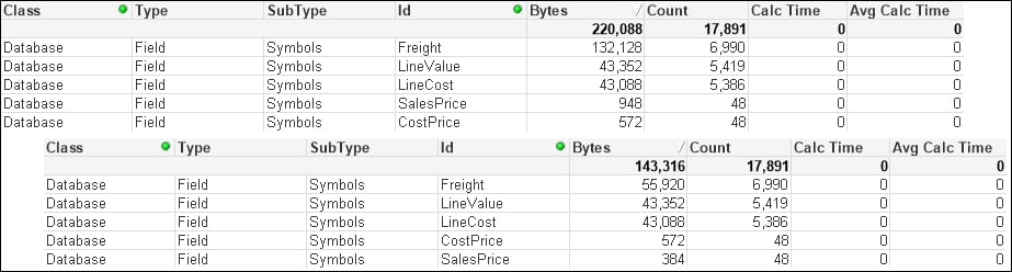
We can see that there is a significant difference in the Freight field. The smaller SalesPrice field has also been reduced. However, the other numeric fields are not changed.
Some numbers have additional format strings and take up a lot of space, some don't. Looking at the numbers, we can see that the Freight value with the format string is taking up an average of over 18 bytes per value. When Num is applied, only 8 bytes are taken per value. Let's add an additional expression to the chart:
|
Expression label |
Expression |
|---|---|
|
|
|
Now we have a quick indicator to see whether numeric values are storing unneeded text.