
A Component is an object that has a visible avatar. Generally speaking, a component can also sense and react to customer inputs. A Widget is a specific type of component with its own distinctive look and feel. A button is a widget and so is a combo box.
During our exploration of LWUIT, we shall keep using the terms Widget, Component (with a capital C) and component. To make sure that we avoid any confusion, let us define what we mean by these terms. The LWUIT library has a Component class that is the superclass for all widgets and embodies their essential qualities. The word Component (yes, with a capital C) will be used to refer to the class, while component (with a lowercase C) will mean any instance of the Component class. This principle of distinguishing between Component and component will be applicable to all classes and their instances. So the word Label refers to the class, and the word label refers to a specific object of that class.
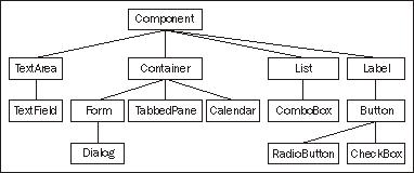
The widgets are the visible faces of LWUIT. So before we delve into the inner details of the library, let us check out the widgets. The following figure is the widget family tree showing all major widgets.
Among the widgets, the Container is the basic 'holder' which can contain other components, including other containers. This nesting ability of containers allows complex and elaborate UIs to be built-up. The arrangement of components within a container is taken care of by a layout manager.
Form is a container with a TitleBar at the top, on which the title of the form can be written, and a MenuBar at the bottom for commands and menu. The space between the two bars is for the content pane, which holds the components that are to be placed on the form.
The container branch of the family tree also has Dialog, TabbedPane, and Calendar. All of these Widgets will be introduced here, and dealt with in detail in Chapter 3.
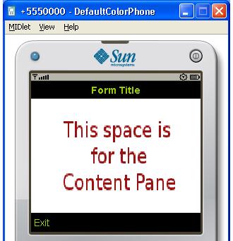
The previous screenshot shows a form and its constituent areas. The title of the form appears on the TitleBar, and the border at the bottom with the Exit command is the MenuBar. We can also see where the content pane goes.
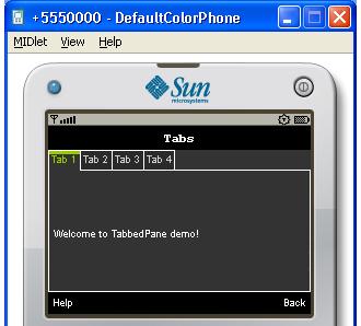
A TabbedPane lets a number of component groups share the same space. Each group of components has a tab associated with it, and the user sees only the group corresponding to the tab that has been selected.
The default placement of tabs is at the top of the pane. However, it is possible to position them at the left, right or at the bottom of the pane. The following screenshot shows a tabbed pane with the tabs at the top, and with the first tab selected.
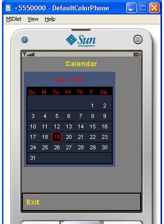
This widget shows date information and supports 'scrolling' through dates and months. The following screenshot shows a calendar:
A Dialog is a component that is usually displayed against a tinted background and covers a part of the screen. By default, a dialog is modal, that is, it blocks the calling thread until it is closed by calling the dispose () method. Dialogs can be one of five types:
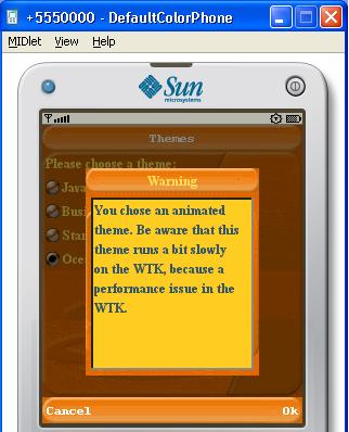
Dialogs can be used to convey information to the user at runtime, and also to collect user feedback. The type of the dialog would normally determine the sound to play when the dialog is displayed. It is possible to add icons to a dialog to graphically indicate the dialog type. The following screenshot shows a simple warning dialog with the Ok and Cancel commands:
A Label displays images and text that cannot be selected. A label does not interact with the user. A number of alignment possibilities are supported for positioning the label, and also for positioning the text with respect to the image on the label. Label and its descendants (Button, RadioButton, and CheckBox) are covered in Chapter 4.
A Button is primarily intended for capturing an input from a user. In a way, we can think of a button as a label that can sense user action—specifically, a click.
The Button class extends Label. A button has states, and it generates an action event when selected and clicked on. Like a label, a button can have a descriptive text or an image or both. The three states of a button are as follows:
A button has two subclasses—RadioButton and CheckBox. A radio button has all of the functionalities of a button. In addition, a radio button can be added to a ButtonGroup, which allows it to maintain its selection state exclusively within the group. Within a button group, only one radio button can be in the pressed state at a time. If another radio button is clicked on, then the one that was in the pressed state earlier will get deselected. Also note that once a radio button is in the pressed state, clicking on it does not change the state.
A check box is similar to a radio button in the sense that it can remember its state, if it has been selected by being clicked on. However, repetitive clicking on a check box will toggle its state between selected and deselected. Another difference is that a check box cannot be a part of button group.
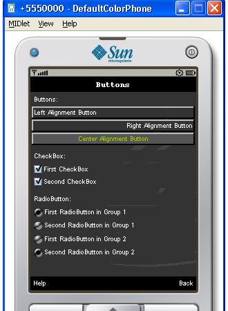
A number of labels, buttons, radio buttons, and check boxes are shown in the following screenshot. The screenshot shows that the first two buttons are in the default state, while the third is in the rollover state. Both the check boxes are shown selected, but only one radio button in each group is selected.
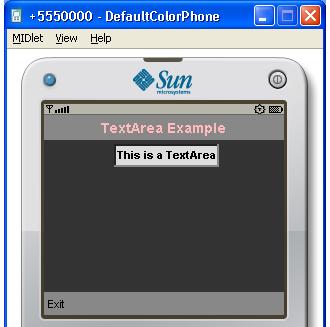
TextArea is a component that displays text that may be editable. The editing is performed using the native system editor, which often opens a new screen. A text area uses the concept of constraints just like TextField of javax.microedition.lcdui. The constraints allow a text area to be tailored to accept a particular type of input like a password or an email address. We shall study this in detail when we discuss TextArea in Chapter 6. The following screenshot shows a form with a text area:
A TextField (this one is a part of LWUIT) extends TextArea, and provides a single line text display. It differs significantly from TextArea in the way that it supports text editing. In Chapter 6, we shall study TextField in detail.
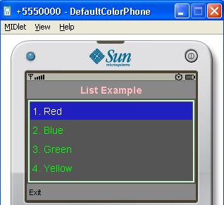
A List is a very widely used component that presents a number of information items to the user. The items are presented in a single column, but each item may contain multiple lines of text and images.
The data structure of a list is represented by the ListModel interface. Therefore, a list is not tied to any specific data structure, and can display information from any object that implements this interface. Similarly, the rendering of a list is performed by any class that implements the ListCellRenderer interface, thus making it possible to create the kind of look the application developer wants. The library includes default implementations of the above interfaces that make it easy to instantiate a list.
List and its subclass ComboBox will be discussed in Chapter 5. The following screenshot shows a simple list with four items:
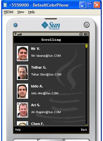
Compare this with the list shown in the following screenshot and its significantly different appearance. The application behind the following screenshot implements its own renderer to achieve a very polished and attractive look. We shall see how to write custom renderers in Chapter 5.
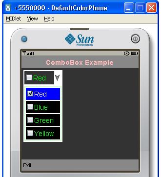
The ComboBox is a space saving component that drops down a list when its button is clicked on. The user can then select one of the items on that list. As ComboBox extends List, you can use custom models and renderers for combo boxes too. The following screenshot shows a combo box with a four item drop-down list: