Book Image

The Business Analyst's Guide to Oracle Hyperion Interactive Reporting 11

By : Edward Cody
Book Image

The Business Analyst's Guide to Oracle Hyperion Interactive Reporting 11

By: Edward Cody

Overview of this book

Oracle Hyperion Interactive Reporting is one of the many products in the Oracle Enterprise Performance Management software suite, an industry-leading business intelligence software package. The primary focus of the Interactive Reporting product is to provide strong relational querying and data analysis capabilities. It also provides the capability to disseminate information throughout an enterprise. There is a very steep learning curve for most users of this tool.This book examines the power of the Interactive Reporting Web Client software, focusing on the key features of each section of the product. The author's experience in developing and supporting Interactive Reporting users is very well documented in this book. The goal is to educate you on every useful feature of the product, enabling you to gather information from various sources and process it to produce meaningful results that help you to spot problems and analyze trends necessary for business decisions.The book starts with a quick introduction to the product interface and the EPM Workspace, with explanation of importing and provisioning. It then takes you through each section from building a query and data model to building graphical displays of the data in a logical sequence. The report sections and interactive dashboards are also discussed at length. The book also covers advanced features of the product and provides you with the information necessary to build the foundation for creating complex queries and computations using the product.
Table of Contents (16 chapters)
The Business Analyst's Guide to Oracle Hyperion Interactive Reporting 11
Credits
About the Author
Acknowledgement
About the Reviewer
Preface
Index

Configuring gauges


When a gauge is added to a dashboard, the gauge must be populated with data elements from a Query section, and the properties of the gauge can be configured to produce the desired view of interest. The following image is a sample of each of the four gauges on a dashboard:

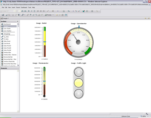
Each gauge contains a Fact element and all of the gauges besides the Traffic Light contain a Target Fact element. When a gauge is clicked and highlighted on the dashboard during design, a Data Layout window appears at the bottom of the main screen with areas to add data elements from Query results or a table. Dragging-and-dropping the desired elements from the Elements window into the Data Layout area will configure and populate the object with data. After adding the elements to the section, making the dashboard active will display the populated object.

When viewing the gauges (other than the Traffic Light), notice the gauges show the Fact in either the black line or speedometer needle and the Target...