
In the Role Tailored client there are two kinds of charts that can be added to any page by the user. To do this, the user can add chart parts and/or charts panes to a page. But there are some restrictions:
These charts that can be added to the Role Tailored Client at runtime give the user the perception of self service business intelligence in the Role Tailored Client.
Note
You can also add other types of charts to the RTC, for example via Control Addins. These types of charts are not covered in this chapter.
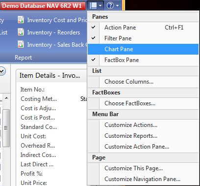
In any List page of the Role Tailored client a user can go to Customize This Page and add a chart pane to the page. When you do this, a chart pane is added that can be used to design a chart at runtime. The following screenshot presents these customization options. Enable the Chart Pane:
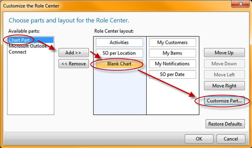
When you do this, a blank chart is added to the List page, below the list of fields. In this chart, the user can select one measure and one or two dimension fields:
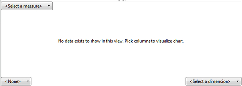
The measure and dimension fields are all fields from the underlying table of the list page. Flowfields are also available to choose from:
The measure represents a numerical value you want to visualize in the chart.
The dimensions represent the axes you want to use to analyse the selected measure.
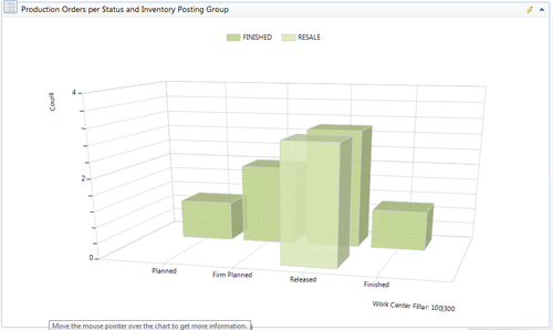
For example, in the Item List page, the user can create this kind of chart:
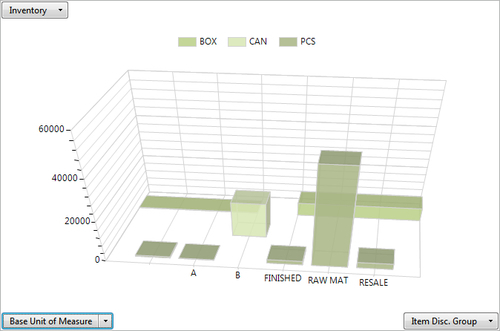
By selecting the Inventory flowfield as the measure and the Item Discount Group and Base Unit of Measure fields as dimensions, you have now visualized the inventory in a three dimensional bar chart. This provides you with an easy to understand graphical representation of the Inventory.
When you right-click on the chart, you can either copy or export it as a bitmap.
Chart panes are added by the user at runtime, and they are limited to the user only. Chart panes are a part of the user personalization features of the Role Tailored Client. Furthermore, after you stop and restart the Role Tailored Client, the chart pane is removed.
Chart panes can be demanding on performance. Chart panes are combinations of one measure field and one or two dimension fields, without filters. As you can probably imagine, when there are many records in the underlying table, running these chart panes can become very demanding on server resources. That's probably why they are removed after you restart the RTC.
A chart is added by using the Customize This Page feature in the RTC. Click on the Customize button at the top right of the window in the RTC as follows:
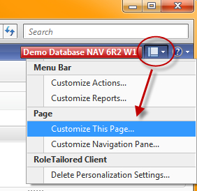
Now, you can add a chart to the page as follows:
When you then click on Customize Part, after selecting Blank Chart, you can select the chart you want to show in this chart part from the list of chart parts.
Now, where are these chart parts coming from? Actually, the chart parts are stored in the table: 2000000078 Chart.
You can create a new chart by importing it into this table. To help you in this process you can use the Classic Client (CC) or the Role Tailored Client (RTC):
A window opens that you can use to import a new chart into the Chart table. Give the chart a unique ID, and a name. Then, you must import an XML file, which will contain the definition of the chart. Furthermore, you can enter none, one, or more companies, to limit the chart to become only available in certain companies of the database.
There are some limitations when creating a chart:
A chart has a simple layout. You choose the table to base it on, then a field from that table to show along the X-axis, and, if needed, a filter on this table. Then, you select what data from the table to show on the Y-axis (also called a measure). A measure can be based on Sum or Count. You can display multiple measures in the same chart. Charts are defined by XML documents that are stored as BLOB fields. You can export a chart to an XML document, then modify the XML document, and import it back as a new chart.
The table, measures, and dimensions on which you base your chart are entered in the XML document.
This is an example of a chart definition:
<ChartDefinition xmlns="urn:schemas-microsoft-com:dynamics:NAV:MetaObjects" xmlns:xsd="http://www.w3.org/2001/XMLSchema" xmlns:xsi="http://www.w3.org/2001/XMLSchema-instance" Type="Column">
   <Title>
      <Text ID="ENU">Items by location</Text>
   </Title>
   <Table ID="32">
      <Filters>
         <Filter>
            <Field Name="Item No." />
            <Value>70000|70001|70002|70003</Value>
         </Filter>
      </Filters>
   </Table>
   <XAxis ShowTitle="true">
      <Title>
         <Text ID="ENU">Location Code</Text>
      </Title>
      <Field Name="Location Code" />
   </XAxis>
   <YAxis ShowTitle="false">
      <Measures>
         <Measure Operator="Sum">
            <Field Name="Quantity" />
         </Measure>
      </Measures>
   </YAxis>
</ChartDefinition>
A chart automatically becomes a 3D chart by adding a Z-axis to the chart definition, for example like this:
   <ZAxis ShowTitle="false">
      <Field Name="Item No." />
   </ZAxis>
The presence of a Z-axis will automatically make the user able to rotate the chart:
Note
This XML file is an example coming from this website: http://blogs.msdn.com/b/nav/archive/2008/08/20/nav-2009-how-to-generate-charts-kpis.aspx.
On this blog, you can also download a Chart Generator tool. This tool contains objects that can make it easier to generate charts using the Classic Client and not by editing the XML file directly, which is very error sensitive. The tool contains the following objects:
Type ID Name
1 72000 Chart Generator
1 72001 Chart Generator Filter
1 72003 Chart Generator YAxis
2 72000 Chart Generator List
2 72001 Chart Filters
2 72003 YAxis List
2 72004 Chart Generator Card
5 72000 Chart Generator Mgt
Charts can be generated from form 72004 "Chart Generator Card". The Chart Generator tool is only supplied as an example of how such a tool could be made. It is completely un-supported and to be used at your own risk and responsibility.
A
definition of the XML file can be found in an XSD file that you can find on the installation DVD of the Dynamics NAV application. It has been added on this DVD in version NAV 2009 R2. Before the R2 release, there was no .xsd file available.
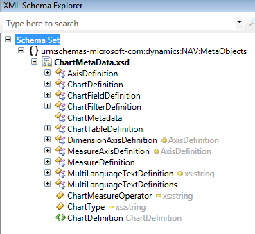
This XSD file can be found in this location on the DVD: DVD\Documentation\Utility\ChartMetaData.xsd.
This .xsd schema describes the possible building blocks of the XML definition for a chart. A schema is a blueprint of an XML document that defines the elements, data types, and nesting structure of the page.
The following is a screenshot of the XSD file, when you open it in Visual Studio and display it in the XML Schema Explorer:
What can we conclude after investigating the .xsd file?
Well, first of all, some of the limitations we had before on charts are removed in NAV 2009 R2.
The ChartType is limited to Column, Point, and Line, as you can see here:
<xs:simpleType name="ChartType">
<xs:restriction base="xs:string">
<xs:enumeration value="Column" />
<xs:enumeration value="Point" />
<xs:enumeration value="Line" />
</xs:restriction>
</xs:simpleType>
The
ChartMeasureOperator is now limited to the following operations:
None
Count
Sum
Min
Max
Avg
Relative
RelativePct
And the default is Sum, as you can see here:
<xs:simpleType name="ChartMeasureOperator">
<xs:restriction base="xs:string">
<xs:enumeration value="None" />
<xs:enumeration value="Count" />
<xs:enumeration value="Sum" />
<xs:enumeration value="Min" />
<xs:enumeration value="Max" />
<xs:enumeration value="Avg" />
<xs:enumeration value="Relative" />
<xs:enumeration value="RelativePct" />
</xs:restriction>
</xs:simpleType>
Compared to the previous release of Dynamics NAV, there are new options—Relative and RelativePct:
Secondly, the ChartTableDefinition now has an extra attribute: Key. This will I think determine the sort order when possible, but also have an impact on performance.
A question you might ask yourself is: What about charts and security? Can I make sure only specific users will be able to add a chart to their Role Center page?
Well, the answer to this question is: no and yes. No, because there's no specific feature that was added to NAV 2009 to set up chart security. The way to set up security for these charts is by using security filters. As you might have seen, the existing charts all have a specific naming convention in their ID's. It is the Table Number followed by an index. This means that if you also follow this naming convention, you can use the chart ID as a security filter value when setting up roles and security in NAV 2009.
Record level security is a system that allows you to limit the access that a user has to the data in a table by specifying that the user only has permission to access certain records in the table. Record level security is implemented by applying security filters to the tables and the table data that a user has access to. You can specify, for example, that a user can only read the records that contain information about a particular customer and cannot access the records that contain information about any of the other customers.
Note
Record level security is only available in the SQL Server Option for Dynamics NAV. But because the RTC only works on a SQL Server database this should not be a problem.
Record level security filters do not support wildcards. This means that you cannot use * and ? in the filters. You can use the other symbols, delimiters, and operators, such as, <, >, |, &, .. and =.
The maximum length of a security filter is 250 characters, but all of the delimiters, symbols, and operators such as, <, >, |, &, .. and = also count as characters and can considerably reduce the length of the security filters that you can enter.
Furthermore, security filters are concatenated and therefore the sum of all the security filters applied to a user or a role cannot exceed 250 characters.
When you are a developer who designs the XML for a chart object, or when you are a user who's adding a chart to a page in the Role Tailored Client, you should consider the performance impact of the chart. In a chart object, although the data comes from one table, this table could contain thousands, tens of thousands, or even more records. Doing calculations on such huge amounts is normally not a problem for SQL Server, but for Dynamics NAV it might be.
That's why you should carefully design the chart. You can do this by selecting the appropriate key in the chart definition, and by supplying the appropriate filters.
The user should also be aware that the more charts he or she adds to a page, the bigger the impact on performance.