
The Microsoft Dynamics CRM 2011 interface has many new buttons, links, and UI features that can be a bit overwhelming at first glance. This section will introduce you to some of the common navigation methods to locate and view different dashboards.
Sign in to your Microsoft Dynamics 2011 Online account (we created one in the first section) by using your Windows Live ID credentials. By default, the Dynamics CRM 2011 application already has the Dashboards area set as the homepage. Therefore, the first time you sign into the application, you will start with the Dashboards. Microsoft Dynamics CRM Online comes ready with pre-populated sample data. This data will help you to build your dashboards, and is the same as is used in the rest of this book.
Carry out the following steps in order to complete this recipe:
By default, the Dashboards link can be found in the Workplace section of the left-hand navigation for Dynamics CRM 2011, as shown in the following screenshot:

When working in the Dashboard area, you can select a different dashboard by clicking on the small down arrrow next to the current dashboard's title and then choosing a new dashboard to view. The following screenshot shows one such example of this:

Another way to select and view dashboards is by clicking on the similar small arrow when you highlight the Dashboards link in the left-hand navigation section, as depicted in the following screenshtot:

One of the new navigation features in Dynamics CRM 2011 is the new Recently Visited and Favorites link; this lets you quickly jump to a dashboard when you are not in the Workplace section. You can also pin your favorite dashboards, so that they are always available. For example, the following screenshot shows how you can access a favorite dashboard while you are still in the Sales section.

Now that you understand the basics around locating and viewing CRM Dashboards, let's take a detailed look at the standard dashboards that come with the Dynamics CRM 2011 application and what each one contains.
To review each standard Dashboard, sign in to your Dynamics CRM 2011 Online account and navigate to the Dashboards section in the Workplace area.
The Microsoft Dynamics CRM Overview Dashboard is a good example of how a general user who might work across multiple modules in CRM (Sales, Marketing & Service) can use a dashboard to get a view of the entire system.
The Sales Pipeline chart is a funnel report on open/active opportunity records, grouped into the different stages.
The Leads by Source Campaign chart shows all lead records that came in as a direct result of a CRM-managed campaign. The data is grouped by campaign and covers the current fiscal year.
The Cases By Priority (Per Day) chart is a stacked chart that tracks the active cases assigned to the current user per day, stacked by priority.
The list of My Activities is a collection of CRM Activities (Phone Call, Task, Appointment, Email, and so on) that belong to the current user.
These are depicted in the following screenshot:

The Sales Activity Dashboard is an example of how a sales person might design a dashboard. The idea is to provide sales data and goal measurements to quickly identify areas that need attention. All the charts are focused on the current user's data.
The Sales Pipeline chart is a funnel report on open/active opportunity records, grouped into the different stages.
The Percentage Achieved chart shows the progress against the user's active goals. These goals cover four quarters of the current fiscal period, and track opportunities.
The Leads by Source chart shows all the Lead records this user owns, and groups them by source (Advertisement, Trade Show, Referral and so on).
The Top Opportunities chart takes the user's list of open opportunities and selects the top 10 based on the estimated revenue.
The Top Customers chart takes the user's list of closed opportunities for the current fiscal period and selects the top ten opportunities based on the estimated revenue. The related customer name is also displayed.
The list of My Activities is a collection of CRM Activities (Phone Call, Task, Appointment, Email, and so on) that belong to the current user.
These are depicted in the following screenshot:

The Sales Performance Dashboard shows how a manager or VP can use a dashboard to view the progress of a team or the entire organization. The charts read data across the entire CRM system, not just for the current user account.
The Sales Pipeline chart is a funnel report on open/active opportunity records, grouped into the different stages.
The Goals Progress (Money) chart allows the user to see how the team or organization is progressing towards financial goals. This example uses opportunities grouped by fiscal quarters.
The Percentage Achieved chart shows the progress against active goals. The default goals cover four quarters of the current fiscal period, tracking opportunities.
The Sales Leaderboard chart sums opportunities closed in this fiscal period and groups them by the opportunity owner.
The Deals Won vs. Deals Lost By Owner is a stacked chart that sums the opportunities won in this fiscal period and combines that with a sum of the opportunities lost in this fiscal period. That data is then grouped by the owner of the opportunities.
These are depicted in the following screenshot:

The Marketing Dashboard provides an overview of the marketing efforts across the organization. The charts presented here are more reflective rather than a call to action, but completing marketing and sales processes in CRM brings this dashboard to life.
The Campaign Type Mix is a pie chart that simply groups all the campaigns for the current fiscal year by the campaign type field.
The Campaign Budget vs. Actual Costs is a stacked chart that takes all campaigns for the current fiscal year and compares the budgeted amount versus the actual costs recorded to run the campaign. This data is then grouped by fiscal quarters.
The Leads by Source Campaign allows the user to see the number leads generated by each campaign run in the current fiscal year. This information is driven from the new lead records that are tied back to an originating campaign.
The Revenue Generated by Campaign chart sums the actual revenue data from all the closed opportunities for the current fiscal year and relates them back to a campaign that influenced or started the deal. This data is then grouped by campaign.
The list of My Activities is a collection of CRM Activities (Phone Call, Task, Appointment, Email, and so on) that belong to the current user.
These are depicted in the following screenshot:

The Customer Service Representative Dashboard shows the KPIs for a Customer Service Rep, or support personnel. The chart provides case data and goal measurements to provide a quick status report. The charts are focused on data for the current user.
The Case Mix (By Origin) is a pie chart that groups active cases by the case origin field value.
Cases By Priority (Per Day) is a stacked chart that provides a view of the incoming cases, grouped per day, and stacked by priority.
The Case Resolution Trend (By Day) chart is a mixed chart (bar and line) that is used to report on the number of cases closed per day, along with the average time spent to resolve those cases.
The Goal Progress (Count) chart uses the goals data in CRM to report on numeric (count) goals instead of the usual financial goals. This chart has a target for completing cases per quarter, and shows the completed status along with a forecast for current progress towards the goal.
The list of My Activities is a collection of CRM Activities (Phone Call, Task, Appointment, Email, and so on) that belong to the current user.
These are depicted in the following screenshot:

The Customer Service Performance Dashboard shows the KPIs for a customer service team within the Customer Service group. The data includes team-wide results, not just data for the current user.
The Service Leaderboard chart shows the number of cases resolved in the last 7 days, grouped by the user who resolved the cases.
The Case Resolution Trend (By Day) chart is a mixed chart (bar and line) that is used to report on the number of cases closed per day, along with the average time spent to resolve those cases.
The Goal Progress (Count) chart uses the Goals data in CRM to report on numeric (count) goals instead of the usual financial goals. This chart has a target for completing cases per quarter, and shows the completed status along with a forecast for current progress towards the goal.
The Articles By Status chart reports counts all of the knowledgebase articles stored in CRM and groups them by status (draft, unapproved, approved).
These are depicted in the following screenshot:

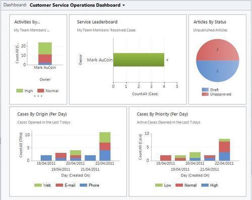
The Customer Service Operations Dashboard is similar to the Customer Service Performance Dashboard, except that this dashboard focuses on the entire Customer Service group (operation) and not just a team or an individual user.
Activities by Owner and Priority is a stacked chart that counts open activities by the user and then stacks them by the activity priority field value.
The Service Leaderboard counts all resolved cases and groups them by the user who resolved the case.
Articles By Status is a pie chart that counts all of the unpublished knowledgebase articles stored in CRM and groups them by status (draft or unapproved).
The Cases By Origin (Per Day) chart is a stacked chart that counts and groups all cases opened over the last 7 days and stacks them by the case source field (web, e-mail, phone).
Cases By Priority (Per Day) is another stacked chart that counts and groups all active cases opened in the last 7 days and stacks them by the case priority field.
These are depicted in the following screenshot: