

The saying goes: a picture is worth a thousand words. When dealing with diagrams, the same point is true: a good diagram saves a thousand words.
In this section, you will draw your first diagram. We'll build the diagram from scratch to a finished product, and along the way explain what you need to do. If you follow each step without deviation, you will get a good background on a lot of the possibilities that are present in the OmniGraffle program. It is thus better to experiment after the diagram is done, rather then when you are working your way through the various steps.
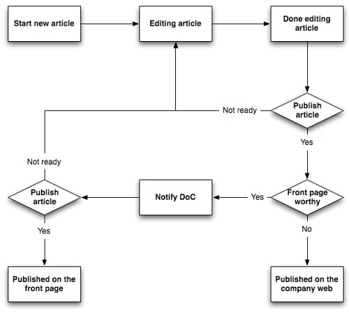
Our first diagram is going to describe the workflow for publishing information on an imaginary company's web page.
 |
To set the stage we need to introduce some actors and publishing rules. First out is the writer. This person is actually writing content to be published. However, a writer is not allowed to publish information on the web without being checked by the editor. Unless the article being published is to be put on the front page, the editor does not need any permission to publish. If the article is to be published on the front page, then the Director of Communication needs to give her consent.
What we have here is a common workflow for publishing information on a company website. However, often these workflows are described in many more words and in language confusing to the reader. Using a diagram will help the reader to understand how the workflow is really going.
We are now going to make a diagram that clearly shows the workflow described in the previous section.
 |
If OmniGraffle is already running, you can use the File| New command.
If you need to start OmniGraffle you may either have a new blank document at your disposal, or you may be presented with the Template Chooser.
 |
The template chooser contains a few ready-made templates for various tasks.
For this task, choose the Blank template and hit the New Diagram button.
The first task for a website author is of course to start a new article. We'll use an oblong to denote this.
In the tool-selector, you click on the Shape Tool. You will notice a blue circle with the number 1 inside. This indicates that this tool has been selected to perform once.
This means that after you have used the tool once, OmniGraffle will revert back to the selection tool. If you want to draw more than one particular shape, double-click on the corresponding icon, and it will not change until you select another tool to use.
Now, draw an oblong shape on the canvas. Notice that the blue circle over the shape tool is gone—and the selection tool has been automatically selected.
 |
Double-click inside the oblong shape. You will now have the ability to put text inside the shape. Type in Start new article.
 |
If your version of the oblong and the text does not exactly look like what you see in the book, this is not important right now. We are going to fix this later. Do not spend time trying to get your oblong looking 100% like what you see here.
When you are done press the Esc key (or click anywhere on the canvas, outside of the shape). You will now notice that the shape is selected since the shape has got eight "handles":
 |
Just leave it like this.
The handles you see on the shape are what you use when you want to resize the shape using your mouse.
The next task is of course to write the actual article.
With the Start new article box selected, press the ⌘+D keyboard shortcut combination to duplicate the shape. You should now have one box on top of the other:
 |
Move the selected (copied) oblong to the right of the one underneath. Try to leave a good amount of space between the boxes. You will now have two rectangles with the same content next to each other.
Double-click inside the box on the right side to edit the text, and enter Editing article.
Since you are in fact documenting a process, using an arrow from one point in the workflow to the next point makes sense. What we want is an arrow going from the Start new article box to the Editing article rectangle.
To achieve this, click on the Line Tool in the tool-selector on the canvas toolbar. You will notice a blue circle with the number 1 inside. This indicates that this tool has been selected to perform once.
Next, place the cursor over the Start new article oblong. You will notice that the shape is now glowing with a colored hue.
The glow is to indicate that you can start (or end) a line on a shape. The color of the glow depends on which version of OmniGraffle you are using. If you are reading the PDF version of this book, you will notice that the glowing color is red. Usage of the red color is also reflected elsewhere in the text.
 |
Click once, and move the cursor over to the Editing article oblong. You will notice two things: The Editing article oblong is now glowing; and there is a straight line between the two shapes.
When you click on the Editing article oblong, the line becomes permanent. The line is also selected, which is a good thing, as you now will put on an arrow to indicate the direction of the workflow.
 |
To add an arrow to a line, you need to use the Lines and Shapes inspector. If the style palette is not shown, press the ⌘+1 keyboard combination. The style palette is now visible. Click on the line style and you have access to line properties.
 |
As you notice in this inspector, there are several properties you can use to alter the appearance of a line. In fact, you can alter certain properties on all drawn shapes (lines, circles, oblongs, and so on).
The important widget for you right now is the following part of the inspector:
The left selector controls the appearance of the start of the line.
The right selector controls the appearance of the line ending.
The middle selector is what kind of line you want to have. Between the two shapes we are now working on, you can leave this selector as it is.
Change the right selector to an arrow head:
 |
Now you have an arrow between your shapes:
 |
We need to add the step where the writer is done editing the article. This is done by adding a new oblong, entering the Done editing article text, and finally connecting the Editing article oblong with the Done editing article oblong.
Instead of repeating Step 3 and Step 4, we will duplicate the last box we created along with the arrow. Then we'll re-connect the new arrow to the Editing article oblong.
Hold down the Shift key and click on the arrow and the Editing article box. Both should now be selected.
 |
Use the ⌘+D keyboard shortcut command to duplicate these shapes:
 |
Move the selected arrow and oblong below the existing diagram. You will now for all practical purposes have two diagrams, which need to be connected to each other.
 |
Double-click inside the newly created oblong and change the text to Done editing article.
To connect the "loose arrow" to the upper diagram, click on the arrow. You will notice the arrow has a small red diamond on the right side, and a small green circle on the left side (where you now have the arrow point). The red ring is an indication of the starting point of the line, and the green ring is an indication of the endpoint of the line.
 |
Click on the red circle and drag it over the Editing article oblong. Notice that the oblong will now glow with the red hue we saw before, giving you an indication that the line can be attached to this shape.
 |
We suddenly notice that we need to move the Done editing article shape to the right.
Before we move the shape, let's make sure that the Smart Alignment Guides, and the Smart Distance Guides are turned on. These are found in the Arrange | Guides menu:
 |
Turning on these two guides will give use some nice visual hints along the way, making sure our diagram will turn out visually great.
Earlier in this chapter you learned that the canvas is WYSIWYG. Simply click on the Done editing article, and drag it to the right of the other two shapes.
 |
You will notice two things as you move the Done editing article shape to the right of the two other shapes:
First, is the thin blue line going through all three shapes. This is a visual cue that the three shapes are aligned vertically centered to each other. What you see here, is the Smart Alignment Guides in action. When you align two or more shapes, the Smart Alignment Guide kicks into action and shows you that the shape you are now moving around is aligned with other shapes.
Secondly, between the shapes we see some distance indicators. This is a visual cue that the distance between shape number 1 and shape number 2, is equal to the distance between shape number 2 and shape number 3. What you see here, is the Smart Distance Guides in action.
While alignment and distance guides may seem minors feature at present, in time, their power (if you elect to use them) will become apparent.
You can temporarily enable or disable guides by holding down the command key (⌥) after you have started to drag your selected shape around.
Note
When moving a shape, correctly connected connection lines will stay connected to their corresponding shapes.
When moving a connection line, the line may lose its connection—the connected shape will not move. The reason for this is that shapes are conceptually more important than lines (this is true for most diagrams).
The next step in the workflow is adding the logic around the editorial step. This is where the editor decides if the article is worth publishing.
We start by replicating Step 5. Click on the Done editing article and its corresponding arrow, then press the ⌘+D keyboard shortcut combination to duplicate the shape and the arrow. Move the newly created shapes below the current diagram:
 |
Now, click on the new Done editing article shape.
 |
We are now going to change this shape into a "decision" shape. Traditionally, such decision shapes have had the diamond form.
If you take a look in the Style inspector, you'll notice that the bottom half has changed from when we added the arrowhead to our connecting line. This area is called the Shape Collection.
 |
More precisely we are looking at the section with a lot of small shapes—and this is where you select the diamond shape:
 |
Your oblong shape is now a diamond! Pretty neat!
 |
We need to do two things to be done with this step. Firstly, we need to amend the Done editing article text inside the diamond to Publish article. Secondly, we need to connect the arrow to our other diagram.
To change the text, double-click inside the diamond and type in the new the text. You will find the details of how to perform this in Step 3 (found earlier in this chapter).
To connect the arrow to the other diagram, click on the arrow. Then drag the end with the red circle to the Done editing shape. Notice how the shape is glowing red when you put your cursor on the shape.
 |
We now have the decision step in place, but without logical outcomes. There are two logical outcomes of this step. The article is either ready for publication—or if the article is to be published on the front page, we need to add another logical step—the step where the Director of Communication decides if this article is worthy of the front page of our website.
Let's end this step in the workflow by adding the notion that an article will not be published until the content has been reworked.
In practise, we want to connect the Publish article diamond with the Editing article oblong.
To achieve this, click on the Line Tool in the tool-selector on the canvas toolbar. You will notice a blue circle with the number 1 inside. This is an indication that the tool has been selected to perform its task once.
Now place the cursor on the Publish article diamond (it should now become glowing red)—then click. Now move the cursor to the Editing article oblong (this shape will also become glowing red), and click.
We now have a connection between these two shapes:
 |
This does not look very good. We need to add an arrow to the line, and we need to add a corner to the line.
|
To add an arrow to a line, you need to use the Style inspector. If the style palette is not visible, press the ⌘+1 keyboard shortcut combination. The style palette is now visible. Click on the Line and Shapes style and you have access to the line properties.
As you notice with this inspector, there are several properties you can use to alter the appearance of a line.
In fact, you can alter certain properties on all drawn shapes (lines, circles, oblongs, and so on).
What is important for us is the following part of the line and shape inspector:
The left selector controls the appearance of the start of the line.
The right selector controls the appearance of line ending.
The middle selector is what kind of line you want to have.
Change the right selector to an arrowhead:
|
Then change the middle selector to Orthogonal.
 |
Your diagram should now look like this:
 |
We are very close now. What we really want is to have the line between the Editing article oblong and the Publish article diamond, start at the left tip of the diamond.
To achieve this we need to add Magnets to the shapes. A magnet is a fixed point on a shape where the connection lines will attach themselves. The connection lines will automatically take the shortest path between two shapes that have no magnets—magnets will give you full control of where connection lines will attach to shapes. You will learn more about magnets in Chapters 3 and 4.
First select both the Editing article and the Publish article shapes:
 |
Then open up the Connections property inspector.
 |
Click on the drop-down list saying No magnets, and select 4 magnets: N, S, E, W.
 |
Unfortunately, now your drawing looks even worse than before.
 |
To fix this, click on the arrowhead on the right of the Editing article oblong.
 |
Remember earlier when you learned that the start of a line (or an arrow) has a small red circle and the ending point of the line has a small green circle.
All you have to do now is to drag the small red circle (it should be at the top of the Publish article diamond) to the left point of the diamond. Notice how we now have four small pink circles at each point of the diamond—these are the magnets we added earlier.
 |
We need to add a text label to the line between the Publish article diamond, and the Editing article oblong.
To achieve this, click on the Text Tool in the tool-selector on the canvas toolbar. You will notice a blue circle with the number 1 inside. This indicates that the tool has been selected to perform its task once.
Notice how the cursor has changed its appearance(![]() ) to indicate that we are now working with the text shape.
) to indicate that we are now working with the text shape.
Next you move the new cursor over the line—notice how the line will slightly glow to indicate that it is possible to associate the text with the line.
Click on the line and notice how OmniGraffle asks you for a Line Label—another visual cue that we are attaching a label to a line.
Enter Not ready in the text box, and your diagram should look like this:
 |
Now the workflow states, that if the article is not ready for publication, it's back to the Editing article workflow step.
This is another logic-based step much like the one in the previous step. We will thus copy the Publish article diamond, and amend the text associated with this shape to Front page worthy.
Highlight the Publish article diamond, and press the ⌘+D keyboard shortcut combination. As always this will duplicate the shape. This is the ideal way to continue, compared to adding a shape from the bottom up. The main reason is that we want to save the time it takes to set up the magnets again.
Note
When duplicating any shape, including lines, every aspect such as magnets, color, size, and fonts of the shape will be duplicated.
After duplicating the Publish article diamond, move the copy below the original. The Smart Alignment Guides and the Smart Distance Guides will aid you in the placement of the shape.
Notice that the thin blue line is going through the center of the Done editing article oblong, the original Publish article diamond, and our copy of said diamond.
 |
Let's change the text in our new diamond to Front page worthy by double-clicking on the Publish article text. You will now have a brand new diamond with the correct text and the valuable magnets intact.
 |
Now you need to connect an arrow between the Publish article diamond and the Front page worthy diamond. You can either copy an existing arrow or you can create the arrow from the ground up like you learned in Step 4.
Let's copy the arrow between the Start new article and the Editing article oblongs. Click on the arrow once to mark it, then hit the ⌘+D keyboard shortcut combination. You will now have a copy of the original arrow—the copy has the usual red and green circles on each end. Drag the green circle (which coincidently is the arrow head) to the top of the Front page worthy diamond—now notice how the pink colored magnets spring to life. Attach the arrowhead to the top of the diamond:
 |
Now attach the end of the arrow (where you see the red circle) to the bottom of the Publish article diamond. The resulting diagram should look like this:
 |
To complete this step in the workflow, we need to add a line label on the arrow connecting the two diamonds.
Click on the Text Tool in the tool-selector on the canvas toolbar. Notice the usual blue circle with the 1 inside indicating that this tool will perform its task once.
Also, notice how the cursor has changed its appearance(![]() ) to indicate that we are now working with the text shape.
) to indicate that we are now working with the text shape.
Next you move the new cursor over the line between the two diamonds. The line will slightly glow to indicate that it is possible to associate the text with the line.
Click on the line and notice how OmniGraffle asks you for a Line Label—another visual cue that we are attaching a label to a line. If you compare this line label, to the label you added in step 6 you will see that the label is always horizontal—no matter if the line is horizontal, vertical, or even oblique.
Change the label text into Yes. Your diagram should resemble the following one:
 |
This workflow step does in fact consist of three diagram elements. One element will indicate that the Director of Communication needs to be notified, one logical element which will show if the article is to be published on the front page, and one last element that says Published on front page.
Let's start with the notification of the Director. This is an oblong saying Notify DoC. Place this oblong to the left of the Front page worthy diamond.
To save you some time, not only duplicate an existing oblong, but also remember to duplicate an arrow in the same operation. Mark the Start new article along with its associated arrow and press the ⌘+D keyboard shortcut combination to duplicate these two elements. Also move them in line with the Front page worthy diamond.
Tip
Copy as much as you can in each step
As you build up your diagram, you will quickly see that a lot of the elements you use can be re-used elsewhere in your diagram. Copy and paste elements until your heart's content – or use the ⌘+D key combination to duplicate elements.
Change the text in the oblong to Notify DoC.
You will now end up with an oblong and an arrow pointing the wrong way.
 |
Do not despair—this is easy to fix!
What you now want is to switch the direction of the arrowhead.
|
To change the direction of the arrowhead, you need to use the Lines and Shapes property inspector. If the style palette is not shown, use the ⌘+1 keyboard combination.
First you need to click on the line with the arrowhead you want to change the direction of. In your case, it's the arrow pointing away from the Notify DoC oblong.
Now click on the ![]() symbol in the Lines and Shapes palette. Presto! The arrow is now pointing the correct way.
symbol in the Lines and Shapes palette. Presto! The arrow is now pointing the correct way.
 |
Now connect the red circle to the Front page worthy diamond; with the help of the Smart Alignment, and the Smart Distance Guides you can now align the Notify DoC oblong to both the Editing article oblong, and the Front page worthy diamond. These smart guides work in both directions at the same time.
Also, make sure to enter Yes on the line label – after all, the article is deemed to be worthy of publishing to the front page of the company website!
The resulting diagram should now look something like this:
 |
The next part of the workflow is the logical step: The Director of Communication's decision if the article is of the quality for publishing on the front page or not. If the quality is not adequate, the author must amend and change the article some more. What we need is yet another diamond with an arrow pointing back to the Editing article oblong, and of course an arrow from the Notify DoC oblong.
Place this diamond to the left of the Notify DoC oblong.
You should now have come so far into your OmniGraffle education that you do not need the step-by-step handholding. If you are unsure about how to proceed, you could always take a peek at Step 6.
Note
A hot tip is to copy both the Publish article diamond and its corresponding line going back to the Editing article oblong.
 |
This does not look very pretty as it now stands.
There are two things you can do to fix this and make a "better look". First you can click on the little blue box next to the newly created line going from the newly created Publish article diamond. Now drag this upwards to align with the line from the other Publish article diamond:
 |
The second operation that you can do, is to move the Not ready line labels as close to their respective diamonds as possible.
Note
How close should a line label be to a shape?
There are really no fixed rules on this. However, the whole point about creating a diagram is to ease the understanding of the reader. It is quite important to place the labels accordingly.
A best practise regarding labels corresponding to diamonds in the kind of diagrams you are working with in this chapter is to have the label text as close as possible to the diamond – but always leave just enough line between the diamond and the line label so a reader can see the connection between the label and the diamond.
The resulting diagram is now only two steps until completion—so let's continue.
The workflow states that an article can either be published on the front page after the approval of the Director of Communication—or it can be published elsewhere on the web page.
So you'll need two oblongs—one under the Director of Communication's Publish article diamond, and one under the Front page worthy diamond.
Given the "magic" of the Smart guides, it will make sense to start with the non-front page publication part of the workflow. Duplicate any of the existing oblongs with the ⌘+D keyboard shortcut combination; change its content to read Published on the company web.
Now move it under the Front page worthy diamond, and see how the Smart Guides will not only help you align it correctly, but also space it out evenly!
 |
Now add an arrow from the Front page worthy diamond to the Published on the company web oblong. Add a line label saying No. Don't forget that the question is if the article was worth publishing on the front page or not. It still is published even if it's not front page material.
Now repeat the step from the diamond associated with the Notify DoC oblong. The only difference is that the text in the published oblong is Published on the front page, and the line label between the diamond and the oblong is Yes.
While performing this operation notice how the Smart Alignment Guides springs into life, assisting you in the optimal placement of this shape:
 |
Congratulations! You have now finished your first OmniGraffle diagram. Good work. If you have followed all the steps, you'll now have a diagram resembling this:
 |
Seen from a design perspective, the lines are on the thin side. Also, only the boxes and the diamonds have shadows.
We can also enhance the diagram with color.
Why use color to enhance a diagram? One reason is to clearly extrude which parts of the workflow belong to the author, the editor, and finally the Director of Communication.
Let's first make all the lines a bit thicker. In the diagram portrayed in the book all lines are 1 point thick. This is a bit flimsy for the kind of diagram we have made here. Let's make all lines 2 points thick.
The easiest way to have all shapes 2 points thick is to select all the shapes, lines, and text. You can either do this with your mouse or simply use the ⌘+A keyboard combination. This keyboard shortcut command will select all shapes in your diagram.
 |
After you have selected all the shapes, go to the Lines and Shapes property inspector and then change Thickness to 2 pt. All your lines and shapes should now be a tad thicker than before.
Now you will add shadows to the lines.
 |
You do not want to simply mark the whole diagram again and add shadows. Let's do it using the very handy Selection property inspector. If the inspector is not visible, just use the ⌘+3 keyboard shortcut combination, or use the Inspectors program menu.
This inspector shows you all the various shapes that are present in the current canvas. The numbers under each shape tells you the total number of a given shape, and the number of currently selected shapes of the same type.
Hold down your Shift key while selecting the two arrow-lines present.
Now use the Shadow property inspector and enable the checkbox.
All your lines now have a shadow.
 |
Tip
A word of caution
Not every shape in a diagram will look good with a shadow. If you believe that your diagram is best without shadows altogether, then remove all shadows. One important point about diagrams is to make information and ideas easier to understand for the reader. If shadows add to the understanding, then everything is good. The exception is of course if you just want to make a nice looking diagram with all the bells and whistles on.
Let's move on to putting some color into the diagram. We'll need three colors, one for each stakeholder in the process. The colors will indicate which part of the workflow belongs to which stakeholder.
 |
Start with selecting the Start new article oblong. Next, use the Fill property inspector. This is the inspector that governs how shapes are to be filled. On the right hand side of the inspector there are two squares. Click on the topmost square and the color-picker will appear.
If you have used other programs on the Macintosh where you could select colors, you'll notice that this may look and behave much like what you are used to from other Macintosh software titles.
 |
There are several ways to choose a color, and what you see here is the Crayons color selection. Compared to the other modes of choosing colors, the crayons are quite limited with regard to the actual number of colors available.
However, for a lot of diagrams, like the one you now are working on, only a few colors are needed. As a general rule less is more when coming to use colors in diagrams. Try not to fall into the trap of using too many colors.
Now, choose the lightest green color you can find on the palette. It's crayon number 2 from the left on the bottom row.
Your oblong will now be in a lime green color.
 |
Let's color the rest of the author's task with the same color.
You can of course repeat the process two more times for the Editing article and the Done editing article oblongs. However, OmniGraffle has a more efficient way to copy the whole look and feel of a shape onto another shape. The shapes do not even need to be of the same type.
Select the green Start new article shape and look at the bottom left of the canvas. You will notice a set of small icons. This is called the Canvas Style Tray.
The Style tray contains style properties or attributes for a selected object. You'll see a collection of small squares. In OmniGraffle "speak", each of these small squares is called a style chit. The left-most chit is a collection of all style properties for the currently selected object – this chit is the Complete Style Chit.
The other chits are, in succession, the fill style, the line stroke style, the image style, the shadow style, the actual shape, the font for the same, and finally the text placement.
Now you can drag the complete style chit over the Editing article and then the Done editing article oblongs to replicate all styling aspects of the Start new article oblong. Notice how the shape starts to glow when you hover over the oblongs while dragging the chit. This is a visual cue that you can drop the complete style chit onto the shape.
It is also possible to drag any of the chits onto the Selection property inspector.
 |
Let's say you want to have the various labels using the same font type, size and color as our oblongs – then you just drag the font chit (number two from the right) onto the line labels. If you really want to save some headaches just drag the font chit onto the Canvas: Selection Aa object.
 |
Tip
Use of fonts—do not get carried away
When people first got access to graphical computer user interfaces in the early 90s and a word processor that was able to display more than one font—people went on a "font rampage". This syndrome was known as Desktop Publishing Sickness.
Even if your diagramming software can "do anything" – do not become either fontblind or colorblind.
General rule of thumb: If you use more than two different kinds of fonts—rethink your design.
Now you need to color the tasks belonging to the editor. These are the two decision diamonds along with the oblong on the right-hand side of the diagram. For this task, you should really use the color style chit, and not the complete style chit. The reason is that if you use the complete style chit, and drop this over the Published on the company web oblong, the oblong will become a diamond—and this is not what you want.
We suggest that you use the mauve color, this is the fourth crayon from the right, on the bottom row.
Finally, the last step: Color the resulting two oblongs and diamond, which belong to the Director of Communication. The color we would love to use here a light orange one – you will find this as the first crayon on the bottom row.
You may notice that when the diagram is done in flying colors, the shadow under the arrows does not add clarity to the diagram. In fact, the shadows under the arrows make the diagram look murky. If you remove these shadows, you should have a diagram that looks like the one below.
|
If you want to see the finished diagram in full color—please open the file named your first diagram.png found in the Chapter 1 folder in the download bundle.