
To test your own and others' responsive website designs fully would involve having separate systems set up for every device and screen size. Although nothing betters that practice, the majority of testing can be achieved simply by resizing the browser window. To further aid this method, there are various third-party plugins and browser extensions that display the current browser window or viewport size in pixels. Or in some cases, automatically switch the current window or viewport to a default screen size (1024 x 768 pixels, for example). This allows you to more easily test what happens as screen viewports change.
Note
Attached to pixels? Get over it!
Don't get very attached to pixels as a measurement unit because we will be abandoning them in many instances and moving to relative measurement units (typically, "em" or "ems" and percentages) instead, once we get into responsive web design proper. For reviewing the work of other responsive designs and where those designs change however, they provide a handy reference point.
Internet Explorer users should make sure that they have the Microsoft Internet Explorer Developer Toolbar . This can be downloaded from the following URL:
http://www.microsoft.com/download/en/details.aspx?id=18359
If you are using Safari, my personal favorite is Resize (http://resizeSafari.com/),ERROR PARSING ATTRIBUTE CONTENTalthough ResizeMe (http://web.me.com/aaronholla/Safari_Extensions/ResizeMe.html) is similar and free.
If you use Firefox, there is Firesizer (https://addons.mozilla.org/en-US/firefox/addon/firesizer/) and Chrome users should check out the aptly titled Windows Resizer (https://chrome.google.com/webstore/detail/kkelicaakdanhinjdeammmilcgefonfh).
Not a fan of extensions? Here's a further alternative: I wrote a simple HTML page to display the current viewport height and width of a browser window. Using a dab of the JavaScript library, jQuery (http://jquery.com), this page gets the current viewport height and width, and displays them. You can keep this page open in another browser tab, resize your window, and then flick back to the website in question to see how it fares. You can find the super simple "What size is my viewport page?" page at the following URL:
http://benfrain.com/easily-display-the-viewport-size-of-your-page-for-responsive-designs/
Note
Viewport or screen size?
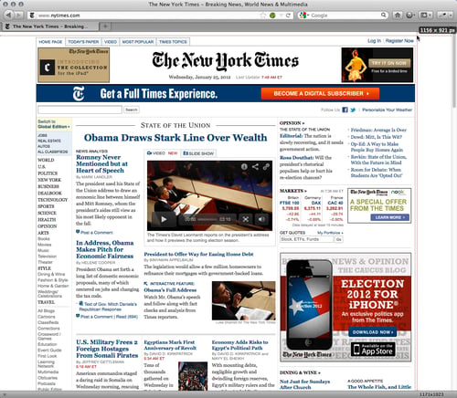
It's important to understand that viewport and screen size are not the same thing. Viewport relates to the content area within the browser window, excluding the toolbars, tabs, and so on. More succinctly, it relates to the area where a website actually displays. Screen size refers to the physical display area of a device. Beware that some browser resizer tools display the size, including browser elements such as the URL bar, tabs, and search boxes, and others don't. In the following screenshot, the actual viewport size is shown at the top-right position (1156 x 921 px) whilst the Firesizer plugin shows the window size at the bottom-right position (1171 x 1023).
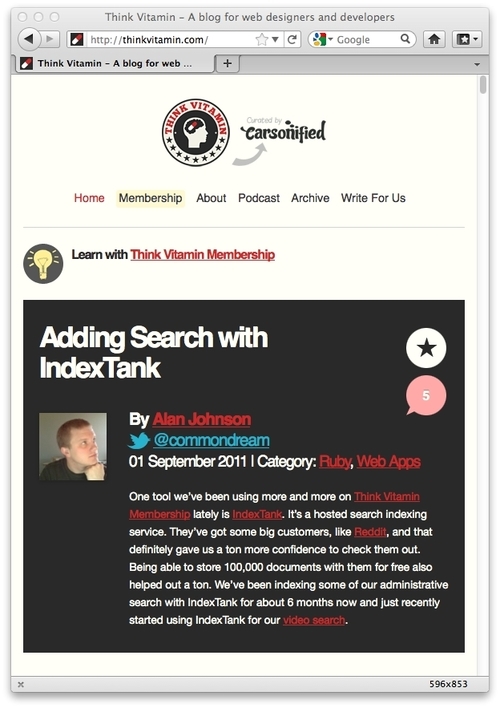
Now, we're armed with everything we need to start appreciating the best that the responsive web has to offer. Fire up your browser of choice, engage your screen size tool, and take a look at http://thinkvitamin.com/.
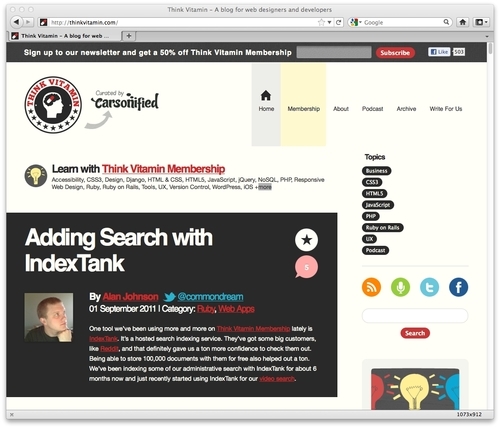
If you are viewing the page with a viewport larger than 1060 pixel wide, you will see a layout similar to the one shown in the following screenshot:
If however, you're viewing the site with a viewport larger than 930 pixels but lower than 1060 pixels, you will see a layout, as shown in the following screenshot:
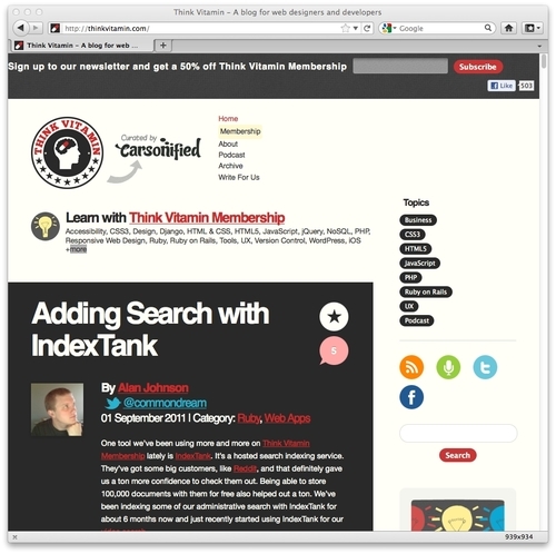
Notice how the main navigation to the side of the logo has changed? The icons to the right of the main content have been arranged to sit one under another. Everything is perfectly usable, and most importantly, isn't disappearing off the screen. Now, take a look with a viewport less than 880 pixels, in the following screenshot:
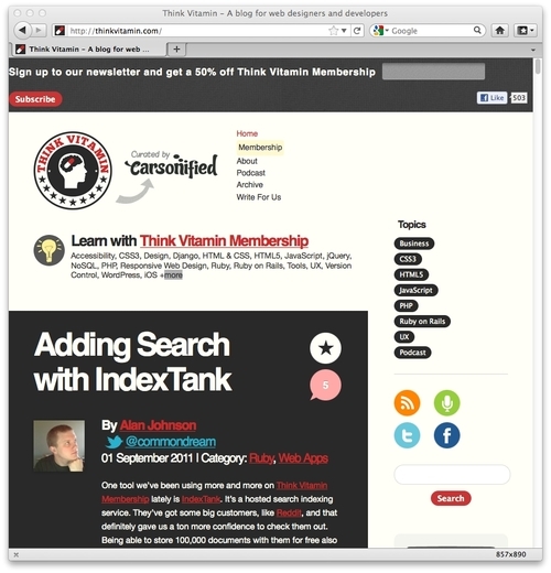
The header remains similar but notice that the right-hand sidebar is thinner still; the icons are now 2 by 2 whilst the text blocks have adjusted and the text is flowing accordingly within the block.
However, reduce your viewport to less than 600 pixel in width and you will notice a major change, as shown in the following screenshot:
How about that? The entire sidebar has responded to our new viewport, letting the most important part of the site, the content, enjoy the full width of the browser window. Notice also how the header links are now horizontal, as opposed to being at the side of the logo, and the logo itself has resized? All these changes help to create a better experience for the user based upon the viewport dimensions.
Let's look at another example, http://2011.dconstruct.org/. With a wide viewport (say, more than 1350 pixels) the site looks like the one shown in the following screenshot:

Notice particularly the grid of nine images. As you decrease the width of the viewport (to less than around 960 pixels), notice what happens? The grid of three rows of three images becomes three rows of two images and one row of three at the bottom, as shown in the following screenshot:

Decreasing the width of our viewport smaller still, at less than around 720 pixels we encounter another design "break point"; the header links switch to include images that provide a better target area for touchscreen navigation:

Smaller still, once we reduce the viewport to less than 480 pixels wide, the image grid changes again, now showing a row of two images, then three, and then four. These images continue to resize as the viewport is shrunk to around 300 pixels. To illustrate, the following screenshot shows how it looks on an iPhone:

One web destination that is useful for inspiration is http://mediaqueri.es. However, not all websites displayed there necessarily embrace the full responsive methodology of displaying content around small viewports first, and progressively enhancing for larger viewports. Regardless, at this early point, whilst considering the possibilities of what we can do with responsive web design, there are many great examples to draw ideas from. Although viewing these websites and resizing the viewport illustrates what a responsive web design can do, it doesn't demonstrate what's good about HTML5. The benefits of HTML5 occur "behind the scenes" as it were, so let's now turn our attention there and find out what's so great about HTML5.