Book Image

Responsive Web Design with HTML5 and CSS3

By : Ben Frain
Book Image

Responsive Web Design with HTML5 and CSS3

By: Ben Frain

Overview of this book

Tablets, smart phones and even televisions are being used increasingly to view the web. There's never been a greater range of screen sizes and associated user experiences to consider. Web pages built to be responsive provide the best possible version of their content to match the viewing devices of not just today's devices but tomorrow's too.Learn how to design websites according to the new "responsive design"ù methodology, allowing a website to display beautifully on every screen size. Follow along, building and enhancing a responsive web design with HTML5 and CSS3. The book provides a practical understanding of these new technologies and techniques that are set to be the future of front-end web development. Starting with a static Photoshop composite, create a website with HTML5 and CSS3 which is flexible depending on the viewer's screen size.With HTML5, pages are leaner and more semantic. A fluid grid design and CSS3 media queries means designs can flex and adapt for any screen size. Beautiful backgrounds, box-shadows and animations will be added ñ all using the power, simplicity and flexibility of CSS3.Responsive web design with HTML5 and CSS3 provides the necessary knowledge to ensure your projects won't just be built "right" for today but also the future.
Table of Contents (16 chapters)
Responsive Web Design with HTML5 and CSS3
Credits
About the Author
About the Reviewers
www.PacktPub.com
Preface
Index

Changing navigation links to a drop menu (conditionally)


A common issue with responsive designs is that if you have lots of navigation links on a page they can take up a sizeable portion of your screen real estate in smaller viewports.

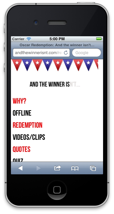
For example, with only six page links, this is how any page currently loads for the And the winner isn't… website on a smaller viewport:
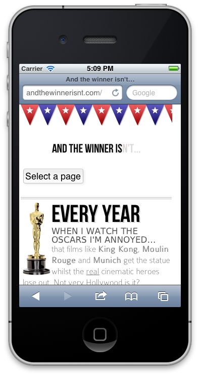
I'd like to swap those links out for a drop menu but only if a browser is below a certain viewport width. Now, you can roll your own piece of JavaScript to convert the menu items to a drop menu. The venerable Chris Coyier has documented how this can be achieved (http://css-tricks.com/convert-menu-to-dropdown/). Alternatively, there are a few pre-written scripts that do this for you. For brevity and ease, I have opted to use one such script. The following screenshot shows what the drop menu does to our navigation links on smaller viewports:
Clicking on the Select a page button brings up the navigation, as shown in the following...