

A common use case for Visualforce charting is producing a number of custom charts arranged into rows and columns, much like a standard dashboard. Simply adding chart components to HTML table cells results in all the charts being displayed in the top-left cell of the table, as shown in the following screenshot:
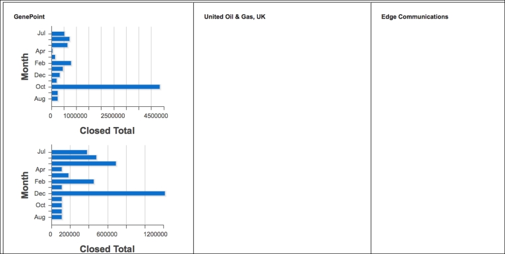
The solution to this is to use the chart
renderTo attribute to specify the DOM component that the chart should be rendered inside.
In this recipe we will create a Visualforce page that displays a table of bar charts. Each bar chart displays the total won opportunity value per month for the last year for a specific account.
This recipe makes use of a custom controller, so this will need to be present before the Visualforce page can be created.