Book Image

UX Design for Mobile

By : Pablo Perea, Pau Giner
3 (1)
Book Image

UX Design for Mobile

3 (1)
By: Pablo Perea, Pau Giner

Overview of this book

User experience (UX) design provides techniques to analyze the real needs of your users and respond to them with products that are delightful to use. This requires you to think differently compared to traditional development processes, but also to act differently. In this book, you will be introduced to a pragmatic approach to exploring and creating mobile app solutions, reducing risks and saving time during their construction. This book will show you a working process to quickly iterate product ideas with low and high fidelity prototypes, based on professional tools from different software brands. You will be able to quickly test your ideas early in the process with the most adequate prototyping approach. You will understand the pros and cons of each approach, when you should use each of them, and what you can learn in each step of the testing process. You will also explore basic testing approaches and some more advanced techniques to connect and learn from your users. Each chapter will focus on one of the general steps needed to design a successful product according to the organization goals and the user needs. To achieve this, the book will provide detailed hands-on pragmatic techniques to design innovative and easy to use products. You will learn how to test your ideas in the early steps of the design process, picking up the best ideas that truly work with your users, rethinking those that need further refinement, and discarding those that don’t work properly in tests made with real users. By the end of the book, you will learn how to start exploring and testing your design ideas, regardless the size of the design budget.
Table of Contents (11 chapters)
10
Bibliography and References

Design principles

Many different factors contribute to the user experience. Imagine that you are using an e-book reading app. Your experience reading a novel can be ruined by different factors, for example, the use of a tiny font that is uncomfortable on your eyes, an inconvenient way to move through pages that makes you wait too long, or the app forgetting the page where you stopped reading.

Each of these issues is problematic, but each one fails to meet needs of different kinds. A well-designed product responds to user needs at different levels:

  • Needs from our human condition
  • Needs from general expectations
  • Needs from the specific context of use

We'll provide more details on each of those needs.

Needs from our human condition

As humans, we probably experience our world very differently than bats, octopuses, or the fascinating water bears (half-millimeter-long animals that can survive in outer space) do. We experience the world through our human senses; we process information in a visual, auditive, and to a lesser degree, olfactive way--we use our hands to manipulate elements and our voice to communicate.

After a process of millions of years of evolution, our human capabilities have been shaped as a key factor for survival in the physical world. However, when using digital products, our experience is heavily influenced by these same senses and the way our brain is wired to process them.

Understanding how our senses work can help us to design solutions that better fit our natural behavior as humans. For example, our peripheral vision allows us to identify movement at the edges of our vision field. Although we cannot recognize shapes or colors perfectly in that area, we can quickly notice any movement. The evolution theory suggests that this may have been useful to our primitive ancestors to quickly react to predators.

Nowadays, we use our peripheral vision to note the notifications that many apps show us as moving boxes at the top of the screen of our mobile devices. Designers of such interaction patterns took advantage of our capability to detect movement in the surroundings of our focus area. They decided that notifications should appear by moving in--as opposed to fading in--so our eyes notice them more easily.

Incoming call notification appears by moving in from the top

We have intuitive reactions to different stimuli. Even the most basic aspects--such as shape or color--bring their own implicit meaning when we process them. We describe these effects as their psychology.

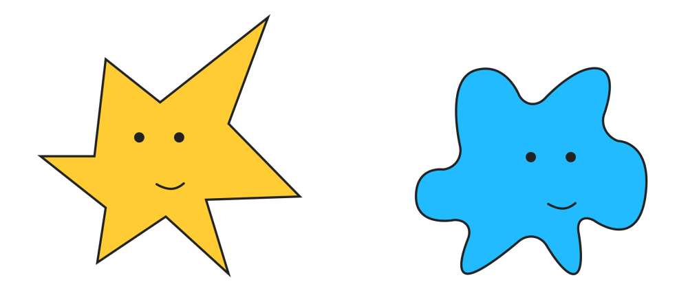
A simple experiment shows the psychology of shapes in action. When people are shown two apparently random shapes like the ones in the subsequent image and are asked to name them as either Bouba or Kiki, most people will pick the same names for the same shapes. Most people will associate the rounded shape figure with the Bouba name and the spiky figure with the Kiki name.

Given the names Bouba and Kiki, most people assign them consistently to each of these shapes

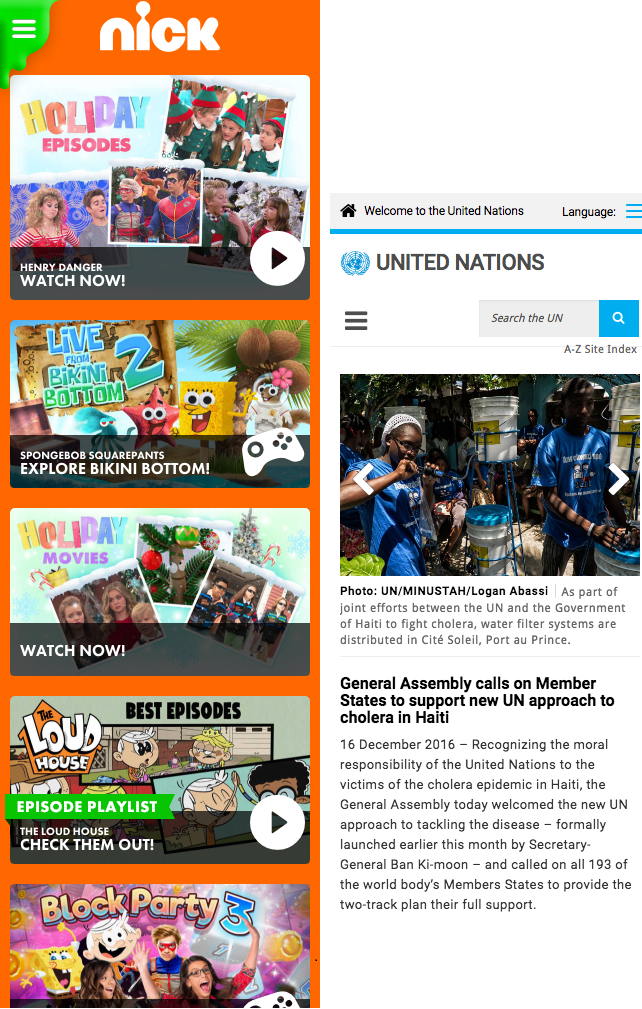
The psychology of shapes can affect many elements in the design of your app. For example, the use of straight corners or rounded corners in the interactive controls can help to provide a more serious or a more playful feel to it.

Rounded shapes are predominant in the child-oriented Nickelodeon website, whereas straight shapes are more common on the United Nations website with more serious content. (Source: Source: http://www.nick.com/, Source: http://www.un.org/)

The psychology of color is another widely researched area. Technically, color is just a representation of light at different wavelengths. However, when classifying colors, we use temperature (warm or cold colors) based on some of their associations. Marketing and branding has studied how these associations affect the sales of products and the perception of the companies selling them. While red is associated with excitement, blue is associated with relaxation.

These implicit reactions should not be the main force driving our design decisions, but we should be aware of possible contradictions that can confuse users. These confusions may occur when the meaning we try to convey contradicts the implicit meaning of those elements. For example, a red text will catch the user's attention, so it may not be the best choice for an e-book app as the main text color for reading a book comfortably.

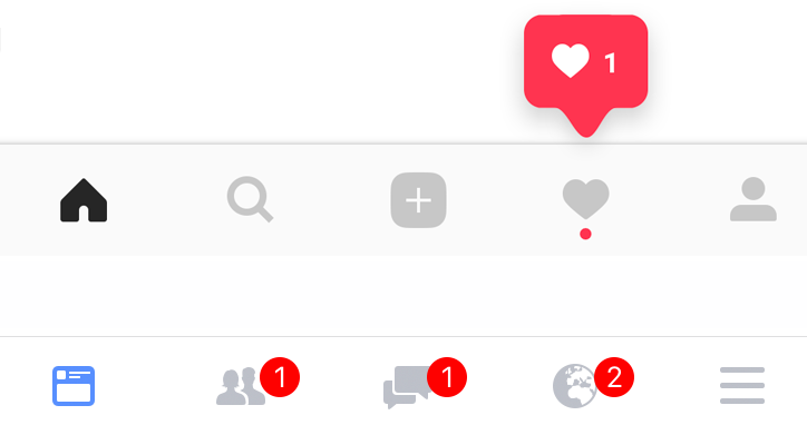
Instagram and Facebook use red for calling the user's attention to specific areas when there is any new relevant content (source: Screenshot from Instagram, source: Screenshot from Facebook)

Beyond the perception of individual elements and their properties, it is interesting to think about how we understand them together to form our experience. Gestalt (form in German) psychologists studied human perception and defined a set of properties that have been influential for many designers. They described how our brain identifies individual elements and is eager to find meaning of those elements. In particular, gestalt principles for grouping have many applications in the design of digital products.

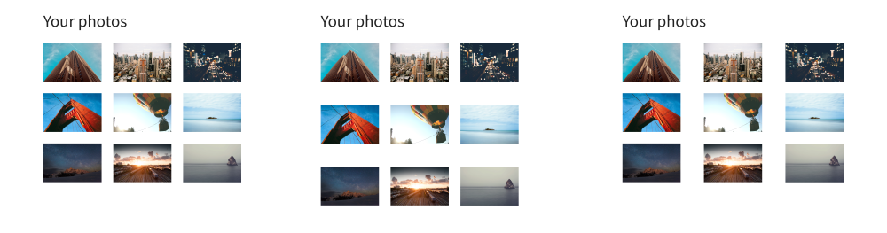
For example, the law of proximity dictates that elements that are close to each other are perceived as a group. By adjusting the space around elements, we can control how those are related to each other by our brains. Consider a photo gallery app; by adjusting the relative distance between pictures, we can make all photos look like a single group (keeping a uniform separation) or break them into rows or columns (increasing the vertical or horizontal space to guide our eyes).

We don't need to enclose elements in a box to organize them in groups

Other gestalt principles suggest that our brain also groups together elements that look similar (law of similarity), move in the same direction (law of common fate), are connected without abrupt overlaps (law of continuity), or form a simple pattern (law of good form).

One of the main underlying ideas of these and other gestalt principles is the tension between similarity and contrast. This tension can occur in different dimensions (space, proportion, time, motion, and so on) and contributes to our perception of order.

When designing a product, we want to present physically connected what is conceptually related. Adjusting these different properties in the right way allows us to guide the eyes and the brain of our users to understand such organization as intended.

The Human Computer Interaction (HCI) community has been modeling many different human behaviors. For example, Fitt's law is a predictive model for human movement. In short, it states that the time it takes to hit a target (such as tap on a button) depends on how far away the target is and its size. This means that a small button far away will be harder to access than a big button you can access nearby.

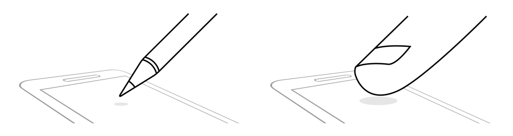
The size of the targets, such as buttons and other controls, have evolved in mobile design thorough history, affecting their ease of use. The first mobile devices adopted the stylus as a pointing device and required users to be precise when choosing their targets. The iPhone challenged the idea that a smaller screen required smaller targets. Increasing the size of the targets made it comfortable to use with fingers, resulting in more intuitive interactions.

Different touch pointers need different sized targets

Our bodies and brains are the platform we ultimately run our products on. There are many disciplines and much research that provides us with valuable information about this platform. You don't need to be an expert in psychology, medicine, or biology to design great products, but understanding how humans work at their basic level will help you to design better for them. Being curious about human nature and observing people's most intuitive and visceral reactions can help you to identify relevant behavior that, being a core part of our nature may otherwise go unnoticed.

Needs from general expectations

Even if our body and brain are capable of doing many activities, it does not mean all of them are convenient, comfortable, or pleasing for us. Regardless of the specific type of product, users have general expectations when using them. Failing to meet those expectations when designing our products will negatively affect the resulting user experience. Users will be confused to see a product not behaving as they expected, which is breaking the principle of least astonishment.

Each interaction the user performs with a product requires some mental effort. This mental effort is often referred as the cognitive load. For example, a navigation app can ask your destination during your vacation trip in different ways. It would be easier for you to indicate the destination by the name of the place (Eiffel Tower) rather than the specific address (Champ de Mars, 5 Avenue Anatole France, Paris) or using the exact coordinates (48° 51' 29.6" N, 2° 17' 40.2" E). The cognitive load could be reduced further if the app were capable of ignoring potential typos, allowed voice input to just say the destination, or could suggest the destination in the first place, anticipating your needs.

A well-designed product should demand as little effort from the user as possible, reducing the points of friction where the user has to stop and think, reorient, or gets confused. Reducing friction often requires moving most of the complexities--such as translating the name of a place into coordinates--from the user into the computer.

The effort to use a product can be divided in two stages--understanding how the product works and operating it. Design considerations are key in both stages.

Explaining how a product works should be the job of the product itself. Designing a product that is obvious to use is essential since no one is going to read the instructions.

Donald Norman described the elements that communicate the possible actions of an object as affordances. Door handles are a classic example of affordances. They are placed at the hand reach and shaped to be manipulated by our hands. They are the way for the door to tell us how to open it. When affordances are applied wrong, they result in confusions about the possible actions. As a result, people find themselves pushing a door that should be pulled instead--those cases of badly designed doors are known as Norman Doors, named after the well-known designer.

A post-it note was added as an attempt to clarify how to operate the door (source: https://www.flickr.com/photos/chrisandhilleary/153059898/)

Affordances can use different properties to suggest their intended use such as shape, position, color, or movement. That helps users to interpret their meaning, but their meaning is also reinforced by previous experiences. The direct or indirect associations with previous uses of similar cases helps with the learning of new ones. Products do not exist in isolation, and the use of existing products will influence our expectations of new ones.

The digital world also has its own conventions that millions of previous products have help to establish. For example, many users will identify an "X" icon to represent an action to close or discard.

LinkedIn, TripAdvisor, and Google using an "X" icon as a way to discard (source: Screenshot from LinkedIn, source: Screenshot from TripAdvisor, source: Screenshot from Google)

Metaphors can help users connect the dots between a known concept and an old one. The digital concepts of desktop, folder, or windows rely on some of the aspects of their physical counterparts. A shopping app can use a shopping cart icon to signal the place where your selected products are.

However, we need to be careful and avoid mimicking the original concepts. It won't make much sense to use a 3D recreation of the shopping cart where you need to make the space to place each product in the cart as you would in a real supermarket. Avoid transferring the limitations of the physical world into the digital one. The digital space is better suited for many actions such as finding the products you bought last week. You don't want to follow a metaphor so literally that it limits the possible solutions.

Design guidelines capture important conventions to consider when you design for a specific platform, organization, or family of products. In this way, your solutions can reuse concepts that are familiar to users in the exact way they are used to interacting.

Breaking conventions may be needed at times, but it should be done only for a really good reason. We need to make sure that the benefit provided to our users is much greater than the potentially negative effects of possible confusions.

Social and cultural conventions also have their influence on what people expect from products. A hand gesture that means approval in one culture can be an offensive gesture in another, when found as an icon. Similarly, languages bring their own conventions. Concepts associated with directionality will be represented differently depending on the language direction. For example, a forward, next, or reproduce action in English--a left-to-right language--can be represented with a triangle or arrow pointing to the right, whereas it needs to point to the left for languages, such as Arabic, which are written in the opposite direction to keep its forward action.

In addition to understanding how products work, we want them to require minimal effort when they are used. The following principles contribute to a positive user experience for all kinds of products:

  • Require minimal intervention: The fewer steps we need to solve a problem, the better. Our designs should avoid unnecessary steps for people when using our product. This can be supported by the following different strategies:
    • Allowing flexible input: Information can be provided in many different ways. Some people use spaces, parenthesis, or dashes to group telephone numbers or monetary amounts in a transaction, others do not. Instead of imposing a specific format to meet the needs of the technology, allow your users to provide the information in all the ways that are most natural to them.
    • Providing smart defaults: When asking users for information, we should avoid open questions, and provide options instead. Recognition is a much simpler mental process than recall from memory. Thus, anticipating possible answers will save time for the user. If any of those options is likely to be what the user needs, setting it as the default would save time in most cases. For example, navigation apps can assume that your current position is your starting point. That is not always the case, and you may need to change those defaults, but overall it will avoid an additional step to go through most of the time.
    • Support direct manipulation: For a long time, the mouse was one of the most common input devices. Users moved the mouse on their desk to move the cursor on their screens in order to act on a digital object. The arrival of touch screens allowed users to tap the element directly, reducing indirection steps. Indirection steps require users to make mental efforts to go through them. For example, it is simpler to use a hand gesture to zoom a picture than accessing a separate zoom menu that is disconnected from the picture it affects.
iOS Maps assumes that you are interested in knowing your current location (left) and provides suggestions as you look for destinations (right) (source: screenshots from iOS Maps)
  • Inform users in relevant terms: Users want to know what is happening when using a product, but this feedback needs to be meaningful. Some aspects to consider:
    • Make users feel in control: Regardless of the level of automation a product can provide, users want to feel in control. A user trying to send a message to a friend will be more comfortable when they are sure that the message is sent and has reached the destination. This confirmation can happen in many different ways, from a simple visual cue to a more explicit feedback text. Choosing the right level of prominence for feedback according to each case will allow users to feel in control without the system being perceived as annoying.
    • Explain by comparing: Information is better understood when compared. During a car trip, knowing the distance to the destination can be useful. This distance is useful in your favorite distance unit--miles or kilometers--but it is even more useful when presented compared with the car speed as the time to reach your destination. Given a piece of information, it is important to identify the purpose it serves for our users in order to decide which is the most meaningful representation for it.
    • Communicate in the user's terms: The closest we represent concepts to the way users understand them--what is referred to as the user mental model, the more fluent their interaction will be. We should avoid messages that refer to internal aspects of the system or using technical jargon. A user looking for a taxi will be confused to hear that no records were found. It is easier to understand instead that no taxis are available in the nearby area.
  • Don't waste the user's time: Time is a precious resource. When helping users to solve their problems, they will always appreciate solutions that require them to use as little time as possible. These are some relevant concepts to be considered:
    • Keep tools at hand: Providing the tools people need where they need them helps the user to avoid spending time looking for them elsewhere. After you call a telephone number that is not in your contacts, it is convenient to have an option to save it as a new contact. Identifying the next logical step and looking for ways to facilitate it will help you come up with these convenient shortcuts. Separating actions (the operations you commonly use to manipulate information) from configuration (the preferences you have and rarely change) also helps users to have the most needed options at hand.
    • Performance: Nobody likes waiting. We should aim for our products to respond to user interactions as fast as possible. Anticipating the user next steps, caching, and other technical optimizations can help you to keep the user interactions under a reasonable response time. Regardless of the real time it takes to complete an action, even more important is how long the wait is perceived by the user. The perceived performance can be improved in many ways. Using placeholders similar to the content that will be loaded or communicating long waits with an adequate loading indicator will help the wait to feel shorter than what it actually is.
    • Reduce interruptions: Asking the user to stop what they are doing will force them to switch context and break their flow of actions. Modal dialog and alerts can become annoying. We should aim to communicate relevant circumstances, such as the username proposed not being available or the internet connection being lost in a non-blocking way. Make your users aware of the information, but let them to decide when to act about it. Similarly, when waiting for some information, keeping the blocked elements to a minimum will help to reduce interruptions. For example, on a map application, it is convenient to make it still possible to manipulate the map--moving or zooming it--while the map tiles are being loaded with images.
iOS Maps allows the map to be manipulated while loading the additional details (left) or even the map tiles (right) (source: screenshots from iOS Maps)
  • Avoid mistakes: People feel bad when they make mistakes. Your products should not harm the user or make them feel stupid. These are some possible approaches:
    • Make it impossible to use it incorrectly: Ideally, a product should be designed in such a way that it is impossible to use it improperly. For example, using the appropriate controls, you can communicate that the range of dates for your hotel reservation can only include future dates. Preventing accidental side-effects and confusing errors contributes to creating an environment of safe exploration, where users are welcome to move around and find their way without the fear of messing things up.
    • Avoid dead-ends: Users should always have a way forward to achieve their goals. We should avoid putting them in situations where there is no apparent way to move forward. For example, if there are no results for a user search, some alternatives can be suggested based on similar results--similarly spelled results--or you can provide alternative ways to find content--such as browsing by categories.
    • Alleviate the unavoidable: In cases where mistakes are unavoidable, our product can consider ways to correct or alleviate those issues. For example, a network failure can be fixed by retrying the operation automatically without bothering the user. If the connection remains unavailable for a longer time, informing about the issue and keeping the pending changes locally to be saved later would help. In any case, never blame the user. Avoid messages that can be understood as an error being the fault of the user, since users only do what the system lets them do.

There are many general design and usability heuristics and pattern libraries and guidelines. These provide recommendations on important aspects to consider when designing positive interactions for all kinds of products. Following them will help your products to be more usable. However, these are not enough to guarantee that your solution will satisfy all the needs of your users.

Needs from the specific context of use

In addition to our needs as humans, and our general expectations as users, there is another set of needs that are specific to the context of use. These are defined by the purpose and goals of people using a product.

The video editing needs of a casual consumer documenting their last vacation trip are very different from those a professional filmmaker may have for a film. Therefore, a video editing app will be very different depending on which of these audiences we design the app for.

Conversely to the previous sets of needs, you can only learn about context-specific needs on a case-by-case basis. The users you will be designing for will be very different from yourself. There is no specific advice that applies to all kinds of products. Nevertheless, the design process will help you with the mindset and provide a set of activities to guide you to learn more about your users, identify their needs, and solve their problems.

In order to solve a user need, first you have to recognize what a need is. This may sound simple, but the distinction between a need and a solution is not always obvious.

Imagine that you live in a town next to a river. The town mayor calls and tells you: "We need a bridge. Can you design one for us?". At that point, you may be tempted to start thinking on how to design the perfect bridge. However, a bridge is not a need, the real need is to cross the river.

A bridge is just one of the many possible ways in which the underlying need of crossing to the other side of the river can be addressed. Other possible ways to cross the river are creating a ferry service, a cable car, or a zip-line. Failing to identify the underlying need limits the possible solutions you may consider.

Limiting the range of possible solutions too narrowly can lead you to suboptimal solutions, ignoring interesting ideas and limiting your capabilities to innovate. Asking "why?" is a good way to identify the underlying needs.

Asking why allows you to make the problem scope wider--maybe the town inhabitants don't need to cross the river if they have a food delivery service or if the course of the river can be diverted. The different constraints, priorities, and conflicts will limit the scope of the problem and will inform the selection of possible design solutions.

Design rarely happens in an environment with unlimited resources. There are many constraints we need to take into account instead. These constraints may come from different areas such as budget, law regulations, social conventions, and more. It is part of the designer's job to understand and consider those when looking for solutions.

In a constrained environment, not all needs have the same priority. It is important to consider how they impact the user since we'll have to support them at different levels. The model described by Noriaki Kano defines different patterns of user satisfaction:

  • Must-haves: This indicates the basic needs users expect to be supported by a product. Failing to properly support these generates frustration for users. However, there is a certain point where improving the support will have diminishing returns. For example, users of a navigation app will expect to have some zoom capabilities. Providing no zoom at all would be frustrating for users to pick their destination; however, they don't need the app to compete with a NASA telescope in zoom capabilities and additional levels of detail won't improve the user experience significantly.
  • Linear needs: This indicates the needs that add more value as they are better supported. In our navigation example, the time it takes to find a route will impact the user experience. There will be a point where the time is considered too long to be usable, and another point where it will be considered fast enough, but the faster it finds the best route, the more value it will bring to the user.
  • Latent needs: These are needs that users do not realize they have. For products that don't support them, users won't miss them. Therefore, they don't get frustrated by their absence. However, as soon as a product solves those needs, they will greatly benefit from the new possibilities. A navigation app that suggests good places to eat when lunch time approaches can be helpful for many users, but it may not be something they ask for if it is not common in other apps. Latent needs are hard to discover since users cannot easily articulate them. Research techniques will help you to identify behavior patterns that can signal these needs.
  • Indifferent aspects: Some aspects from a product may not be serving any particular user need. You would want to identify and remove those.
Kano model classifies the needs based on their impact in user satisfaction as they are better supported

When designing a product, it is common to find conflicting needs. Users of a camera app may need it to be quick to shoot with. However, they may also need a high degree of control to adjust many different parameters. Design is about finding optimal balances between conflicting interests. Some useful considerations when dealing with conflicting needs:

  • Adjust the prominence level based on frequency and impact: When satisfying multiple needs, the designer acts as an orchestra conductor. Supporting in a more prominent way--bigger, in an easier to find location, with a contrasting color, and so on; these needs occur more frequently or have a bigger impact on the user. Functionality, such as the shutter button of a camera, which is often used, should be more prominent than controls that are used infrequently or have a much lower impact.
  • Identify what to optimize and what to just allow: When you cannot satisfy multiple needs to the fullest extent, you need to identify the ones you want to optimize your product for. Consider how to fully support the essential needs while still providing basic support for the secondary ones. It is often better to prioritize support for the critical needs at the expense of other less critical needs rather than providing mediocre support for all of them.
  • Keep things simple: Between two solutions that solve a given problem well, you should prefer the simple one. Simple solutions are easier to understand and operate. Don't be afraid to drop some capabilities in favor of supporting the main needs better.

Solving design problems requires a deep understanding of the context of use. Every problem is different. Fortunately, the design process can be applied to different contexts.

The process we present in this book will guide you through the steps to identify different user needs, find solutions for them, and verify that your ideas work in practice. The great Italian designer Massimo Vignelli (more about his perspective on design can be found in his freely available Canon at http://www.vignelli.com/canon.pdf ) said, "If you can design one thing, you can design everything."