
Owner-draw controls are powerful. They allow you to completely adapt your GUI to the needs of your users and potentially enable your application to display data in a more familiar way. In the end, owner-draw controls improve the user's experience with the application. However, owner-draw controls do not always fit in well with the VCL custom styles. Why? Because if you try to draw something by yourself, you could be tempted to use a fixed color, such clRed or clYellow, or you could be tempted to use the operating system color, such as clBtnFace or clWindow. In doing so, your owner-draw controls will not be style aware and will be drawn in the same way regardless of the current VCL style. In this recipe, you'll learn how to make custom graphics that remain relevant to the selected VCL style.
Making an owner-draw control aware of the VCL styles
Getting ready
Let's say you are in charge of developing a control panel for a hotel's lighting system. You have a list of lamps to power on and you, using some hardware, have to power on some lamps by clicking on a button. Customers tell you that buttons should show some additional information about the lamp, for example:
- Served zone (corridor, hall, room number, and so on)
- State (on/off, using some fancy graphics)
- The time the lamp was powered on
- The time when electrical problems were detected, and a red icon to indicate that the lamp is off even when a current supplies the line, so the circuit is interrupted somewhere
- Other custom information not currently known, such as small graphs showing lamp state history during the last 24 hours
The question is how to implement this kind of UI. One of the possible ways is to use TDrawGrid and draw all the required details in each cell, using the cell as a button. Using TDrawGrid, you get a grid of buttons for free. You have also the greatest flexibility in terms of the information displayed because you are using the TCanvas method to custom draw each cell. This is quite a popular solution for this kind of non-standard UI.
However, when you deploy this application, the customers ask about the possibility of changing the style of the application to fit the needs of the current user. So you think about VCL styles, and you are right. However, the graphics drawn into the cells don't follow the currently selected VCL style, and your beautiful application becomes a bad mix of colors. In other words, when users change the selected VCL style, all the controls reflect the new style, but the owner-drawn grid, which is unaware to the selected style, doesn't look as nice as the rest of the UI. How do you solve this problem? How do you draw custom graphics adhering to the selected VCL style? In this recipe, you'll learn how to do it using the lamp control grid example.
How it works...
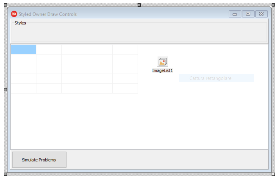
At design time, the form looks like the one shown in the following screenshot:
When the form is created, the list of available styles is loaded in the Radio group using code similar to the following:
  RadioGroup1.Items.Clear;
  RadioGroup1.Columns := Length(TStyleManager.StyleNames);
  for LStyleName in TStyleManager.StyleNames do
    RadioGroup1.Items.Add(LStyleName);
  RadioGroup1.ItemIndex := 0;
  TStyleManager.SetStyle('Windows');
Then, a list of TLampInfo objects is created and initialized using the information contained in the Zones array. After that, the draw grid is initialized according to the LAMPS_FOR_EACH_ROW constant. Here's the relevant code:
  FLamps := TObjectList<TLampInfo>.Create(True);
  for I := 1 to LAMPS_FOR_EACH_ROW * 4 do
  begin
    FLamps.Add(TLampInfo.Create(Zones[I]));
  end;

  DrawGrid1.DefaultColWidth := 128;
  DrawGrid1.DefaultRowHeight := 64;
  DrawGrid1.ColCount := LAMPS_FOR_EACH_ROW;
  DrawGrid1.RowCount := FLamps.Count div LAMPS_FOR_EACH_ROW;
The FormCreate event handler initializes the styles list and the list of lamps (the model) on the form. Now, we'll see how the other event handlers will use them.
The TDrawGrid OnSelectCell event, as the name suggests, is used to address the current lamp from FLamps and to toggle its state. That's it. If the lamp is on, then the lamp will be powered down, otherwise the lamp will be powered on. After that, the code forces the grid to redraw using the Invalidate method:
procedure TMainForm.DrawGrid1SelectCell(Sender: TObject; ACol,
   ARow: Integer; var CanSelect: Boolean);
begin
  FLamps[ACol + ARow * LAMPS_FOR_EACH_ROW].ToggleState;
  DrawGrid1.Invalidate;
end;
Now, really interesting things happened in the DrawThemed method called inside the TDrawGridOnDrawCell event. This method receives information about the coordinates of the cell to draw, and then it draws a button on the canvas using the information contained in the corresponding TLampInfo instance. The code is quite long, but an interesting concept is that no specific colors are used. When it is necessary to draw something, the code asks StyleService to get the correct color according to the current style. This approach is also used for font color and for system colors. Here's a handy table that summarizes these concepts:
|
Method name |
Description |
|
StyleServices.GetStyleColor(Color: TStyleColor) |
Returns the color defined in the style for the element specified by Color |
|
StyleServices.StyleFontColor(Font: TStyleFont) |
Returns the font color for the element specified by Font |
|
StyleServices.GetSystemColor(Color: TColor) |
Returns the system color defined in the current style |
So, when we have to highlight the (pseudo) button if there are electrical problems on the power line, we use the following code:
if LLamp.ThereAreElectricalProblems then
   LCanvas.Brush.Color := StyleServices.GetStyleColor(scButtonHot)
else
   LCanvas.Brush.Color := StyleServices.GetStyleColor(scWindow);
LCanvas.FillRect(LRect);
When we've got to draw normal text, we use the following code:
LCanvas.Font.Color :=
   StyleServices.GetStyleFontColor(sfButtonTextNormal);
LCanvas.TextRect(LRect, LValue, [TTextFormats.tfCenter, TTextFormats.tfVerticalCenter]);
It is clear that the paradigm is this:
- Get the current color for the selected element of the UI according to the style
- Draw the graphics using that color
Clicking on the Simulate Problems button, it is possible to see how the graphics are drawn in the case of problems on the power line. The images are drawn directly from the image list using the following code:
procedure TMainForm.DrawImageOnCanvas(ACanvas: TCanvas;
   var ARect: TRect; ImageIndex: Integer);
begin
  ImageList1.Draw(ACanvas, ARect.Left + 4,
     ARect.Top + ((ARect.Bottom - ARect.Top) div 2) - 16,
     ImageIndex);
end;
Using this approach, the application created in this recipe, which has a lot of custom graphics, behaves very well even for VCL styles. Here are some screenshots:
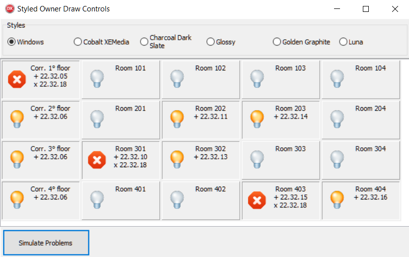
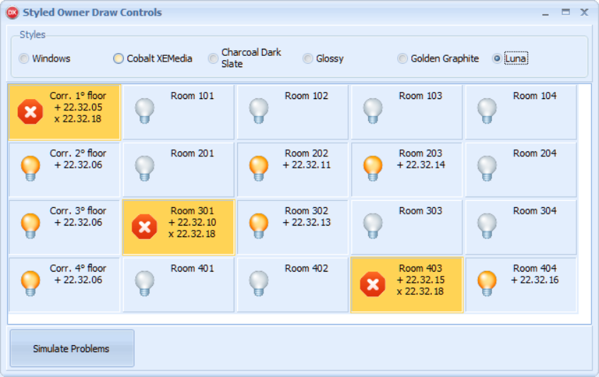
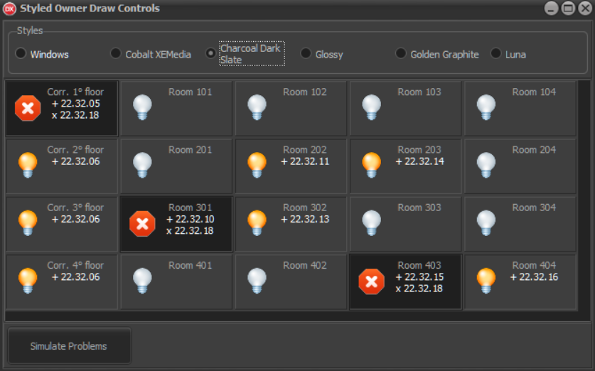
As you can see, the application correctly draws the owner-draw parts of the UI using the right colors from the selected style.
There's more...
The VCL style infrastructure is very powerful. In the case of TWinControl descendants, you can even define specific hooks for your components using TStyleHook. TStyleHook is a class that handles messages for controls acting as a wrapper for the hooked control. If you have a custom control that you want to be style enabled, inherit from TStyleHook and provide custom processing for that control. For examples, see TEditStyleHook and TComboBoxStyleHook. You need to register the style hook class with the style engine using the RegisterStyleHook method, as shown in the following code:
TCustomStyleEngine.RegisterStyleHook(TCustomEdit, TEditStyleHook);
Moreover, the StyleServices function returns an instance of TCustomStyleServices, which provides a lot of customization methods related to VCL styles. Check out the related documentation at http://docwiki.embarcadero.com/Libraries/en/Vcl.Themes.TCustomStyleServices_Methods to see all the possibilities.