Book Image

Tkinter GUI Application Development Blueprints - Second Edition

By : Bhaskar Chaudhary
Book Image

Tkinter GUI Application Development Blueprints - Second Edition

By: Bhaskar Chaudhary

Overview of this book

Tkinter is the built-in GUI package that comes with standard Python distributions. It is a cross-platform package, which means you build once and deploy everywhere. It is simple to use and intuitive in nature, making it suitable for programmers and non-programmers alike. This book will help you master the art of GUI programming. It delivers the bigger picture of GUI programming by building real-world, productive, and fun applications such as a text editor, drum machine, game of chess, audio player, drawing application, piano tutor, chat application, screen saver, port scanner, and much more. In every project, you will build on the skills acquired in the previous project and gain more expertise. You will learn to write multithreaded programs, network programs, database-driven programs, asyncio based programming and more. You will also get to know the modern best practices involved in writing GUI apps. With its rich source of sample code, you can build upon the knowledge gained with this book and use it in your own projects in the discipline of your choice.
Table of Contents (12 chapters)

The Tkinter geometry manager

You may recall that we used the pack() method to add widgets to the dummy application that we developed in the previous section. The pack() method is an example of geometry management in Tkinter.

The pack() method is not the only way of managing the geometry in your interface. In fact, there are three geometry managers in Tkinter that let you specify the position of widgets inside a top-level or parent window.

The three geometry managers are as follows:

  • pack: This is the one that we have used so far. It is simple to use for simpler layouts, but it may get very complex for slightly complex layouts.
  • grid: This is the most commonly used geometry manager, and provides a table-like layout of management features for easy layout management.
  • place: This is the least popular, but it provides the best control for the absolute positioning of widgets.

Now, let's have a look at some examples of all the three geometry managers in action.

The pack geometry manager

The pack manager can be a bit tricky to explain in words, and it can best be understood by playing with the code base. Fredrik Lundh, the author of Tkinter, asks us to imagine the root as an elastic sheet with a small opening at the center. The pack geometry manager makes a hole in the elastic sheet that is just large enough to hold the widget. The widget is placed along a given inner edge of the gap (the default is the top edge). It then repeats the process till all the widgets are accommodated.

Finally, when all the widgets have been packed in the elastic sheet, the geometry manager calculates the bounding box for all the widgets. It then makes the parent widget large enough to hold all the child widgets.

When packing child widgets, the pack manager distinguishes between the following three kinds of space:

  • Unclaimed space
  • Claimed but unused space
  • Claimed and used space

The most commonly used options in pack include the following:

  • side: LEFT, TOP, RIGHT, and BOTTOM (these decide the alignment of the widget)
  • fill: X, Y, BOTH, and NONE (these decide whether the widget can grow in size)
  • expand: Boolean values such as tkinter.YES/tkinter.NO, 1 / 0, and True/False
  • anchor: NW, N, NE, E, SE, S, SW, W, and CENTER (corresponding to the cardinal directions)
  • Internal padding ( ipadx and ipady ) for the padding inside widgets and external padding ( padx and pady ), which all default to a value of zero

Let's take a look at demo code that illustrates some of the pack features.

Two of the most commonly used pack options are fill and expand:

The following code (1.04.py) generates a GUI like the one shown in the preceding screenshot:

import tkinter as tk
root = tk.Tk()
frame = tk.Frame(root)
# demo of side and fill options
tk.Label(frame, text="Pack Demo of side and fill").pack()
tk.Button(frame, text="A").pack(side=tk.LEFT, fill=tk.Y)
tk.Button(frame, text="B").pack(side=tk.TOP, fill=tk.X)
tk.Button(frame, text="C").pack(side=tk.RIGHT, fill=tk.NONE)
tk.Button(frame, text="D").pack(side=tk.TOP, fill=tk.BOTH)
frame.pack()
# note the top frame does not expand or fill in X or Y directions
# demo of expand options - best understood by expanding the root
#vwidget and seeing the effect on all the three buttons below.
tk.Label (root, text="Pack Demo of expand").pack()
tk.Button(root, text="I do not expand").pack()
tk.Button(root, text="I do not fill x but I expand").pack(expand = 1)
tk.Button(root, text="I fill x and expand").pack(fill=tk.X, expand=1)
root.mainloop()

The following is a description of the preceding code:

  • When you insert the A button in the root frame, it captures the leftmost area of the frame, expands, and fills the Y dimension. Because the fill option is specified as fill=tk.Y, it claims all the area that it wants and fills the Y dimension of its container frame.
  • Because frame is itself packed with a plain pack() method with no mention of a pack option, it takes the minimum space required to accommodate all of its child widgets.
  • If you increase the size of the root window by pulling it down or sideways, you will see that all the buttons within the frame do not fill or expand with the root window.
  • The positioning of the B, C, and D buttons occurs on the basis of the side and fill options specified for each of them.
  • The next three buttons (after B, C, and D) demonstrate the use of the expand option. A value of expand=1 means that the button moves its place on resizing the window. Buttons with no explicit expand options stay in their place and do not respond to changes in the size of their parent container (the root window, in this case).
  • The best way to study this piece of code would be to resize the root window to see the effect that it has on various buttons.
  • The anchor attribute (not used in the preceding code) provides a means to position a widget relative to a reference point. If the anchor attribute is not specified, the pack manager places the widget at the center of the available space or the packing box. The other options that are allowed include the four cardinal directions (N, S, E, and W) and a combination of any two directions. Therefore, valid values for the anchor attribute are CENTER (the default value), N, S, E, W, NW, NE, SW, and SE.
The values for most Tkinter geometry manager attributes can either be specified in capital letters without quotes (such as side=tk.TOP and anchor=tk.SE) or in small letters within quotes (such as side='top'and anchor='se').

We will use the pack geometry manager in some of our projects. Therefore, it will be worthwhile to get acquainted with pack and its options.

The pack manager is ideally suited for the following two kinds of situation:

  • Placing widgets in a top-down manner
  • Placing widgets side by side


1.05.py shows an example of both of these scenarios:

parent = tk.Frame(root)
# placing widgets top-down
tk.Button(parent, text='ALL IS WELL').pack(fill=tk.X)
tk.Button(parent, text='BACK TO BASICS').pack(fill=tk.X)
tk.Button(parent, text='CATCH ME IF U CAN').pack(fill=tk.X)
# placing widgets side by side
tk.Button(parent, text='LEFT').pack(side=tk.LEFT)
tk.Button(parent, text='CENTER').pack(side=tk.LEFT)
tk.Button(parent, text='RIGHT').pack(side=tk.LEFT)
parent.pack()

The preceding code produces a GUI, as shown in the following screenshot:

For a complete pack reference, type the following command in the Python shell:

>> import tkinter
>>> help(tkinter.Pack)

Besides getting interactive help with documentation, Python's REPL is also a great tool for iterating and quick prototyping of Tkinter programs.

Where should you use the pack() geometry manager?
Using the pack manager is somewhat complicated as compared to the grid method, which will be discussed next, but it is a great choice in situations such as the following:
  • Having a widget fill the complete container frame
  • Placing several widgets on top of each other or side by side (as shown in the preceding screenshot)

Although you can create complicated layouts by nesting widgets in multiple frames, you will find the grid geometry manager more suitable for most complex layouts.

The grid geometry manager

The grid geometry manager is easy to understand and perhaps the most useful geometry manager in Tkinter. The central idea of the grid geometry manager is to organize the container frame into a two-dimensional table that is divided into a number of rows and columns. Each cell in the table can then be targeted to hold a widget. In this context, a cell is an intersection of imaginary rows and columns.

Note that in the grid method, each cell can hold only one widget. However, widgets can be made to span multiple cells.

Within each cell, you can further align the position of the widget using the sticky option. The sticky option decides how the widget is expanded. If its container cell is larger than the size of the widget that it contains, the sticky option can be specified using one or more of the N, S, E, and W options or the NW, NE, SW, and SE options.

Not specifying stickiness defaults stickiness to the center of the widget in the cell.

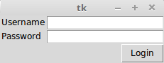
Let's have a look at demo code that illustrates some features of the grid geometry manager. The code in 1.06.py generates a GUI, as shown in the following screenshot:

The following code (1.06.py) generates the preceding GUI:


import tkinter as tk
root = tk.Tk()
tk.Label(root, text="Username").grid(row=0, sticky=tk.W)
tk.Label(root, text="Password").grid(row=1, sticky=tk.W)
tk.Entry(root).grid(row=0, column=1, sticky=tk.E)
tk.Entry(root).grid(row=1, column=1, sticky=tk.E)
tk.Button(root, text="Login").grid(row=2, column=1, sticky=tk.E)
root.mainloop()

The following is a description of the preceding code:

  • Take a look at the grid position defined in terms of the row and column positions for an imaginary grid table spanning the entire frame. See how the use of sticky=tk.W on both the labels makes them stick on the left-hand side, thus resulting in a clean layout.
  • The width of each column (or the height of each row) is automatically decided by the height or width of the widgets in the cell. Therefore, you need not worry about specifying the row or column width as equal. You can specify the width for widgets if you need that extra bit of control.
  • You can use the sticky=tk.NSEW argument to make the widget expandable and fill the entire cell of the grid.

In a more complex scenario, your widgets may span across multiple cells in the grid. To make a grid to span multiple cells, the grid method offers handy options such as rowspan and columnspan.

Furthermore, you may often need to provide some padding between cells in the grid. The grid manager provides the padx and pady options to provide padding that needs to be placed around a widget.

Similarly, the ipadx and ipady options are used for internal padding. These options add padding within the widget itself. The default value of external and internal padding is 0.

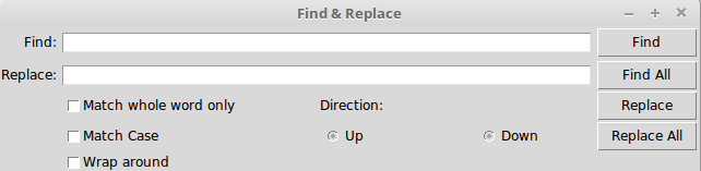
Let's have a look at an example of the grid manager, where we use most of the common arguments to the grid method, such as row, column, padx, pady, rowspan, and columnspan.

1.07.py produces a GUI, as shown in the following screenshot, to demonstrate how to use the grid geometry manager options:

The following code ( 1.07.py ) generates the preceding GUI:

import tkinter as tk
parent = tk.Tk()
parent.title('Find & Replace')
tk.Label(parent, text="Find:").grid(row=0, column=0, sticky='e')
tk.Entry(parent, width=60).grid(row=0, column=1, padx=2, pady=2,
sticky='we', columnspan=9)
tk.Label(parent, text="Replace:").grid(row=1, column=0, sticky='e')
tk.Entry(parent).grid(row=1, column=1, padx=2, pady=2, sticky='we',
columnspan=9)
tk.Button(parent, text="Find").grid( row=0, column=10, sticky='e' + 'w',
padx=2, pady=2)
tk.Button(parent, text="Find All").grid(
row=1, column=10, sticky='e' + 'w', padx=2)
tk.Button(parent, text="Replace").grid(row=2, column=10, sticky='e' +
'w', padx=2)
tk.Button(parent, text="Replace All").grid(
row=3, column=10, sticky='e' + 'w', padx=2)
tk.Checkbutton(parent, text='Match whole word only').grid(
row=2, column=1, columnspan=4, sticky='w')
tk.Checkbutton(parent, text='Match Case').grid(
row=3, column=1, columnspan=4, sticky='w')
tk.Checkbutton(parent, text='Wrap around').grid(
row=4, column=1, columnspan=4, sticky='w')
tk.Label(parent, text="Direction:").grid(row=2, column=6, sticky='w')
tk.Radiobutton(parent, text='Up', value=1).grid(
row=3, column=6, columnspan=6, sticky='w')
tk.Radiobutton(parent, text='Down', value=2).grid(
row=3, column=7, columnspan=2, sticky='e')
parent.mainloop()

Note how just 14 lines of the core grid manager code generate a complex layout such as the one shown in the preceding screenshot. On the other hand, developing this with the pack manager would have been much more tedious.

Another grid option that you can sometimes use is the widget.grid_forget() method. This method can be used to hide a widget from the screen. When you use this option, the widget still exists at its former location, but it becomes invisible. The hidden widget may be made visible again, but the grid options that you originally assigned to the widget will be lost.

Similarly, there is a widget.grid_remove() method that removes the widget, except that in this case, when you make the widget visible again, all of its grid options will be restored.

For a complete grid reference, type the following command in the Python shell:

>>> import tkinter
>>> help(tkinter.Grid)
Where should you use the grid geometry manager?
The grid manager is a great tool for the development of complex layouts. Complex structures can be easily achieved by breaking the container widget into grids of rows and columns and then placing the widgets in grids where they are wanted. It is also commonly used to develop different kinds of dialog box.

Now we will delve into configuring a grid's column and row sizes.

Different widgets have different heights and widths. So, when you specify the position of a widget in terms of rows and columns, the cell automatically expands to accommodate the widget.

Normally, the height of all the grid rows is automatically adjusted so it's the height of its tallest cell. Similarly, the width of all the grid columns is adjusted so it's equal to the width of the widest widget cell.

If you then want a smaller widget to fill a larger cell or to stay on any one side of the cell, you can use the sticky attribute on the widget to control this aspect.

However, you can override this automatic sizing of columns and rows by using the following code:

w.columnconfigure(n, option=value, ...) AND
w.rowconfigure(n, option=value, ...)

Use these to configure the options for a given widget, w, in either the nth column or the nth row, specifying values for the options, minsize, pad, and weight. Note that the numbering of rows begins from 0 and not 1.

The options available are as follows:

Options Descriptions

minsize

This is the minimum size of a column or row in pixels. If there is no widget in a given column or row, the cell does not appear in spite of this minsize specification.

pad

This is the external padding in pixels that will be added to the specified column or row over the size of the largest cell.

weight

This specifies the relative weight of a row or column and then distributes the extra space. This enables making the row or column stretchable.

For example, the following code distributes two-fifths of the extra space to the first column and three-fifths to the second column:
w.columnconfigure(0, weight=2)
w.columnconfigure(1, weight=3)

The columnconfigure() and rowconfigure() methods are often used to implement the dynamic resizing of widgets, especially on resizing the root window.

You cannot use the grid and pack methods together in the same container window. If you try doing that, your program will raise a _tkinter.TclError error.

The place geometry manager

The place geometry manager is the most rarely used geometry manager in Tkinter. Nevertheless, it has its uses in that it lets you precisely position widgets within their parent frame by using the (x,y) coordinate system.

The place manager can be accessed by using the place() method on any standard widget.

The important options for place geometry include the following:

  • Absolute positioning (specified in terms of x=N or y=N)
  • Relative positioning (the key options include relx, rely, relwidth, and relheight)

The other options that are commonly used with place include width and anchor(the default is NW).

Refer to 1.08.py for a demonstration of common place options:

import tkinter as tk
root = tk.Tk()
# Absolute positioning
tk.Button(root, text="Absolute Placement").place(x=20, y=10)
# Relative positioning
tk.Button(root, text="Relative").place(relx=0.8, rely=0.2, relwidth=0.5,
width=10, anchor=tk.NE)
root.mainloop()

You may not see much of a difference between the absolute and relative positions simply by looking at the code or the window frame. However, if you try resizing the window, you will observe that the Absolute Placement button does not change its coordinates, while the Relative button changes its coordinates and size to accommodate the new size of the root window:

For a complete place reference, type the following command in the Python shell:

>>> import tkinter
>>> help(tkinter.Place)
When should you use the place manager?
The place manager is useful in situations where you have to implement custom geometry managers, or where the widget placement is decided by the end user.

While the pack and grid managers cannot be used together in the same frame, the place manager can be used with any geometry manager within the same container frame.

The place manager is rarely used because, if you use it, you have to worry about the exact coordinates. If you make a minor change to a widget, it is very likely that you will have to change the x,y values for other widgets as well, which can be very cumbersome. We will use the place manager in Chapter 7, Piano Tutor.

This concludes our discussion on geometry management in Tkinter.

In this section, you had a look at how to implement the pack, grid, and place geometry managers. You also understood the strengths and weaknesses of each geometry manager.

You learned that pack is suitable for a simple side-wise or top-down widget placement. You also learned that the grid manager is best suited for the handling of complex layouts. You saw examples of the place geometry manager and explored the reasons behind why it is rarely used.

You should now be able to plan and execute different layouts for your programs using these Tkinter geometry managers.