
Once you begin developing Windows Phone 7 applications, you will need to be aware of the various basic layout controls. Each of these controls provides different ways to present your data. These controls include the following:
Grid: The Grid control provides a layout system that can use rows and columns as well as margins to place a control. Grids are the most flexible of the layout controls.
Canvas: The canvas control provides a simple coordinate based layout method for child controls.
Stack Panel: The StackPanel control provides a simple horizontal or vertical "stacking" layout. This stacking method will place child controls in order of their declaration in the XAML.
There are also two other layout controls that supplement the three primary controls. These controls differ a little more because they only allow one child control compared to the Grid, Canvas, and Stack Panel that allow unlimited number of child controls. These two controls are as follows:
ScrollViewer: This control is primarily used to add horizontal and vertical scroll bars to a control that is larger than the area provided to present its child control.
Border: This control provides a simple border to a control. While this control is one of the most basic, it does give you the ability to create nice rounded borders for controls that may not have that option.
Now that you have read about the basic options for laying out controls, let's look into how to use them to modify our existing navigation application to add more content.
This example will carry forward some of the key concepts from the Navigation application to provide an improved UI.
Let's start with the home page to give it a more finished look. You should have something that looks similar to the following screenshot:
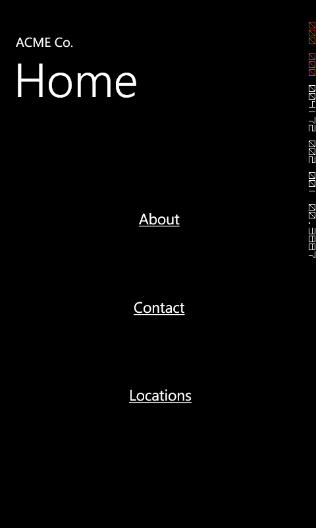
As you can see, it isn't very exciting, but will give you a few foundation steps that are sometimes assumed that you understand. Hopefully, this will get you familiar with the tool in a new way if you are an experienced developer but if you are new to development, it will help you ease into it.
1. Select the border control from the toolbox on the far-left side. Click and hold the current container control (fourth button from the bottom),which will then pop up the selection of other container controls, as shown below:

2. Now that you have selected the Border control, draw it to fill most of your control. From the property window, select Brushes and set the BorderBrush color to white by clicking on the top-left side of the color picker gradient in the Editor and the Background to blue. Now the border is covering the existing buttons. We need to place the hyperlink controls into the border control, but if you remember, the border control and scrollviewer controls can have only one child.
With that, let's actually add a stack panel inside the Border. This time you will want to add it a little differently than we had added other controls. I want to show you that there is another way to add controls, especially when you want to add controls as a child of another control.
3. Add a stack panel to the border by simply selecting the border on your design surface. Now select the stackpanel control on the toolbox so that it is the default container control and then double-click on it. This will add the stackpanel as the child control of the border.
Now that we have seen how to add a new control as a child of an existing control, let's move the hyperlink buttons as children of the stack panel.
4. To do this, we are actually going to use the Objects and Timelines window. This window gives you a representation of what is going on with the layering and grouping of your control. Currently, this window should look similar to the following screenshot:

5. To move the three HyperlinkButtons, click the top one in the Objects and Timeline window, then press Shift, and select the last one. Now you can move all three HyperlinkButtons at once instead of moving them individually. In this window, drag the buttons to the stack panel. This will change your document outline to look similar to the following screenshot:

6. While we have these three controls selected, lets set their margins. One thing that is nice in both Blend and Visual Studio is that you can set properties of multiple selected controls at the same time. So while you have these properties selected, go to the margins section in the Layout section list and set the margins to look like the following:

As you can see, this gives you a nice evenly spaced menu by using the StackPanel control. This combination of layout controls gives you the flexibility to design almost any UI that you would need.
Through the various layout controls you can see that they each offer their own unique features to layout your controls as needed. You can use various combinations of all of these to create any layout you could possibly dream of.
As you have seen in this recipe, the primary layout controls offer a variety of simple layouts by using things such as Grids, Canvas, and the StackPanel. The Grid offers both relational positioning from margins or offering column and row based layouts. The canvas offers a more exact layout that is not adjusted by the container it is in and finally the StackPanel offers a simple stack of child elements.