
In the previous section, we were already using the Label class, which is one of the widgets that Kivy provides. Widgets are the little interface blocks that we use to set up the GUI. Kivy has a complete set of widgets including buttons, labels, checkboxes, dropdowns, and so on. You can find them all in the Kivy API
kivy.uix (http://kivy.org/docs/api-kivy.html) under the package kivy.uix.
It's a good practice to create your own Widget for your applications instead of using the Kivy classes directly as we did in hello2.kv (line 26). The following code shows how to do that through inheritance:
28. # File name: widgets.py
29. from kivy.app import App
30. from kivy.uix.widget import Widget
31.
32. class MyWidget(Widget):
33.   pass
34.
35. class WidgetsApp(App):
36.   def build(self):
37.     return MyWidget()
38.
39. if __name__=="__main__":
40.   WidgetsApp().run()
In line 32 of the preceding code (widgets.py), we inherit from the base class Widget and create the subclass MyWidget, and, in line 37, we instantiated MyWidget instead of modifying the Kivy Label class directly as we did in hello2.py. The rest of the code is analogous to what we covered before. The following is the corresponding Kivy language code (widgets.kv):
41. # File name: widgets.kv
42. <MyWidget>:
43.  Button:
44.    text: 'Hello'
45.    pos: 0, 100
46.    size: 100, 50
47.    color: .8,.9,0,1
48.    font_size: 32
49.  Button:
50.    text: 'World!'
51.    pos: 100,0
52.    size: 100, 50
53.    color: .8,.9,0,1
54.    font_size: 32
Notice that now we are using buttons instead of labels. Most of the basic widgets in Kivy work in a very similar manner. In fact, Button is just a subclass of Label that includes more properties such as background color.
Compare the notation of line 26 (<Label>:) of hello2.kv with the line 43 (Button:) of the preceding code (widgets.kv). We used the class notation (<Class>:) for the Label (and for MyWidget) but another notation (Instance:) for Button. We just defined that MyWidget has two instances of Button (on line 43 and 49), and then we set the properties of those instances (the color is in RGBA format that stands for red, green, blue, and alpha/transparency).
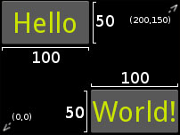
The size and pos properties consist of fixed values, that is, the exact pixels on the window.
Note
Notice that the coordinate (0, 0) is at the bottom-left corner, that is, the Cartesian origin. Many other languages (including CSS) use the top-left corner as the (0, 0) coordinate, so be careful with this.
The following screenshot shows the output of the widgets.py and widgets.kv code files with some helpful annotations (on white color):
Creating our own widget
A couple of things could be improved in the previous code (widgets.kv). The first thing is that there are many repeated properties for the buttons such as pos, color and font_size. Instead of that, let's create our own Button as we did with MyWidget. The second is that the fixed position is quite annoying because the widgets don't adjust when the screen is resized because the position is fixed. Let's make the widgets more responsive:
55. # File name: widgets2.kv
56. <MyButton@Button>:
57.  color: .8,.9,0,1
58.  font_size: 32
59.  size: 100, 50
60.
61. <MyWidget>:
62.  MyButton:
63.    text: 'Hello'
64.    pos: root.x, root.top - self.height
65.  MyButton:
66.    text: 'World!'
67.    pos: root.right - self.width, root.y
In widgets2.kv we created (<MyButton@Button>:) and customized the MyButton class (as shown in lines 56 to 59) and instances (as shown in the lines 62 to 67).
Please note the difference between the way we defined MyWidget and MyButton. We need to specify @Class only if we didn't define the base class in the Python side as we did with MyWidget (line 32 of widgets.py). On the other hand, we had to define MyWidget in the Python side because we instantiated it directly (line 37 of widgets.py).
In this example, each Button's position is responsive in the sense that they will always be displayed in the corners of the screen, no matter what the window size is. In order to achieve that, we need to use the self and root variables. You might be familiar with the variable self. As you have probably guessed, it is just a reference to the Widget itself. For example, self.height (line 64) has a value of 50 because that is the height of that particular MyButton. The root variable is a reference to the Widget class at the top of the hierarchy. For example, the root.x (line 64) has a value of 0 because that is the position in the X-axis of the MyWidget instance created on in line 37 of widgets.py. Since, the
MyWidget instance is the only one in the WidgetsApp, it uses all the space by default; therefore, the origin is (0, 0). The x, y, width, and height are also the widgets properties.
Still, fixed coordinates are an inefficient way of organizing widgets and elements in the window. Let's move on to something smarter: layouts.