Book Image

jQuery Mobile Web Development Essentials-Third Edition - Third Edition

By : Raymond Camden, Andy Matthews
Book Image

jQuery Mobile Web Development Essentials-Third Edition - Third Edition

By: Raymond Camden, Andy Matthews

Overview of this book

jQuery Mobile is a HTML5-based touch-optimized web framework. jQuery Mobile can be used to build responsive cross-platform websites and apps for a wide range of smartphones, tablets, and desktop devices. The jQuery Mobile framework can be integrated with other mobile app frameworks such as PhoneGap, IBM Worklight, and more. Introduction to jQuery Mobile explains how to add the framework to your HTML pages to create rich, mobile-optimized web pages with minimal effort. You’ll learn how to use jQuery Mobile’s automatic enhancements and configure the framework for customized, powerful mobile-friendly websites. We then dig into forms, events, and styling. You'll see how jQuery Mobile automatically enhances content, and will find out how to use the JavaScript API to build complex sites. We’ll introduce you to how jQuery Mobile can be themed as well looking into how JavaScript can be used for deep sets of customizations. The examples are ready to run and can be used to help kick-start your own site. Along the way, you will leverage all the concepts you learn to build three sample mobile applications.
Table of Contents (20 chapters)
jQuery Mobile Web Development Essentials Third Edition
Credits
About the Authors
About the Reviewer
www.PacktPub.com
Preface
Index

Building an HTML page


Let's begin with a simple web page that is not mobile-optimized. To be clear, we aren't saying it can't be viewed on a mobile device. Not at all! But it may not be usable on a mobile device. It may be hard to read (the text may be too small). It may be too wide. It may use forms that don't work well on a touchscreen. We don't know the kinds of problems we will face until we start testing (and we've all tested our websites on mobile devices to see how well they work, right?).

Let's have a look at Listing 1-1:

Listing 1-1: test1.html
<html>
  <head>
    <title>First Mobile Example</title>
  </head>
  <body>
    <h1>Welcome</h1>
    <p>
    Welcome to our first mobile web site. It's going to be the best site you've ever seen. Once we get some content. And a business plan. But the hard part is done!
    </p>
    <p>
    <i>Copyright Megacorp &copy; 2015</i>
    </p>
  </body>
</html>

As we said, it isn't too complex, right? Let's take a quick look at this in the browser:

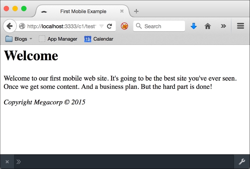
Not so bad, right? But let's take a look at the same page in a mobile simulator:

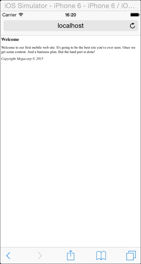
Wow, the text is in a barely readable font size. You've probably seen web pages like this before on your mobile device. You can, of course, typically use pinch and zoom or double-click actions to increase the size of the text. But it would be preferable to have the page render immediately in a mobile-friendly view. This is where jQuery Mobile enters.