
This section will review how to make basic plots using the built-in R functions and the ggplot2 package to plot graphics.
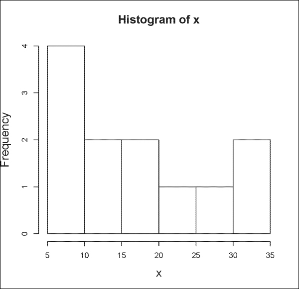
Basic plots in R include histograms and scatterplots. To plot a histogram, we use the hist() function:
> x <- c(5, 7, 12, 15, 35, 9, 5, 17, 24, 27, 16, 32)
> hist(x)
The output is shown in the following plot:
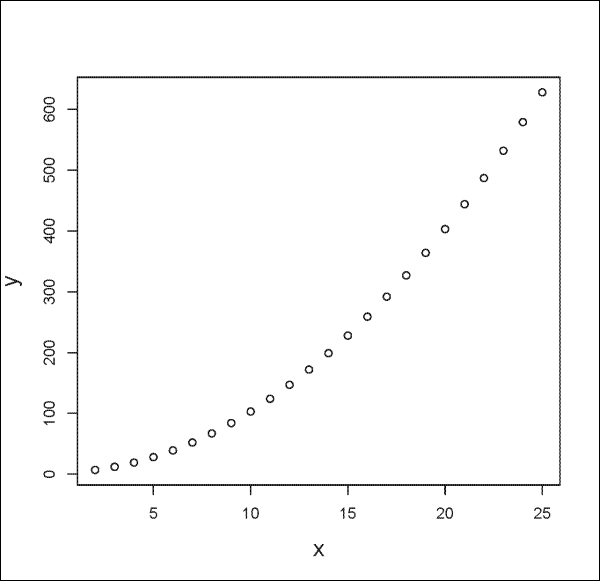
You can plot mathematical formulas with the plot() function as follows:
> x <- seq(2, 25, by=1)
> y <- x^2 +3
> plot(x, y)
The output is shown in the following plot:
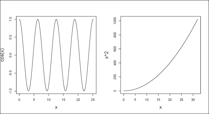
You can graph a univariate mathematical function on an interval using the curve() function with the from and to arguments to set the left and right endpoints, respectively. The expr argument allows you to set a numeric vector or function that returns a numeric vector as an output, as follows:
# For two figures per plot.
> par(mfrow=c(1,2))
> curve(expr=cos(x), from=0, to=8*pi)
> curve(expr=x^2, from=0, to=32)
In the following figure, the plot to your left shows the curve for cox(x) and the plot to the right shows the curve for x^2. As you can see, using the from and to arguments, we can specify the x values to show in our figure.
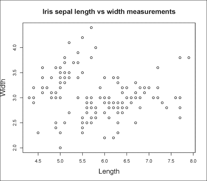
You can also graph scatterplots using the plot() function. For example, we can use the iris dataset as part of R to plot Sepal.Length versus Sepal.Width as follows:
> plot(iris$Sepal.Length, iris$Sepal.Width, main="Iris sepal length vs width measurements", xlab="Length", ylab="Width")
The output is shown in the following plot:
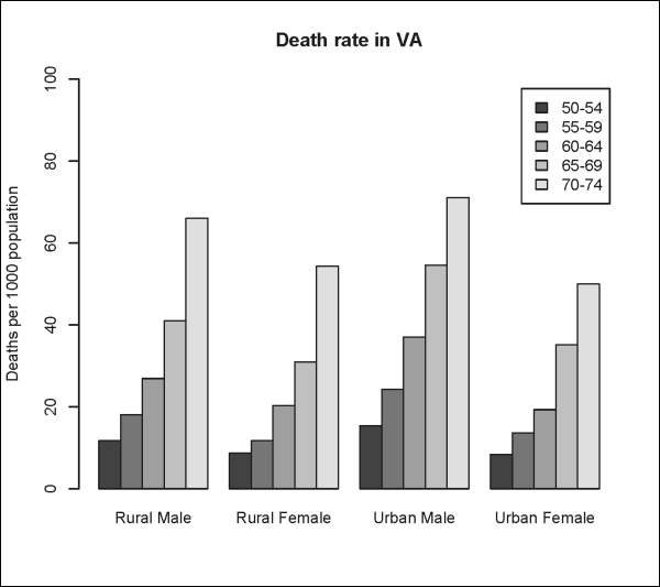
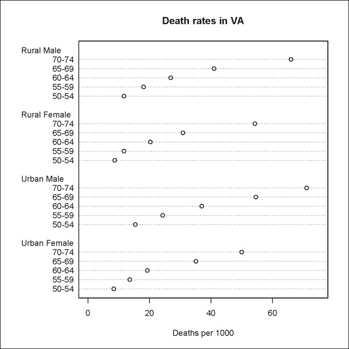
R has built-in functions that allow you to plot other types of graphics such as the barplots(), dotchart(), pie(), and boxplot() functions. The following are some examples using the VADeaths dataset:
> VADeaths
      Rural Male Rural Female Urban Male Urban Female
50-54       11.7          8.7       15.4          8.4
55-59       18.1         11.7       24.3         13.6
60-64       26.9         20.3       37.0         19.3
65-69       41.0         30.9       54.6         35.1
70-74       66.0         54.3       71.1         50.0
> barplot(VADeaths, beside=TRUE, legend=TRUE, ylim=c(0, 100), ylab="Deaths per 1000 population", main="Death rate in VA") #Requires that the data to plot be a vector or a matrix.
The output is shown in the following plot:
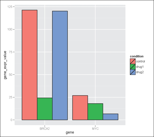
However, when working with data frames, it is often much simpler to use the ggplot2 package to make a bar plot, since your data will not have to be converted to a vector or matrix first. However, you need to be aware that ggplot2 often requires that your data be stored in a data frame in long format and not wide format.
The following is an example of data stored in wide format. In this example, we look at the expression level of the MYC and BRCA2 genes in two different cell lines, after these cells were treated with a vehicle-control, drug1 or drug2 for 48 hours:
> geneExpdata.wide <- read.table(header=TRUE, text='
 cell_line gene control drug1 drug2
       CL1   MYC     20.4  15.9  1.5
       CL2   MYC     26.9  18.1  6.7
       CL1   BRCA2     109.5  18.1  89.8
       CL2   BRCA2    121.3  24.4  120.2
 ')
The following is the data rewritten in long format:
> geneExpdata.long <- read.table(header=TRUE, text='
   cell_line  gene variable value
1        CL1   MYC  control  20.4
2        CL2   MYC  control  26.9
3        CL1 BRCA2  control 109.5
4        CL2 BRCA2  control 121.3
5        CL1   MYC    drug1  15.9
6        CL2   MYC    drug1  18.1
7        CL1 BRCA2    drug1  18.1
8        CL2 BRCA2    drug1  24.4
9        CL1   MYC    drug2   1.5
10       CL2   MYC    drug2   6.7
11       CL1 BRCA2    drug2  89.8
12       CL2 BRCA2    drug2 120.2
')
Instead of rewriting the data frame by hand, this process can be automated using the melt() function, which is a part of the reshape2 package:
> library("reshape2")
> geneExpdata.long<- melt(geneExpdata.wide, id.vars=c("cell_line","gene"), measure.vars=c("control", "drug1", "drug2" ), variable.name="condition", value.name="gene_expr_value")
Now, we can plot the data using ggplot2 as follows:
> library("ggplot2")
> ggplot(geneExpdata.long, aes(x=gene, y= gene_expr_value)) + geom_bar(aes(fill=condition), colour="black", position=position_dodge(), stat="identity")
The output is shown in the following plot:
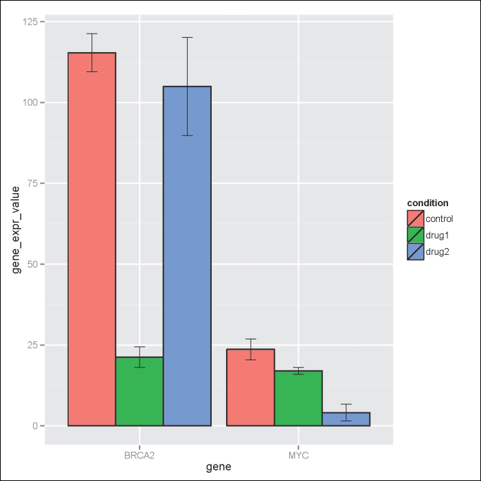
Another useful trick to know is how to add error bars to bar plots. Here, we have a summary data frame of standard deviation (sd), standard error (se), and confidence interval (ci) for the geneExpdata.long dataset as follows:
> geneExpdata.summary <- read.table(header=TRUE, text='
   gene condition N gene_expr_value        sd    se        ci
1 BRCA2   control 2          115.40  8.343860  5.90  74.96661
2 BRCA2     drug1 2           21.25  4.454773  3.15  40.02454
3 BRCA2     drug2 2          105.00 21.496046 15.20 193.13431
4   MYC   control 2           23.65  4.596194  3.25  41.29517
5   MYC     drug1 2           17.00  1.555635  1.10  13.97683
6   MYC     drug2 2            4.10  3.676955  2.60  33.03613
')
> #Note the plot is stored in the p object
> p<- ggplot(geneExpdata.summary, aes(x=gene, y= gene_expr_value, fill=condition)) + geom_bar(aes(fill=condition), colour="black", position=position_dodge(), stat="identity")
> #Define the upper and lower limits for the error bars
> limits <- aes(ymax = gene_expr_value + se, ymin= gene_expr_value - se)
> #Add error bars to plot
> p + geom_errorbar(limits, position=position_dodge(0.9), size=.3, width=.2)
The result is shown in the following plot:
Going back to the VADeaths example, we could also plot a Cleveland dot plot (dot chart) as follows:
> dotchart(VADeaths,xlim=c(0, 75), xlab=Deaths per 1000, main="Death rates in VA")
Note
Note that the built-in dotchart() function requires that the data be stored as a vector or matrix.
The result is shown in the following plot:
The following are some other graphics you can generate with built-in R functions:
You can generate pie charts with the pie() function as follows:
> labels <- c("grp_A", "grp_B", "grp_C")
> pie_groups <- c(12, 26, 62)
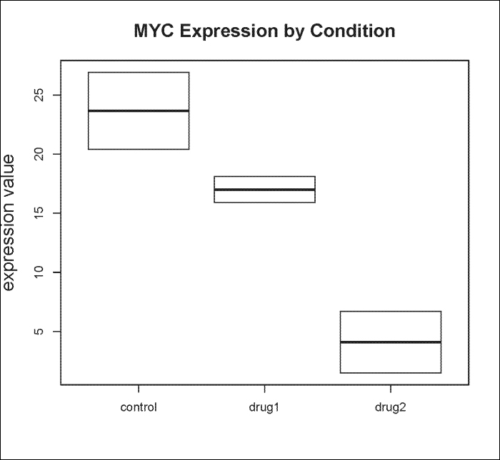
> pie(pie_groups, labels, col=c("white", "black", "grey")) #Fig. 3BYou can generate box-and-whisker plots with the boxplot() function as follows:
> boxplot(value ~ variable, data= geneExpdata.long, subset=gene == "MYC", ylab="expression value", main="MYC Expression by Condition", cex.lab=1.5, cex.main=1.5)
Note
Note that unlike other built-in R graphing functions, the boxplot() function takes data frames as the input.
Using our cell line drug treatment experiment, we can graph MYC expression for all cell lines by condition. The result is shown in the following plot:
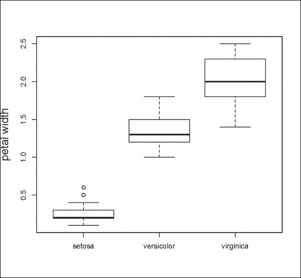
The following is another example using the iris dataset to plot Petal.Width by Species:
> boxplot(Petal.Width ~ Species, data=iris, ylab="petal width", cex.lab=1.5, cex.main=1.5)
The result is shown in the following plot: