
To arrange widgets on the screen, Kivy provides a number of Layout classes. Layout, a subclass of Widget, serves as a container for other widgets. Every layout affects the positioning and size of its children in a unique way.
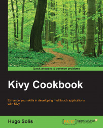
For this application, we won't need anything fancy, as the desired UI is pretty straightforward. This is what we're aiming to achieve:

A mockup layout of the finished Clock app interface.
To build this, we will use BoxLayout, which is basically a one-dimensional grid. We already have BoxLayout in our clock.kv file, but since it only has one child, it does not affect anything. A rectangular grid with one cell is really just that, a rectangle.
Kivy layouts almost always try to fill the screen, thus our application will adapt to any screen size and orientation changes automatically.
If we add another label to BoxLayout, it will take half the screen space, depending on the orientation: a vertical box layout grows from top to bottom, and horizontal from left to right.
You might have guessed that in order to create a row of buttons inside a vertical layout, we can just embed another, horizontal box layout into the first one. Layouts are widgets, so they can be nested in arbitrary and creative ways to build complex interfaces.
Stacking three widgets into BoxLayout normally makes every widget a third of the available size. Since we don't want buttons to be this big compared to clock displays, we can add a height property to the horizontal (inner) BoxLayout and set its vertical size_hint property to None.
The size_hint property is a tuple of two values, affecting the widget's width and height. We will discuss the impact that size_hint has on different layouts in the next few chapters; right now, let's just say that if we want to use absolute numbers for width or height, we have to set size_hint to None accordingly; otherwise, assigning size won't work as the widget will continue to compute its own size instead of using the values that we'll provide.
After updating the clock.kv file to account for stopwatch display and controls, it should look similar to the following (note the hierarchy of the layouts):
BoxLayout:
    orientation: 'vertical'

    Label:
        id: time
        text: '[b]00[/b]:00:00'
        font_name: 'Roboto'
        font_size: 60
        markup: True

    BoxLayout:
        height: 90
        orientation: 'horizontal'
        padding: 20
        spacing: 20
        size_hint: (1, None)

        Button:
            text: 'Start'
            font_name: 'Roboto'
            font_size: 25
            bold: True

        Button:
            text: 'Reset'
            font_name: 'Roboto'
            font_size: 25
            bold: True

    Label:
        id: stopwatch
        text: '00:00.[size=40]00[/size]'
        font_name: 'Roboto'
        font_size: 60
        markup: True
If we run the code now, we'll notice that buttons don't fill all the available space inside BoxLayout. This effect is achieved using the padding and spacing properties of the layout. Padding acts very similar to CSS, pushing children (in our case, buttons) away from the edges of the layout, while spacing controls the distance between adjacent children. Both properties default to zero, aiming at maximum widget density.
This layout works but has one serious problem: the code is very repetitive. Every change we may want to make has to be done in a number of places throughout the file, and it's very easy to miss one of them and thus introduce an inconsistent change.
Note
To continue the analogy with the web platform, before CSS (Cascading Style Sheets) became universally available, style information was being written directly in tags that surround the text. It looked like this:
<p><font face="Helvetica">Part 1</font></p><p><font face="Helvetica">Part 2</font></p>
Using this approach, changing any individual element's properties is easy, but adjusting the properties of the whole document's look requires an excessive amount of manual labor. If we wanted to change the font face to Times in the next version of the page, we would have to search and replace every occurrence of the word Helvetica while trying to make sure that we don't have this same word in the running text, as it may be occasionally replaced too.
With style sheets, on the other hand, we move all of the styling information to a CSS rule:
p {font-family: Helvetica}
Now we have just one place to account for styling of every paragraph throughout the document; no more searching and replacing to change font or any other visual attribute, such as color or padding. Note that we still may slightly adjust a single element's properties:
<p style="font-family: Times">Part 3</p>
So we haven't lost anything by implementing CSS, and there is practically no tradeoff; this explains why the adaptation of style sheets on the Internet was very fast (especially considering the scale) and overwhelmingly successful. CSS is being widely used to this day with no conceptual changes.
In Kivy, there is no need to use a different file for our aggregate styles or class rules, like it's usually done in web development. We just add to the clock.kv file a definition like the following, outside of BoxLayout:
<Label>:
    font_name: 'Roboto'
    font_size: 60
    markup: True
This is a class rule; it acts similar to a CSS selector described in the previous information box. Every Label derives all the properties from the <Label> class rule. (Note the angle brackets.)
Now we can remove the font_name, font_size, and markup properties from each individual Label. As a general rule, always strive to move every repeated definition into a class. This is a well-known best practice called don't repeat yourself (DRY). Changes like the one shown in the previous code snippet may seem trivial in a toy project like this but will make our code much cleaner and more maintainable in a long run.
If we want to override a property of one of the widgets, just add it as usual. Immediate properties take precedence over those inherited from the class definition.
Tip
Keep in mind that a class definition is completely different from a widget defined in the same .kv file. While the syntax is largely the same, the class is just an abstract definition; on its own, it does not create a new widget. Thus, adding a class definition will not introduce any changes to the app if we don't use it later.
One obvious problem with the straightforward approach to classes described earlier is that we can only have one class named Label. As soon as we need two different sets of properties applied to the same kind of widget, we have to define our own custom classes for them. Additionally, overwriting the framework's built-in classes, such as Label or Button, may have undesired consequences throughout the application, for example, if another component is using the widget we've altered under the hood.
Fortunately, this is very simple to solve. Let's create a named class for buttons, RobotoButton:
<RobotoButton@Button>:
    font_name: 'Roboto'
    font_size: 25
    bold: True
The part before the @ symbol designates the new class name, followed by the widget type we're extending (in Python, we would say class RobotoButton(Button): instead). The resulting class can be then used in the Kivy language instead of the generic Button class:
RobotoButton:
    text: 'Start'
The use of class rules allows us to reduce the number of recurrent lines in the clock.kv file, and also provide a consistent way of tweaking similar widgets using class definitions. Next, let's use this feature to customize all the buttons.