
In the previous paragraphs, we encountered some simple maps. Geographers define these kinds of maps as general maps. General maps focus on the description of the physical, political, and human features on the territory. All this data is portrayed for its own sake. In a nutshell, it can be said that general maps tell you where objects are located on the Earth's surface, while thematic maps talk about things happening on the Earth's surface. Thematic maps focus on displaying a single topic and portray spatial distribution and variation. You have general data, such as administrative boundaries or road networks, but this is represented as a base layer for general reference.
Among thematic maps, those using choropleth or dot representations, are by far the most common type you will be using GeoServer for.
Choropleth maps show statistical data aggregated over predefined regions, such as counties or states, by coloring or shading these regions. You can draw states according to their population, gross domestic product, car owners, and the number of national parks. You are not limited to a single variable; indeed, you can merge different values from more than one attribute associated with spatial objects.
The following figure shows a map of European countries colored according to gross domestic product values. Legend on the right shows the five classification intervals. Values were normalized to Eu-27 average (EU stands for the European Union, in the period 2007-2013 when it had 27 countries):
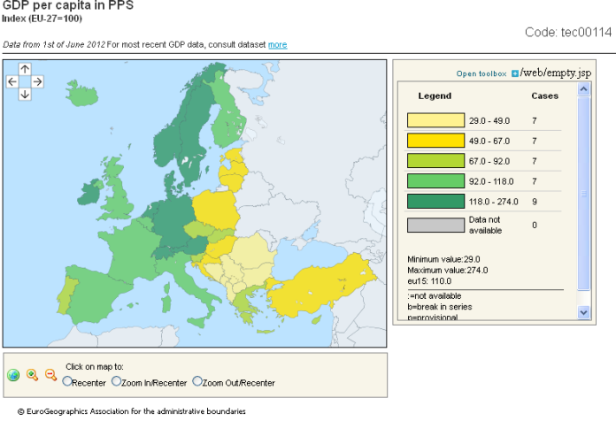
(Image courtesy of http://epp.eurostat.ec.europa.eu)
In proportional maps, symbols of different sizes represent data associated with different areas or locations within the map. As an example, the countries' capitals can be represented with a circle proportional to their population:

This map contains a representation of European countries. They are drawn all using the same symbology. The information is pointed out by the circles, a nongeographical feature, with a radius proportional to the residents. For the reader convenience there are also some labels, but he may also guess the name of the capital from its position.
Are you ready to build some maps? We can do this without the use of GeoServer since we have not yet discussed how to install it; we will cover that in the next chapter. For the moment we will play with an online map engine to assist your understanding of thematic map concepts:
Note
The World Bank is an international financial institution that provides loans to countries of the world for capital programs. It also distributes a lot of social and economic data under an open data license. The data used in this section is available at http://datacatalog.worldbank.org/.
- To build the thematic map, we will use an online engine. Although it's built on open source software, it's a commercial solution. You need to register to use it, but, for the purpose of this section, and for other small maps you may want to create, you can use the free of charge account. Point your browser to https://carto.com/:

- Click on the
Sign uplink from the home page and complete your application for a free of charge account. After signing up, log in to Carto and you will arrive at the front dashboard, the starting point for building your maps:

- Select the
WorldBank.csvfile and drag it on the dashboard to create your first map. The engine will process your data, trying to georeference it, and then a new map will be shown for you:
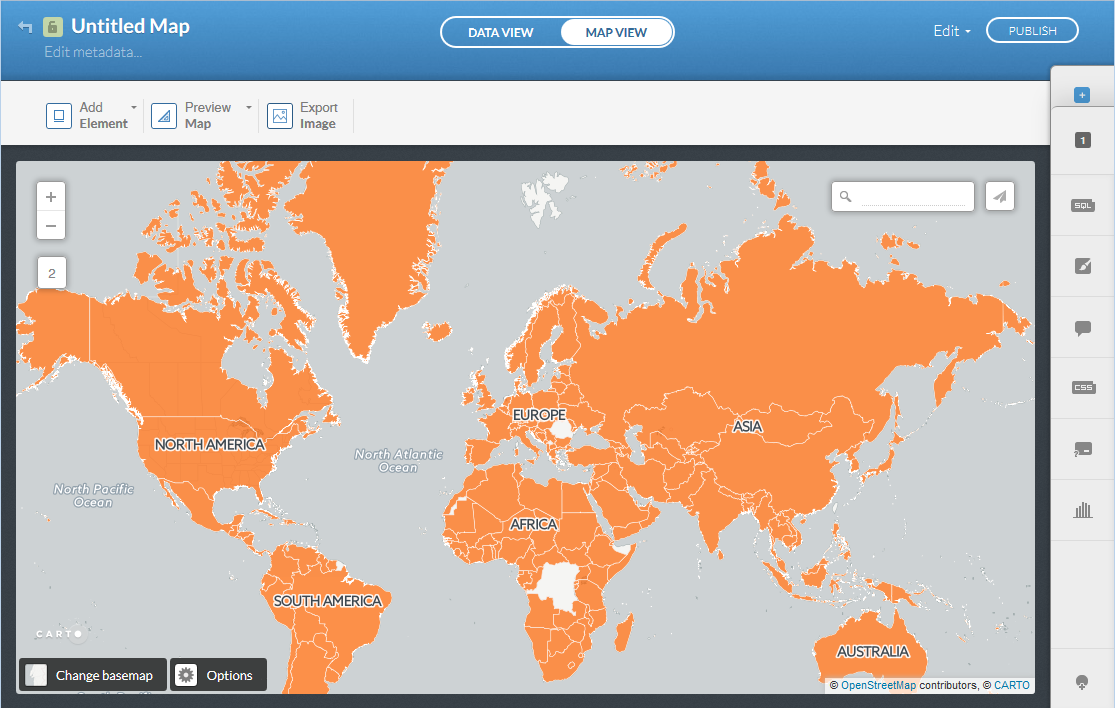
- The map you just created does not seem interesting. All the countries use the same orange symbol, what about the economic data from World Bank? Locate the toolbar in the right part of the user interface and press the symbol with a paintbrush; this will show you a custom interface to change the rendering of your data:
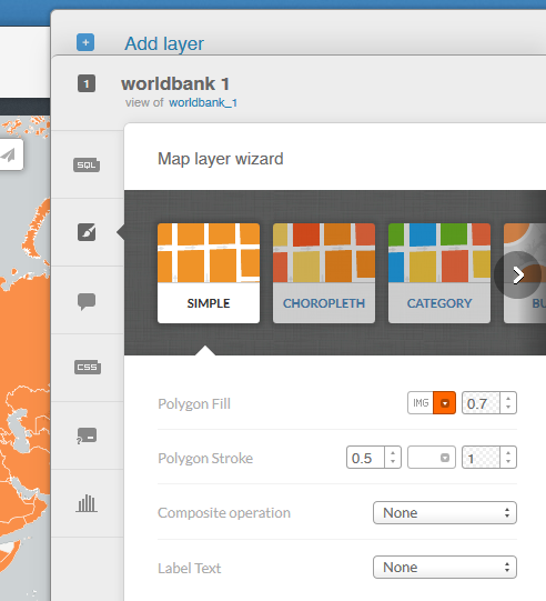
- Select the choropleth category and leave the other setting at default. Now your map shows the countries with a color ramp, according to the GDP value. You can explore the setting; try to change the classification and the color ramp used:

You built a brand new thematic map, selecting data and symbol colors. You will need to set these parameters exactly in GeoServer to produce beautiful maps. This time we did it without exploring the technical details behind feature rendering. In Chapter 6, Styling Your Layers, you will learn how to use SLD (Styled Layer Descriptor) to make thematic maps.