

When working with Visual Studio we can add more powerful charts with more options than the ones presented with the Report Wizard or the Report Builder applications. We are going to create a simple report to show as an example:
Drag-and-drop a chart control that is available in the toolbox. We will be presented with a dialog box as shown in the following screenshot:

For this sample we will select the first chart under the Column section and click on OK.
Click on the columns to configure the fields we want to be displayed. That should open the following properties window to the right of the chart control:
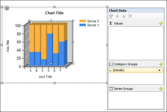
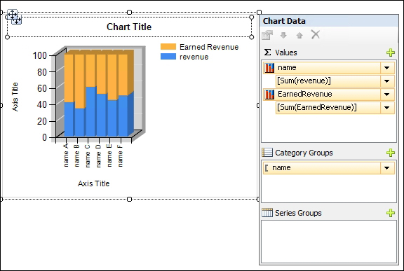
Click on the plus sign under the ∑ Values list, so that we can select the fields that we want to use for aggregation. In this example, we will add Name and EarnedRevenue. Notice we can also use an expression if we want to create something more complex.
We can add different groups of series to display more than one aggregated field by using the Category Groups and Series Groups.
Setting the...