
Next we will extend our solution and show an easy way to provide global links as part of the standard footer in the Master Page. While the linked content can be to anything web accessible, the sample solution will be used to link to an appropriate use page as well as a form used for reporting content.
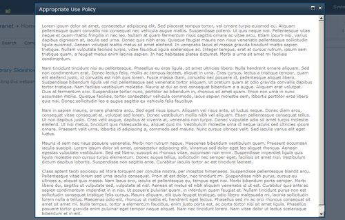
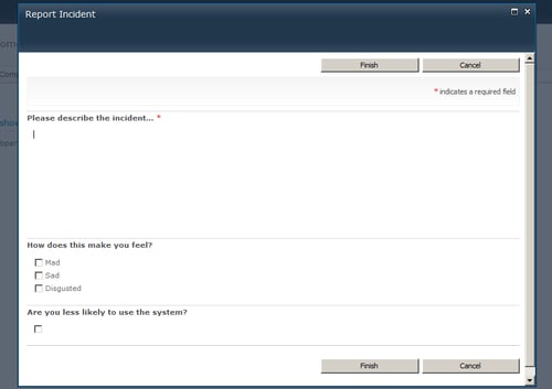
Many environments today are investing time and effort into creating a SharePoint Governance Plan, or have existing Appropriate Use or Information Security policies. Creating a policy is relatively easy, but making it easy to find and access is something that many organizations struggle with. It is also critical to provide easily accessible incident reporting mechanisms so that the system can be self-policed as much as possible.
Since this is content we want to display globally, we are going to include it as part of the standard footer in the Master Page. This will guarantee that it is easily accessible. For the presentation, I think this is a good use of the Client OM's SP.UI.Dialog class which creates an Ajax shadowbox.
To simplify the example, we will use a standard SharePoint Survey list for the Incident Report form. You could alternatively create an application page and deploy it to the farm.
We are going to start by adding the div container govFooter to the Master Page, just above the<SharePoint:DeveloperDashboard runat="server"/> control. The remainder of the code will be placed inside this container. We will reference the stylesheet class s4-notdlg which has special meaning within SharePoint. When this class is referenced, it will ensure that this content will be hidden from any dialog windows, such as the ones we are launching with the code added in this section:
<div id="govFooter" class="s4-notdlg" style=" text-align:center;
width:100%">
<script type="text/ecmascript">
</script>
</div>
Calling the modal dialog is as easy as calling the showModalDialog() function, and passing it the input options for what to display. The showPolicy() and showIncidentForm() functions are as follows:
function showPolicy() {
var _options = { url: "http://intranet/Pages/Acceptable-Use-
Policy.aspx", width: "800", title: "Appropriate Use Policy" };
SP.UI.ModalDialog.showModalDialog(_options);
}
function showIncidentForm() {
var _options = { url:
"http://intranet/Lists/Incident%20Reports/NewForm.aspx", width:
"800", title: "Report Incident" };
SP.UI.ModalDialog.showModalDialog(_options);
}
Next we just have to call the two functions with a JavaScript function call added to an anchor tag:
<a href="javascript:showPolicy();" style="text- decoration:underline">View Acceptable Use Policy</a> | <a href="javascript:showIncidentForm();" style="text- decoration:underline">Report Incident</a>