
The Kendo Mobile ActionSheet widget is used to show a list of actions to perform when a user taps on an element on the screen. The ActionSheet widget slides from the bottom and shows a list of actions to perform against the tapped element on the screen.
Create a
ListViewwidget with each list item containing an anchor element with itsdata-relattribute set toactionsheet.Create an
ActionSheetwidget by setting thedata-roleattribute toactionsheet.The
hrefattribute of the anchor elements in theListViewwidget should be the same as theidattribute of theactionsheetwidget.<div data-role="view"> <ul data-role="listview" data-style="inset" data-type="group"> <li> <ul> <li> <a data-rel="actionsheet" href="#optionActionSheet"> Action 1 </a> </li> <li> <a data-rel="actionsheet" href="#optionActionSheet"> Action 2 </a> </li> <li> <a data-rel="actionsheet" href="#optionActionSheet"> Action 3 </a> </li> </ul> </li> </ul> <ul data-role="actionsheet" id="optionActionSheet"> <li><a data-action="option1">Option 1</a></li> <li><a data-action="option2">Option 2</a></li> <li><a data-action="option3">Option 3</a></li> </ul> </div>
The previous code snippet defines a view containing a ListView widget. The ListView widget contains anchor elements of the following form:
<a data-rel="actionsheet"
  href="#optionActionSheet">
  Action 1
</a>
Here, the anchor element specifies the data-rel attribute with its value as actionsheet. This data-rel attribute is used to open the ActionSheet widget from any navigational widget such as a button, an anchor link item, or a tabstrip. Also, the href attribute of the anchor element specifies the id value of the ActionSheet widget (openActionSheet) to be invoked.
The ActionSheet widget is defined with the data-role attribute set to actionsheet and its id attribute set to openActionSheet. This widget contains three list items containing a list of actions to perform. The data-action attribute is used to specify the JavaScript function to invoke when the user taps one of the options.
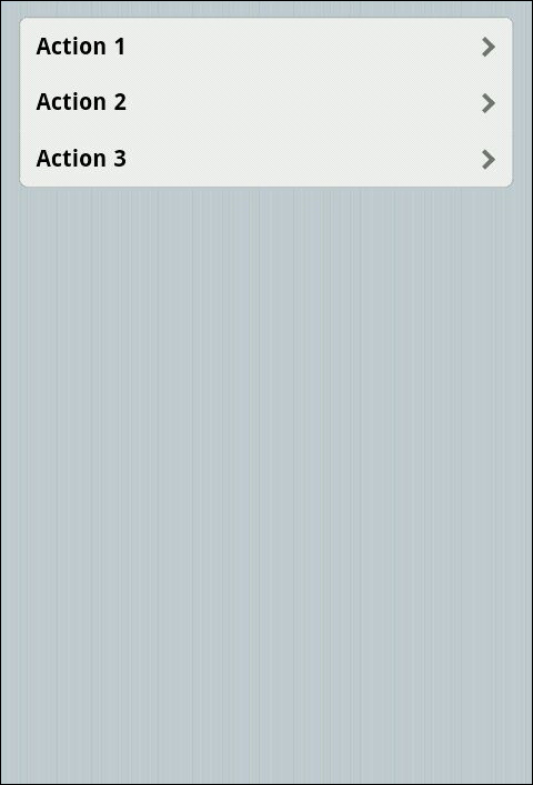
When you execute the previous code snippet, you will see that a ListView widget is shown as follows:
On clicking on any of the list items in the ListView widget, the ActionSheet widget will slide in from the bottom of the screen to show a list of options, as shown in the following screenshot:
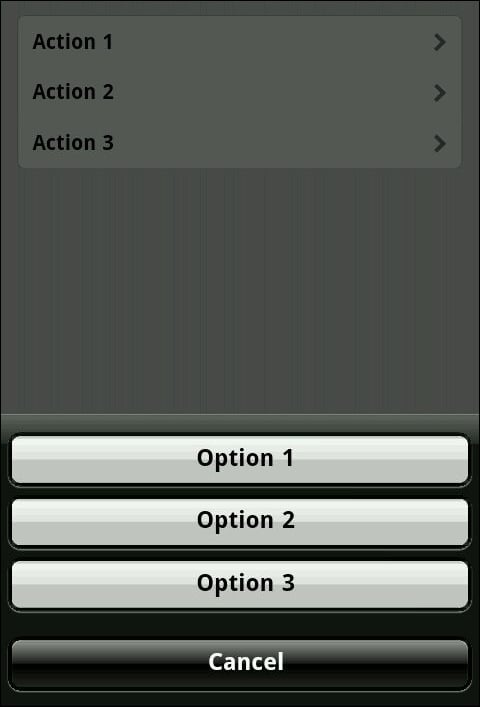
Notice that along with the three options, another option with the value Cancel is also added to the list. This allows the user to cancel the task and hide the ActionSheet widget.
As mentioned earlier, the data-action attribute is used to specify the JavaScript callback function to be invoked when the user selects one of the options in the ActionSheet widget. This callback function receives an object with two fields, namely, target and context. The target field holds the reference to the DOM element that opened the ActionSheet widget and the context field will contain the value passed from the same DOM element. To pass a value to the ActionSheet widget, specify the data-actionsheet-context attribute with the value that you need to pass.
<a id="firstItem"
  data-rel="actionsheet"
  data-actionsheet-context="1"
  href="#optionActionSheet">
  Action 1
</a>
In the previous markup, one of the list items is updated to contain a data-actionsheet-context attribute with the value 1. The JavaScript function is defined as follows:
function option1 (e) {
  console.log(e.target); // $('#firstItem')
  console.log(e.context); // 1
}
Here, the target field will refer to the DOM element that invoked the ActionSheet widget and the context field will contain the value 1, which was passed from the DOM element that invoked the ActionSheet widget.