

There are many types of charts suited for different kinds of data and analysis scenarios. This recipe will explore the various visualization types and explain which type of chart is best suited for the right task.
Web Intelligence provides 10 chart categories that can address different visualization requirements.
We want to explore the different chart types available and get a better understanding of what we can use.
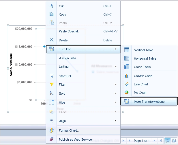
By right-clicking on the existing line chart, we will choose the More Transformations option in order to get the entire chart types menu, as shown in the following screenshot:
After choosing the preceding option, we will navigate to the chart and table type menu. By using this menu, we will be able to access each chart category located on the left-hand side of the screen as well as define which objects will be presented in the chart, as shown:
