
Visualization has a broad definition, and so does data. The cave paintings drawn by our ancestors can be argued as visualizations as they convey historical data through a visual medium. Map visualizations were commonly used in wars since ancient times to discuss the past, present, and future states of a war, and to come up with new strategies. Astronomers in the 17th century were believed to have built the first visualization of their statistical data. In the 18th century, William Playfair invented many of the popular graphs we use today (line, bar, circle, and pie charts). Therefore, it appears as if many, since ancient times, have recognized the importance of visualization in giving some meaning to data.
To demonstrate the importance of visualization in a simple mathematical setting, consider fitting a line to a given set of points. Without looking at the data points, it would be unwise to try to fit them with a model that seemingly lowers the error bound. It should also be noted that sometimes, the data needs to be changed or transformed to the correct form that allows us to use a particular tool. Visualizing the data points ensures that we do not fall into any trap. The following screenshot shows the visualization of a polynomial as a circle:
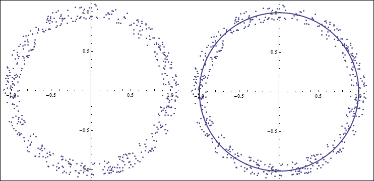
Figure 1.1 Fitting a polynomial
In figure 1.1, the points are distributed around a circle. Imagine we are given these points in a Cartesian space (orthogonal x and y coordinates), and we are asked to fit a simple linear model. There is not much benefit if we try to fit these points to any polynomial in a Cartesian space; what we really need to do is change the parameter space to polar coordinates. A 1-degree polynomial in polar coordinate space (essentially a circle) would nicely fit these points when they are converted to polar coordinates, as shown in figure 1.1. Visualizing the data points in more complicated but similar situations can save us a lot of trouble. The following is a screenshot of Anscombe's quartet:
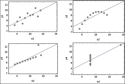
Figure 1.2 Anscombe's quartet, generated using Mathematica
Tip
Downloading the color images of this book
We also provide you a PDF file that has color images of the screenshots/diagrams used in this book. The color images will help you better understand the changes in the output. You can download this file from: https://www.packtpub.com/sites/default/files/downloads/2999OT_coloredimages.PDF.
Anscombe's quartet (figure 1.2), named after the statistician Francis Anscombe, is a classic example of how simple data visualization like plotting can save us from making wrong statistical inferences. The quartet consists of four datasets that have nearly identical statistical properties (such as mean, variance, and correlation), and gives rise to the same linear model when a regression routine is run on these datasets. However, the second dataset does not really constitute a linear relationship; a spline would fit the points better. The third dataset (at the bottom-left corner of figure 1.2) actually has a different regression line, but the outlier exerts enough influence to force the same regression line on the data. The fourth dataset is not even a linear relationship, but the outlier enforces the same regression line again.
These two examples demonstrate the importance of "seeing" our data before we blindly run algorithms and statistics. Fortunately, for visualization scientists like us, the world of data types is quite vast. Every now and then, this gives us the opportunity to create new visual tools other than the traditional graphs, plots, and histograms. These visual signatures and tools serve the same purpose that the graph plotting examples previously just did—spy and investigate data to infer valuable insights—but on different types of datasets other than just point clouds.
Another important use of visualization is to enable the data scientist to interactively explore the data. Two features make today's visualization tools very attractive—the ability to view data from different perspectives (viewing angles) and at different resolutions. These features facilitate the investigator in understanding both the micro- and macro-level behavior of their dataset.