The ggplot2 R package is based on The Grammar of Graphics by Leland Wilkinson, Springer). Using this package, we can produce a variety of traditional graphics, and the user can produce their customized graphs as well. The beauty of this package is in its layered graphics facilities; through the use of layered graphics utilities, we can produce almost any kind of data visualization. Recently, ggplot2 has become the most searched keyword in the R community, including the most popular R blog (www.r-bloggers.com). The comprehensive theme system allows the user to produce publication quality graphs with a variety of themes of their choice. If we want to explain this package in a single sentence, then we can say that if whatever we can think about data visualization can be structured in a data frame, the visualization is a matter of few seconds.
In Chapter 12, Data Visualization Using ggplot2, on ggplot2 , we will see different examples and use themes to produce publication quality graphs. However, in this introductory chapter, we will show you one of the important features of the ggplot2 package that produces various types of graphs. The main function is ggplot(), but with the help of a different geom function, we can easily produce different types of graphs, such as the following:
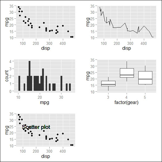
geom_point(): This will create a scatter plotgeom_line(): This will create a line chartgeom_bar(): This will create a bar chartgeom_boxplot(): This will create a box plotgeom_text(): This will write certain text inside the plot area
Now, we will see a simple example of the use of different geom functions with the default mtcars dataset in R:
# loading ggplot2 library
library(ggplot2)
# creating a basic ggplot object
p <- ggplot(data=mtcars)
# Creating scatter plot of mpg and disp variable
p1 <- p+geom_point(aes(x=disp,y=mpg))
# creating line chart from the same ggplot object but different
# geom function
p2 <- p+geom_line(aes(x=disp,y=mpg))
# creating bar chart of mpg variable
p3 <- p+geom_bar(aes(x=mpg))
# creating boxplot of mpg over gear
p4 <- p+geom_boxplot(aes(x=factor(gear),y=mpg))
# writing certain text into the scatter plot
p5 <- p1+geom_text(x=200,y=25,label="Scatter plot")
The visualization of the preceding five plots will look like the following figure: