
Cluster analysis can be performed using a variety of algorithms; some of them are listed in the following table:
Within an algorithm, there are finer levels of granularity as well, including:
In R programming, we have clustering tools for:
K-means clustering
K-medoids clustering
Hierarchical clustering
Expectation-maximization
Density estimation
K-means clustering is a method of partitioning the dataset into k clusters. You need to predetermine the number of clusters you want to divide the dataset into. The k-means algorithm has the following steps:
Select k random rows (centroids) from your data (you have a predetermined number of clusters to use).
We are using Lloyd's algorithm (the default) to determine clusters.
Assign each data point according to its closeness to a centroid.
Recalculate each centroid as an average of all the points associated with it.
Reassign each data point as closest to a centroid.
Continue with steps 3 and 4 until data points are no longer assigned or you have looped some maximum number of times.
This is a heuristic algorithm, so it is a good idea to run the process several times. It will normally run quickly in R, as the work in each step is not difficult. The objective is to minimize the sum of squares by constant refining of the terms.
Predetermining the number of clusters may be problematic. Graphing the data (or its squares or the like) should present logical groupings for your data visually. You can determine group sizes by iterating through the steps to determine the cutoff for selection (we will use that later in this chapter). There are other R packages that will attempt to compute this as well. You should also verify the fit of the clusters selected upon completion.
Using an average (in step 3) shows that k-means does not work well with fairly sparse data or data with a larger number of outliers. Furthermore, there can be a problem if the cluster is not in a nice, linear shape. Graphical representation should prove whether your data fits this algorithm.
K-means clustering is performed in R programming with the
kmeans function. The R programming usage of k-means clustering follows the convention given here (note that you can always determine the conventions for a function using the inline help function, for example, ?kmeans, to get this information):
kmeans(x,
centers,
iter.max = 10,
nstart = 1,
algorithm = c("Hartigan-Wong",
                        "Lloyd",
                        "Forgy",
                        "MacQueen"),
trace=FALSE)
The various parameters are explained in the following table:
Calling the kmeans function returns a kmeans object with the following properties:
|
Property |
Description |
|---|---|
|
| |
|
| |
|
| |
|
| |
|
| |
|
| |
|
| |
|
| |
|
|
First, generate a hundred pairs of random numbers in a normal distribution and assign it to the matrix x as follows:
>x <- rbind(matrix(rnorm(100, sd = 0.3), ncol = 2),
                     matrix(rnorm(100, mean = 1, sd = 0.3), ncol = 2))
We can display the values we generate as follows:
>x
                [,1]          [,2]
  [1,]  0.4679569701  -0.269074028
  [2,] -0.5030944919  -0.393382748
  [3,] -0.3645075552  -0.304474590
…
 [98,]  1.1121388866   0.975150551
 [99,]  1.1818402912   1.512040138
[100,]  1.7643166039   1.339428999
The the resultant kmeans object values can be determined and displayed (using 10 clusters) as follows:
> fit <- kmeans(x,10)
> fit
K-means clustering with 10 clusters of sizes 4, 12, 10, 7, 13, 16, 8, 13, 8, 9
Cluster means:
          [,1]        [,2]
1   0.59611989  0.77213527
2   1.09064550  1.02456563
3  -0.01095292  0.41255130
4   0.07613688 -0.48816360
5   1.04043914  0.78864770
6   0.04167769 -0.05023832
7   0.47920281 -0.05528244
8   1.03305030  1.28488358
9   1.47791031  0.90185427
10 -0.28881626 -0.26002816
Clustering vector:
  [1]  7 10 10  6  7  6  3  3  7 10  4  7  4  7  6  7  6  6  4  3 10  4  3  6 10  6  6  3  6 10  3  6  4  3  6  3  6  6  6  7  3  4  6  7  6 10  4 10  3 10  5  2  9  2
 [55]  9  5  5  2  5  8  9  8  1  2  5  9  5  2  5  8  1  5  8  2  8  8  5  5  8  1  1  5  8  9  9  8  5  2  5  8  2  2  9  2  8  2  8  2  8  9
Within cluster sum of squares by cluster:
 [1] 0.09842712 0.23620192 0.47286373 0.30604945 0.21233870 0.47824982 0.36380678 0.58063931 0.67803464 0.28407093
 (between_SS / total_SS =  94.6 %)
Available components:
[1] "cluster"      "centers"      "totss"        "withinss"     "tot.withinss" "betweenss"    "size"         "iter"         "ifault"
If we look at the results, we find some interesting data points:
The
Cluster meansshows the breakdown of the means used for the cluster assignments.The
Clustering vectorshows which cluster each of the 100 numbers was assigned to.The
Cluster sum of squaresshows thetotssvalue, as described in the output.The percentage value is the
betweenssvalue divided as a percentage of thetotssvalue. At 94.6 percent, we have a very good fit.
We chose an arbitrary cluster size of 10, but we should verify that this is a good number to use. If we were to run the kmeans function a number of times using a range of cluster sizes, we would end up with a graph that looks like the one in the following example.
For example, if we ran the following code and recorded the results, the output will be as follows:
results <- matrix(nrow=14, ncol=2, dimnames=list(2:15,c("clusters","sumsquares")))
for(i in 2:15) {
  fit <- kmeans(x,i)
  results[i-1,1] <- i
  results[i-1,2] <- fit$totss
}
plot(results)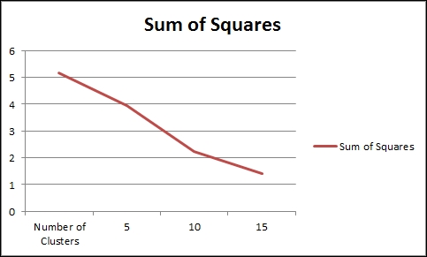
If the data were more distributed, there would be a clear demarcation about the maximum number of clusters, as further clustering will show no improvement in the sum of squares. However, since we used very smooth data for the test, the number of clusters could be allowed to increase.
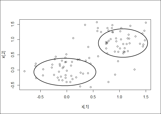
Once your clusters have been determined, you should be able to gather a visual representation, as shown in the following plot:
K-medoids clustering is another method of determining the clusters in a dataset. A medoid is an entity of the dataset that represents the group to which it was inserted. K-means works with centroids, which are artificially created to represent a cluster. So, a medoid is actually part of the dataset. A centroid is a derived amount.
When partitioning around medoids, make sure that the following points are taken care of:
Each entity is assigned to only one cluster
Each entity is assigned to the medoid that defines its cluster
Exactly k clusters are defined
The algorithm has two phases with several steps:
Build phase: During the build phase, we come up with initial estimates for the clusters:
Swap phase: In the swap phase, we fine-tune our initial estimates given the rough clusters determined in the build phase:
Search each cluster for the entity that lowers the average dissimilarity coefficient the most and therefore makes it the medoid for the cluster.
If any medoid has changed, start from step 3 of the build phase again.
K-medoid clustering is calculated in R programming with the pam function:
pam(x, k, diss, metric, medoids, stand, cluster.only, do.swap, keep.diss, keep.data, trace.lev)
The various parameters of the pam function are explained in the following table:
The results returned from the pam function can be displayed, which is rather difficult to interpret, or the results can be plotted, which is intuitively more understandable.
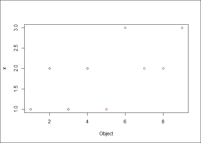
Using a simple set of data with two (visually) clear clusters as follows, as stored in a file named medoids.csv:
|
Object |
x |
y |
|---|---|---|
|
1 |
1 |
10 |
|
2 |
2 |
11 |
|
3 |
1 |
10 |
|
4 |
2 |
12 |
|
5 |
1 |
4 |
|
6 |
3 |
5 |
|
7 |
2 |
6 |
|
8 |
2 |
5 |
|
9 |
3 |
6 |
Let's use the pam function on the medoids.csv file as follows:
# load pam function
> library(cluster)

#load the table from a file
> x <- read.table("medoids.csv", header=TRUE, sep=",")

#execute the pam algorithm with the dataset created for the example
> result <- pam(x, 2, FALSE, "euclidean")
Looking at the result directly we get:
> result
Medoids:
     ID Object x  y
[1,]  2      2 2 11
[2,]  7      7 2  6
Clustering vector:
[1] 1 1 1 1 2 2 2 2 2
Objective function:
   build     swap
1.564722 1.564722
Available components:
 [1] "medoids"    "id.med"     "clustering" "objective"  "isolation"
[6] "clusinfo"   "silinfo"    "diss"       "call"       "data"
Evaluating the results we can see:
We specified the use of two medoids, and row 3 and 6 were chosen
The rows were clustered as presented in the
clustering vector(as expected, about half in the first medoid and the rest in the other medoid)The function did not change greatly from the
buildphase to theswapphase (looking at theObjective functionvalues for build and swap of 1.56 versus 1.56)
Using a summary for a clearer picture, we see the following result:
> summary(result)
Medoids:
     ID Object x  y
[1,]  2      2 2 11
[2,]  7      7 2  6
Clustering vector:
[1] 1 1 1 1 2 2 2 2 2
Objective function:
   build     swap
1.564722 1.564722

Numerical information per cluster:
sizemax_dissav_diss diameter separation
[1,]    4 2.236068 1.425042 3.741657   5.744563
[2,]    5 3.000000 1.676466 4.898979   5.744563

Isolated clusters:
 L-clusters: character(0)
 L*-clusters: [1] 1 2

Silhouette plot information:
  cluster neighbor sil_width
2       1        2 0.7575089
3       1        2 0.6864544
1       1        2 0.6859661
4       1        2 0.6315196
8       2        1 0.7310922
7       2        1 0.6872724
6       2        1 0.6595811
9       2        1 0.6374808
5       2        1 0.5342637
Average silhouette width per cluster:
[1] 0.6903623 0.6499381
Average silhouette width of total data set:
[1] 0.6679044

36 dissimilarities, summarized :
   Min. 1st Qu.  Median    Mean 3rd Qu.    Max.
 1.4142  2.3961  6.2445  5.2746  7.3822  9.1652
Metric :  euclidean
Number of objects : 9

Available components:
 [1] "medoids"    "id.med"     "clustering" "objective"  "isolation"
 [6] "clusinfo"   "silinfo"    "diss"       "call"       "data"
Tip
Downloading the example code
You can download the example code files from your account at http://www.packtpub.com for all the Packt Publishing books you have purchased. If you purchased this book elsewhere, you can visit http://www.packtpub.com/support and register to have the files e-mailed directly to you.
The summary presents more details on the medoids and how they were selected. However, note the dissimilarities as well.
Plotting the data, we can see the following output:
#plot a graphic showing the clusters and the medoids of each cluster
> plot(result$data, col = result$clustering)
The resulting plot is as we expected it to be. It is good to see the data clearly broken into two medoids, both spatially and by color demarcation.
Hierarchical clustering is a method to ascertain clusters in a dataset that are in a hierarchy.
Using hierarchical clustering, we are attempting to create a hierarchy of clusters. There are two approaches of doing this:
The resulting hierarchy is normally displayed using a tree/graph model of a dendogram.
Hierarchical clustering is performed in R programming with the hclust function.
The hclust function is called as follows:
hclust(d, method = "complete", members = NULL)
The various parameters of the hclust function are explained in the following table:
We start by generating some random data over a normal distribution using the following code:
> dat <- matrix(rnorm(100), nrow=10, ncol=10)

> dat
            [,1]       [,2]        [,3]        [,4]        [,5]       [,6]
 [1,]  1.4811953 -1.0882253 -0.47659922  0.22344983 -0.74227899  0.2835530
 [2,] -0.6414931 -1.0103688 -0.55213606 -0.48812235  1.41763706  0.8337524
 [3,]  0.2638638  0.2535630 -0.53310519  2.27778665 -0.09526058  1.9579652
[4,] -0.50307726 -0.3873578 -1.54407287 -0.1503834
Then, we calculate the hierarchical distribution for our data as follows:
> hc <- hclust(dist(dat))
> hc
Call:
hclust(d = dist(dat))

Cluster method   : complete
Distance         : euclidean
Number of objects: 10
The resulting data object is very uninformative. We can display the hierarchical cluster using a dendogram, as follows:
>plot(hc)
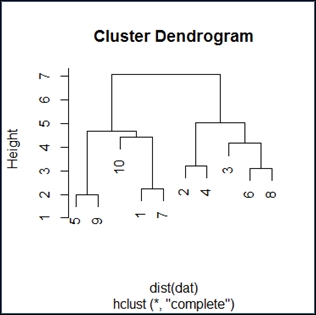
The dendogram has the expected shape. I find these diagrams somewhat unclear, but if you go over them in detail, the inference will be as follows:
Reading the diagram in a top-down fashion, we see it has two distinct branches. The implication is that there are two groups that are distinctly different from one another. Within the two branches, we see 10 and 3 as distinctly different from the rest. Generally, it appears that we have determined there are an even group and an odd group, as expected.
Reading the diagram bottom up, we see closeness and similarity over a number of elements. This would be expected from a simple random distribution.
Expectation-maximization (EM) is the process of estimating the parameters in a statistical model.
For a given model, we have the following parameters:
X: This is a set of observed dataZ: This is a set of missing valuesT: This is a set of unknown parameters that we should apply to our model to predictZ
The steps to perform expectation-maximization are as follows:
Initialize the unknown parameters (
T) to random values.Compute the best missing values (
Z) using the new parameter values.Use the best missing values (
Z), which were just computed, to determine a better estimate for the unknown parameters (T).Iterate over steps 2 and 3 until we have a convergence.
This version of the algorithm produces hard parameter values (Z). In practice, soft values may be of interest where probabilities are assigned to various values of the parameters (Z). By hard values, I mean we are selecting specific Z values. We could instead use soft values where Z varies by some probability distribution.
We use EM in R programming with the Mclust function from the mclust library. The full description of Mclust is the normal mixture modeling fitted via EM algorithm for model-based clustering, classification, and density estimation, including Bayesian regularization.
The Mclust function is as follows:
Mclust(data, G = NULL, modelNames = NULL,
        prior = NULL, control = emControl(),
        initialization = NULL, warn = FALSE, ...)
The various parameters of the Mclust function are explained in the following table:
The Mclust function uses a model when trying to decide which items belong to a cluster. There are different model names for univariate, multivariate, and single component datasets. In each, the idea is to select a model that describes the data, for example, VII will be used for data that is spherically displaced with equal volume across each cluster.
|
Model |
Type of dataset |
|---|---|
|
Univariate mixture | |
|
E |
equal variance (one-dimensional) |
|
V |
variable variance (one-dimensional) |
|
Multivariate mixture | |
|
EII |
spherical, equal volume |
|
VII |
spherical, unequal volume |
|
EEI |
diagonal, equal volume and shape |
|
VEI |
diagonal, varying volume, equal shape |
|
EVI |
diagonal, equal volume, varying shape |
|
VVI |
diagonal, varying volume and shape |
|
EEE |
ellipsoidal, equal volume, shape, and orientation |
|
EEV |
ellipsoidal, equal volume and equal shape |
|
VEV |
ellipsoidal, equal shape |
|
VVV |
ellipsoidal, varying volume, shape, and orientation |
|
Single component | |
|
X |
univariate normal |
|
XII | |
|
XXI |
diagonal multivariate normal |
|
XXX |
ellipsoidal multivariate normal |
First, we must load the library that contains the mclust function (we may need to install it in the local environment) as follows:
> install.packages("mclust")
> library(mclust)
We will be using the iris data in this example, as shown here:
> data <- read.csv("http://archive.ics.uci.edu/ml/machine-learning-databases/iris/iris.data")Now, we can compute the best fit via EM (note capitalization of Mclust) as follows:
> fit <- Mclust(data)
We can display our results as follows:
> fit
'Mclust' model object:
 best model: ellipsoidal, equal shape (VEV) with 2 components

> summary(fit)
----------------------------------------------------
Gaussian finite mixture model fitted by EM algorithm
----------------------------------------------------
Mclust VEV (ellipsoidal, equal shape) model with 2 components:

 log.likelihood   n df       BIC       ICL
      -121.1459 149 37 -427.4378 -427.4385

Clustering table:
  1   2
 49 100
Simple display of the fit data object doesn't tell us very much, it shows just what was used to compute the density of the dataset.
The summary command presents more detailed information about the results, as listed here:
log.likelihood (-121): This is the log likelihood of the BIC valuen (149): This is the number of data pointsdf (37): This is the distributionBIC (-427): This is the Bayesian information criteria; this is an optimal valueICL (-427): Integrated Complete Data Likelihood—a classification version of the BIC. As we have the same value for ICL and BIC we classified the data points.
We can plot the results for a visual verification as follows:
> plot(fit)
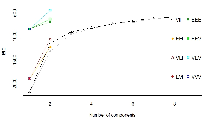
You will notice that the plot command for EM produces the following four plots (as shown in the graph):
The BIC values used for choosing the number of clusters
A plot of the clustering
A plot of the classification uncertainty
The orbital plot of clusters
The following graph depicts the plot of density.
The first plot gives a depiction of the BIC ranges versus the number of components by different model names; in this case, we should probably not use VEV, for example:
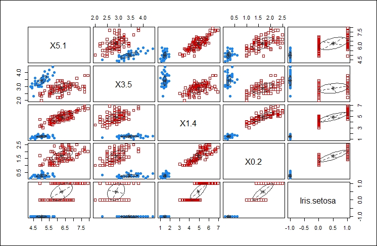
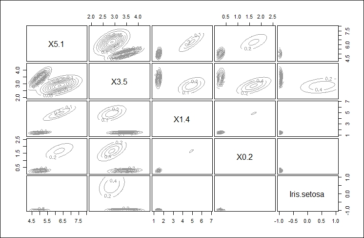
This second plot shows the comparison of using each of the components of the data feed against every other component of the data feed to determine the clustering that would result. The idea is to select the components that give you the best clustering of your data. This is one of those cases where your familiarity with the data is key to selecting the appropriate data points for clustering.
In this case, I think selecting X5.1 and X1.4 yield the tightest clusters, as shown in the following graph:
.
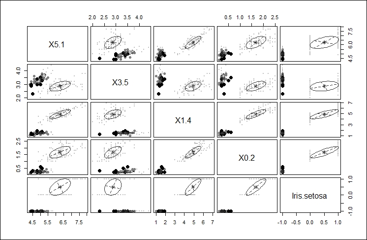
The third plot gives another iteration of the clustering affects of the different choices highlighting the main cluster by eliminating any points from the plot that would be applied to the main cluster, as shown here:
The final, fourth plot gives an orbital view of each of the clusters giving a highlight display of where the points might appear relative to the center of each cluster, as shown here:
Density estimation is the process of estimating the probability density function of a population given in an observation set. The density estimation process takes your observations, disperses them across a number of data points, runs a FF transform to determine a kernel, and then runs a linear approximation to estimate density.
Density estimation produces an estimate for the unobservable population distribution function. Some approaches that are used to produce the density estimation are as follows:
Parzen windows: In this approach, the observations are placed in a window and density estimates are made based on proximity
Vector quantization: This approach lets you model the probability density functions as per the distribution of observations
Histograms: With a histogram, you get a nice visual showing density (size of the bars); the number of bins chosen while developing the histogram decide your density outcome
Density estimation is performed via the density function in R programming. Other functions for density evaluation in R are:
|
Function |
Description |
|---|---|
|
|
This function determines clustering for fixed point clusters |
|
|
This function determines clustering for wide distribution clusters |
The
density function is invoked as follows:
density(x, bw = "nrd0", adjust = 1,
        kernel = c("gaussian", "epanechnikov",
                   "rectangular",
                   "triangular", "biweight",
                   "cosine", "optcosine"),
        weights = NULL, window = kernel, width,
        give.Rkern = FALSE,
        n = 512, from, to, na.rm = FALSE, ...)
The various parameters of the density function are explained in the following table:
The available bandwidths can be found using the following commands:
bw.nrd0(x)

bw.nrd(x)

bw.ucv(x, nb = 1000, lower = 0.1 * hmax, upper = hmax, tol = 0.1 * lower)

bw.bcv(x, nb = 1000, lower = 0.1 * hmax, upper = hmax, tol = 0.1 * lower)

bw.SJ(x, nb = 1000, lower = 0.1 * hmax, upper = hmax, method =
  c("ste", "dpi"), tol = 0.1 * lower)
The various parameters of the bw function are explained in the following table:
We can use the iris dataset as follows:
> data <- read.csv("http://archive.ics.uci.edu/ml/machine-learning-databases/iris/iris.data")
The density of the X5.1 series (sepal length) can be computed as follows:
> d <- density(data$X5.1)
> d
Call:
density.default(x = data$X5.1)
Data: data$X5.1 (149 obs.);  Bandwidth 'bw' = 0.2741
       x               y
 Min.:3.478   Min.   :0.0001504
 1st Qu.:4.789   1st Qu.:0.0342542
 Median :6.100   Median :0.1538908
 Mean   :6.100   Mean   :0.1904755
 3rd Qu.:7.411   3rd Qu.:0.3765078
 Max.   :8.722   Max.   :0.3987472
We can plot the density values as follows:
> plot(d)
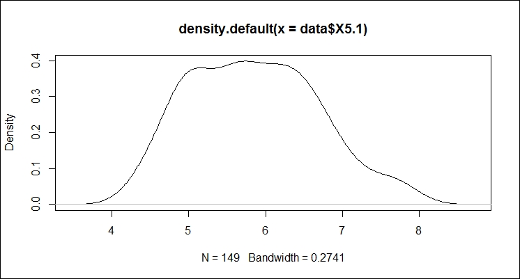
The plot shows most of the data occurring between 5 and 7. So, sepal length averages at just under 6.