

Simple visualizations like those earlier are succinct ways of conveying a large quantity of information. They complement the summary statistics we calculated earlier in the chapter, and it's important that we use them. Statistics such as the mean and standard deviation necessarily conceal a lot of information as they reduce a sequence down to just a single number.
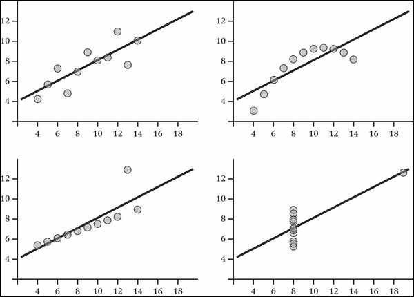
The statistician Francis Anscombe devised a collection of four scatter plots, known as Anscombe's Quartet, that have nearly identical statistical properties (including the mean, variance, and standard deviation). In spite of this, it's visually apparent that the distribution of xs and ys are all very different:
Datasets don't have to be contrived to reveal valuable insights when graphed. Take for example this histogram of the marks earned by candidates in Poland's national Matura exam in 2013:
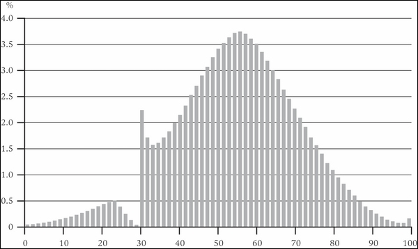
We might expect the abilities of students to be normally distributed and indeed—with the exception of a sharp spike around 30 percent —it is. What we can clearly see is the very human effect of examiners nudging student's grades over the pass mark.
In fact, the distributions for sequences drawn from large samples can be so reliable that any deviation from them can be evidence of illegal activity. Benford's law, also called the first-digit law, is a curious feature of random numbers generated over a large range. One occurs as the leading digit about 30 percent of the time, while larger digits occur less and less frequently. For example, nine occurs as the leading digit less than 5 percent of the time.
Note
Benford's law is named after physicist Frank Benford who stated it in 1938 and showed its consistency across a wide variety of data sources. It had been previously observed by Simon Newcomb over 50 years earlier, who noticed that the pages of his books of logarithm tables were more battered for numbers beginning with the digit one.
Benford showed that the law applied to data as diverse as electricity bills, street addresses, stock prices, population numbers, death rates, and lengths of rivers. The law is so consistent for data sets covering large ranges of values that deviation from it has been accepted as evidence in trials for financial fraud.
Let's return to the election data and compare the electorate sequence we created earlier against the theoretical normal distribution CDF. We can use Incanter's s/cdf-normal function to generate a normal CDF from a sequence of values. The default mean is 0 and standard deviation is 1, so we'll need to provide the measured mean and standard deviation from the electorate data. These values for our electorate data are 70,150 and 7,679, respectively.
We generated an empirical CDF earlier in the chapter. The following example simply generates each of the two CDFs and plots them on a single c/xy-plot:
(defn ex-1-24 []
  (let [electorate (->> (load-data :uk-scrubbed)
                        (i/$ "Electorate"))
        ecdf   (s/cdf-empirical electorate)
        fitted (s/cdf-normal electorate
                             :mean (s/mean electorate)
                             :sd   (s/sd electorate))]
    (-> (c/xy-plot electorate fitted
                   :x-label "Electorate"
                   :y-label "Probability"
                   :series-label "Fitted"
                   :legend true)
        (c/add-lines electorate (map ecdf electorate)
                     :series-label "Empirical")
        (i/view))))
The preceding example generates the following plot:
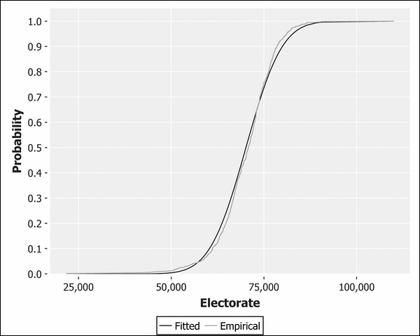
You can see from the proximity of the two lines to each other how closely this data resembles normality, although a slight skew is evident. The skew is in the opposite direction to the dishonest baker CDF we plotted previously, so our electorate data is slightly skewed to the left.
As we're comparing our distribution against the theoretical normal distribution, let's use a Q-Q plot, which will do this by default:
(defn ex-1-25 []
  (->> (load-data :uk-scrubbed)
       (i/$ "Electorate")
       (c/qq-plot)
       (i/view)))
The following Q-Q plot does an even better job of highlighting the left skew evident in the data:
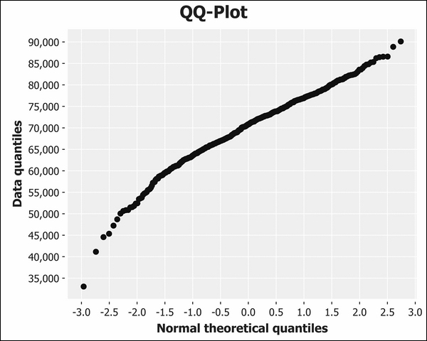
As we expected, the curve bows in the opposite direction to the dishonest baker Q-Q plot earlier in the chapter. This indicates that there is a greater number of constituencies that are smaller than we would expect if the data were more closely normally distributed.