Book Image

Python Data Analysis Cookbook

By : Ivan Idris
Book Image

Python Data Analysis Cookbook

By: Ivan Idris

Overview of this book

Data analysis is a rapidly evolving field and Python is a multi-paradigm programming language suitable for object-oriented application development and functional design patterns. As Python offers a range of tools and libraries for all purposes, it has slowly evolved as the primary language for data science, including topics on: data analysis, visualization, and machine learning. Python Data Analysis Cookbook focuses on reproducibility and creating production-ready systems. You will start with recipes that set the foundation for data analysis with libraries such as matplotlib, NumPy, and pandas. You will learn to create visualizations by choosing color maps and palettes then dive into statistical data analysis using distribution algorithms and correlations. You’ll then help you find your way around different data and numerical problems, get to grips with Spark and HDFS, and then set up migration scripts for web mining. In this book, you will dive deeper into recipes on spectral analysis, smoothing, and bootstrapping methods. Moving on, you will learn to rank stocks and check market efficiency, then work with metrics and clusters. You will achieve parallelism to improve system performance by using multiple threads and speeding up your code. By the end of the book, you will be capable of handling various data analysis techniques in Python and devising solutions for problem scenarios.
Table of Contents (23 chapters)
Python Data Analysis Cookbook
Credits
About the Author
About the Reviewers
www.PacktPub.com
Preface
Glossary
Index

Viewing a matrix of scatterplots


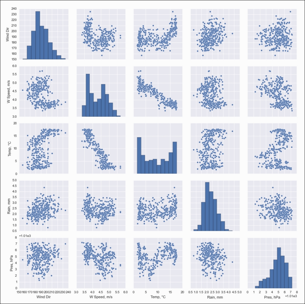
If you don't have many variables in your dataset, it is a good idea to view all the possible scatterplots for your data. You can do this with one function call from either seaborn or pandas. These functions display a matrix of plots with kernel density estimation plots or histograms on the diagonal.

How to do it...

  1. Imports the following:

    import pandas as pd
    from dautil import data
    from dautil import ts
    import matplotlib.pyplot as plt
    import seaborn as sns
    import matplotlib as mpl
  2. Load the weather data with the following lines:

    df = data.Weather.load()
    df = ts.groupby_yday(df).mean()
    df.columns = [data.Weather.get_header(c) for c in df.columns]
  3. Plot with the Seaborn pairplot() function, which plots histograms on the diagonal by default:

    %matplotlib inline
    
    # Seaborn plotting, issues due to NaNs
    sns.pairplot(df.fillna(0))

    The following plots are the result:

  4. Plot similarly with the pandas scatter_matrix() function and request kernel density estimation plots on the diagonal...