Book Image

Getting Started with Python Data Analysis

Book Image

Getting Started with Python Data Analysis

Overview of this book

Data analysis is the process of applying logical and analytical reasoning to study each component of data. Python is a multi-domain, high-level, programming language. It’s often used as a scripting language because of its forgiving syntax and operability with a wide variety of different eco-systems. Python has powerful standard libraries or toolkits such as Pylearn2 and Hebel, which offers a fast, reliable, cross-platform environment for data analysis. With this book, we will get you started with Python data analysis and show you what its advantages are. The book starts by introducing the principles of data analysis and supported libraries, along with NumPy basics for statistic and data processing. Next it provides an overview of the Pandas package and uses its powerful features to solve data processing problems. Moving on, the book takes you through a brief overview of the Matplotlib API and some common plotting functions for DataFrame such as plot. Next, it will teach you to manipulate the time and data structure, and load and store data in a file or database using Python packages. The book will also teach you how to apply powerful packages in Python to process raw data into pure and helpful data using examples. Finally, the book gives you a brief overview of machine learning algorithms, that is, applying data analysis results to make decisions or build helpful products, such as recommendations and predictions using scikit-learn.
Table of Contents (15 chapters)
Getting Started with Python Data Analysis
Credits
About the Authors
About the Reviewers
www.PacktPub.com
Preface
Index

Time series plotting


Pandas comes with great support for plotting, and this holds true for time series data as well.

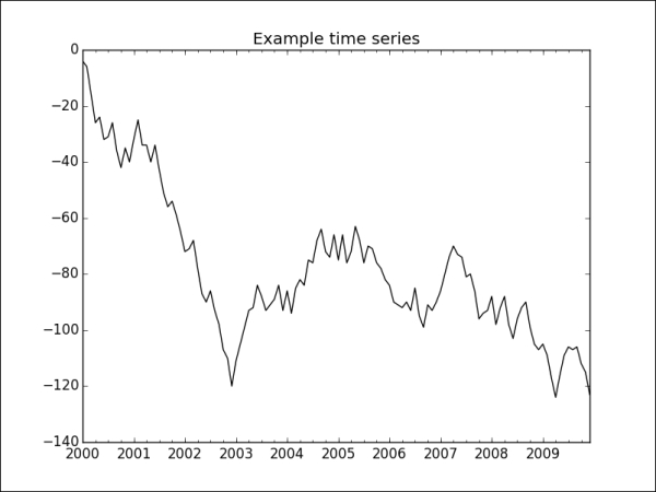
As a first example, let's take some monthly data and plot it:

>>> rng = pd.date_range(start='2000', periods=120, freq='MS')
>>> ts = pd.Series(np.random.randint(-10, 10, size=len(rng)), rng).cumsum()
>>> ts.head()
2000-01-01    -4
2000-02-01    -6
2000-03-01   -16
2000-04-01   -26
2000-05-01   -24
Freq: MS, dtype: int64

Since matplotlib is used under the hood, we can pass a familiar parameter to plot, such as c for color, or title for the chart title:

>>> ts.plot(c='k', title='Example time series')
>>> plt.show()

The following figure shows an example time series plot:

We can overlay an aggregate plot over 2 and 5 years:

>>> ts.resample('2A').plot(c='0.75', ls='--')
>>> ts.resample('5A').plot(c='0.25', ls='-.')

The following figure shows the resampled 2-year plot:

The following figure shows the resample 5-year plot...