Book Image

Tableau 10 Business Intelligence Cookbook

By : Donabel Santos, Paul Banoub
Book Image

Tableau 10 Business Intelligence Cookbook

By: Donabel Santos, Paul Banoub

Overview of this book

Tableau is a software tool that can speed up data analysis through its rich visualization capabilities, and help uncover insights for better and smarter decision making. This book is for the business, technology, data and analytics professionals who use and analyze data and data-driven approaches to support business operations and strategic initiatives in their organizations. This book provides easy-to-follow recipes to get the reader up and running with Tableau 10, and covers basic to advanced use cases and scenarios. The book starts with building basic charts in Tableau and moves on to building more complex charts by incorporating different Tableau features and interactivity components. There is an entire chapter dedicated to dashboard techniques and best practices. A number of recipes specifically for geospatial visualization, analytics, and data preparation are also covered. By the end of this book, you’ll have gained confidence and competence to analyze and communicate data and insights more efficiently and effectively by creating compelling interactive charts, dashboards, and stories in Tableau.
Table of Contents (17 chapters)
Tableau 10 Business Intelligence Cookbook
Credits
About the Author
Acknowledgements
About the Reviewer
www.PacktPub.com
Preface
Index

Performing cluster analysis


Borrowing from the Wikipedia definition:

"cluster analysis or clustering is the task of grouping a set of objects in such a way that objects in the same group (called a cluster) are more similar (in some sense or another) to each other than to those in other groups (clusters)."

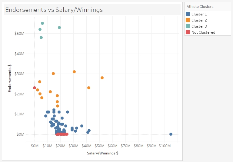
In this recipe, we will try out the new clustering feature introduced in Tableau 10 to group athletes based on endorsements and salary/winnings:

Getting ready

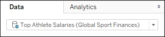
To follow this recipe, open B05527_06 – STARTER.twbx. Use the worksheet called Cluster and connect to the Top Athlete Salaries (Global Sport Finances) data source:

How to do it...

Here are the steps to create the scatter plot with clusters:

  1. Click on the dropdown in the Marks card and change the mark to Circle.

  2. From Measures, drag Salary/Winnings $ to Columns.

  3. From Measures, drag Endorsements $ to Rows.

  4. From Dimensions, drag Athlete to Detail.

  5. On the side bar, click on the Analytics tab to activate it.

  6. Under Model, drag Cluster to your view...