Book Image

Java Data Analysis

By : John R. Hubbard
Book Image

Java Data Analysis

By: John R. Hubbard

Overview of this book

Data analysis is a process of inspecting, cleansing, transforming, and modeling data with the aim of discovering useful information. Java is one of the most popular languages to perform your data analysis tasks. This book will help you learn the tools and techniques in Java to conduct data analysis without any hassle. After getting a quick overview of what data science is and the steps involved in the process, you’ll learn the statistical data analysis techniques and implement them using the popular Java APIs and libraries. Through practical examples, you will also learn the machine learning concepts such as classification and regression. In the process, you’ll familiarize yourself with tools such as Rapidminer and WEKA and see how these Java-based tools can be used effectively for analysis. You will also learn how to analyze text and other types of multimedia. Learn to work with relational, NoSQL, and time-series data. This book will also show you how you can utilize different Java-based libraries to create insightful and easy to understand plots and graphs. By the end of this book, you will have a solid understanding of the various data analysis techniques, and how to implement them using Java.
Table of Contents (20 chapters)
Java Data Analysis
Credits
About the Author
About the Reviewers
www.PacktPub.com
Customer Feedback
Preface
Index

Tables and graphs


Most datasets are still maintained in tabular form, as in Figure 2-12, but tables with thousands of rows and many columns are far more common than that simple example. Even when many of the data fields are text or Boolean, a graphical summary can be much easier to comprehend.

There are several different ways to represent data graphically. In addition to more imaginative displays, such as Minard's map (Figure 3-1), we review the more standard methods here.

Scatter plots

A scatter plot, also called a scatter chart, is simply a plot of a dataset whose signature is two numeric values. If we label the two fields x and y, then the graph is simply a two-dimensional plot of those (x, y) points.

Scatter plots are easy to do in Excel. Just enter the numeric data in two columns and then select Insert | All Charts | X Y (Scatter). Here is a simple example:

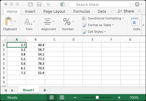
Figure 3-2. Excel data

The given data is shown in Figure 3-2 and its corresponding scatter plot is in Figure 3-3:

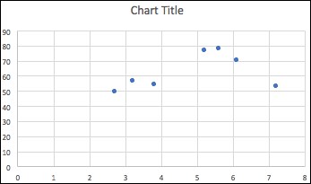
Figure 3-3. Scatter...