
After applying the mathematical transformations discussed in the previous section, we will often be left with what is known as a stationary (or weakly stationary) time series, which is characterized by a constant mean E(xt) and correlation that depends only on the time lag between two time steps, but independent of the value of the time step. This type of covariance is the key in time series analysis and is called autocovariance or autocorrelation when normalized to the range of -1 to 1. Autocorrelation is therefore expressed as the second order moment E(xt,xt+h) = g(h) that evidently is a function of only the time lag h and independent of the actual time index t. This special definition of autocorrelation ensures that it is a time-independent property and hence can be reliably used for making inference about future realization of the time series.
Autocorrelation reflects the degree of linear dependency between the time series at index t and the time series at indices t-h or t+h. A positive autocorrelation indicates that the present and future values of the time series move in the same direction, whereas negative values means that present and future values move in the opposite direction. If autocorrelation is close to zero, temporal dependencies within the series may be hard to find. Because of this property, autocorrelation is useful in predicting the future state of a time series at h time steps ahead.
Presence of autocorrelation can be identified by plotting the observed values of the autocorrelation function (ACF) for a given time series. This plot is commonly referred as the ACF plot. Let us illustrate how plotting the observed values of the ACF can help in detecting presence of autocorrelation. For this we first plot the daily value of Dow Jones Industrial Average (DJIA) observed during January 2016 to December 2016:
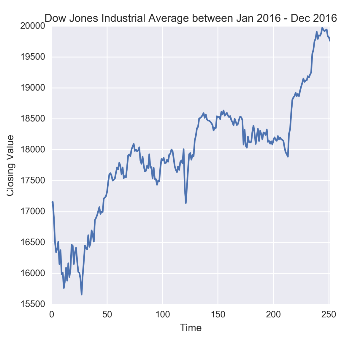
Figure 1.14: Time series of Dow Jones Industrial Average
From the preceding figure, it might be apparent that when DJIA starts rising, it continues to rise for some time and vice-versa. However, we must ascertain this through an ACF plot.
Note
The dataset for this plot has been downloaded from Yahoo! Finance (http://finance.yahoo.com) and kept as DJIA_Jan2016_Dec2016.xlsx under the datasets folder of this book's GitHub repository.
We will use pandas to read data from the Excel file and seaborn along with matplotlib to visualize the time series. Like before, we will also use the os package to set the working directory.
So let us first import these packages:
import os
import pandas as pd
%matplotlib inline
from matplotlib import pyplot as plt
import seaborn as sns
os.chdir('D:/Practical Time Series')
Next, we load the data as a pandas.DataFrame and display its first 10 rows to have a look at the columns of the dataset:
djia_df = pd.read_excel('datasets/DJIA_Jan2016_Dec2016.xlsx')
djia_df.head(10)
The preceding code displays the first 10 rows of the dataset as shown in the following table:
Date | Open | High | Low | Close | Adj Close | Volume | |
0 | 2016-01-04 | 17405.480469 | 17405.480469 | 16957.630859 | 17148.939453 | 17148.939453 | 148060000 |
1 | 2016-01-05 | 17147.500000 | 17195.839844 | 17038.609375 | 17158.660156 | 17158.660156 | 105750000 |
2 | 2016-01-06 | 17154.830078 | 17154.830078 | 16817.619141 | 16906.509766 | 16906.509766 | 120250000 |
3 | 2016-01-07 | 16888.359375 | 16888.359375 | 16463.630859 | 16514.099609 | 16514.099609 | 176240000 |
4 | 2016-01-08 | 16519.169922 | 16651.890625 | 16314.570313 | 16346.450195 | 16346.450195 | 141850000 |
5 | 2016-01-11 | 16358.709961 | 16461.849609 | 16232.030273 | 16398.570313 | 16398.570313 | 127790000 |
6 | 2016-01-12 | 16419.109375 | 16591.349609 | 16322.070313 | 16516.220703 | 16516.220703 | 117480000 |
7 | 2016-01-13 | 16526.630859 | 16593.509766 | 16123.200195 | 16151.410156 | 16151.410156 | 153530000 |
8 | 2016-01-14 | 16159.009766 | 16482.050781 | 16075.120117 | 16379.049805 | 16379.049805 | 158830000 |
9 | 2016-01-15 | 16354.330078 | 16354.330078 | 15842.110352 | 15988.080078 | 15988.080078 | 239210000 |
The first column in the preceding table is always the default row index created by the pandas.read_csv function.
We have used the closing value of DJIA, which is given in column Close, to illustrate autocorrelation and the ACF function. The time series plot has been generated as follows:
plt.figure(figsize=(5.5, 5.5))
g = sns.tsplot(djia_df['Close'])
g.set_title('Dow Jones Industrial Average between Jan 2016 - Dec 2016')
g.set_xlabel('Time')
g.set_ylabel('Closing Value')
Next, the ACF is estimated by computing autocorrelation for different values of lag h, which in this case is varied from 0 through 30. The Pandas.Series.autocorr function is used to calculate the autocorrelation for different values the lag. The code for this is given as follows:
lag = range(0,31)
   djia_acf = []
for l in lag:
    djia_acf.append(djia_df['Close'].autocorr(l))
The preceding code, iterates over a list of 31 values of the lag starting from 0 to 30. A lag of 0 indicates autocorrelation of an observation with itself (in other words self-correlation) and hence it is expected to be 1.0 as also confirmed in the following figure. Autocorrelation in DJIA Close values appears to linearly drop with the lag with an apparent change in the rate of the drop at around 18 days. At a lag of 30 days the ACF is a bit over 0.65.
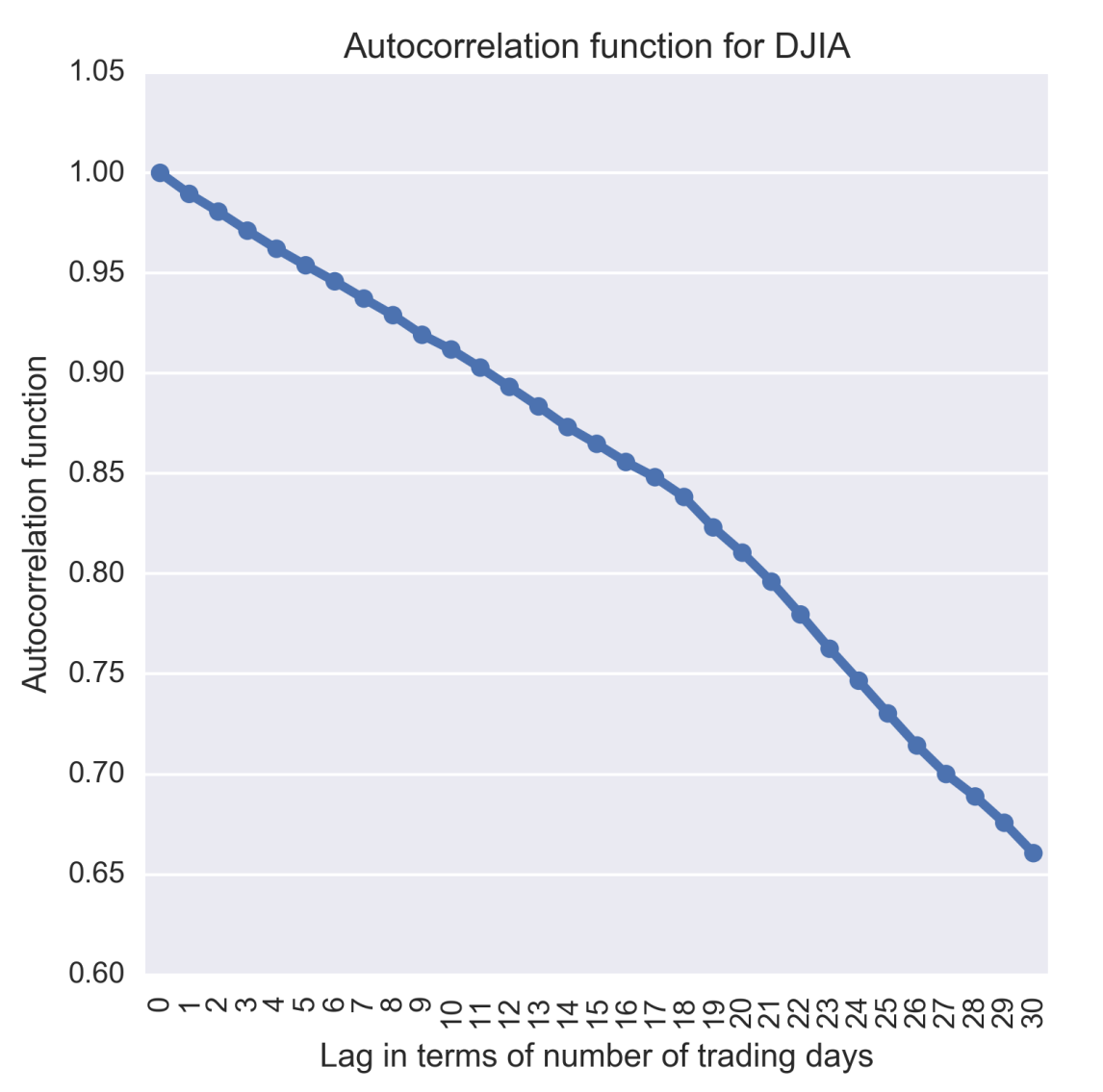
Figure 1.15: Autocorrelation of Dow Jones Industrial Average calculated for various lags
The preceding plot has been generated by the following code:
plt.figure(figsize=(5.5, 5.5))
g = sns.pointplot(x=lag, y=djia_acf, markers='.')
g.set_title('Autocorrelation function for DJIA')
g.set_xlabel('Lag in terms of number of trading days')
g.set_ylabel('Autocorrelation function')
g.set_xticklabels(lag, rotation=90)
plt.savefig('plots/ch2/B07887_02_11.png', format='png', dpi=300)
The ACF plot shows that autocorrelation, in the case of DJIA Close values, has a functional dependency on the time lag between observations.
Note
The code developed to run the analysis in this section is in the IPyton notebook Chapter1_Autocorrelation.ipynb under the code folder of the GitHub repository of this book.
We have written a for-loop to calculate the autocorrelation at different lags and plotted the results using the sns.pointplot function. Alternatively, the plot_acf function of statsmodels.graphics.tsaplots to compute and plot the autocorrelation at various lags. Additionally, this function also plots the 95% confidence intervals. Autocorrelation outside these confidence intervals is statistically significant correlation while those which are inside the confidence intervals are due to random noise. The autocorrelation and confidence intervals generated by the plot_acf is shown in the following figure:
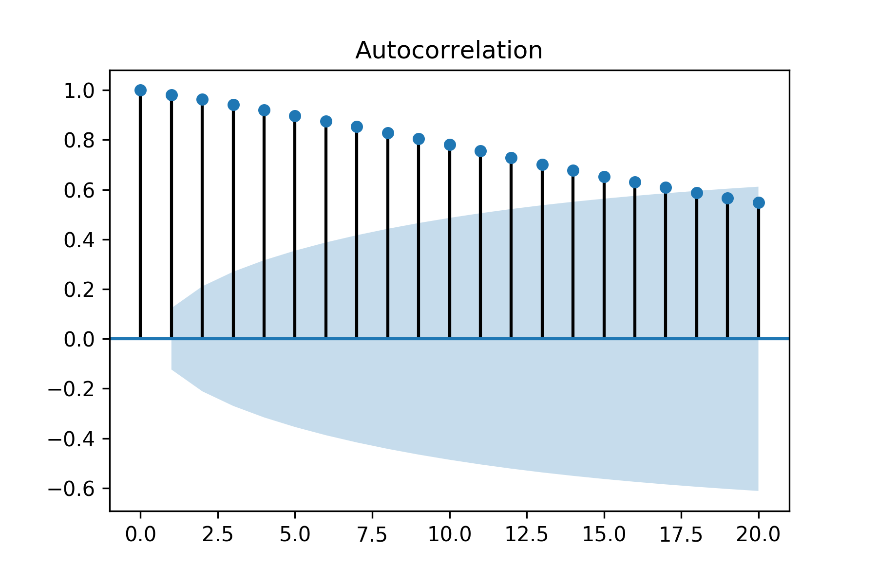
Figure 1.16: Autocorrelation of Dow Jones Industrial Average with 95% confidence intervals
So far, we have discussed autocorrelation which is a measure of linear dependency between variables x_t and x_(t+h). Autoregressive (AR) models captures this dependency as a linear regression between the x_(t+h) and x_t. However, time series tend to carry information and dependency structures in steps and therefore autocorrelation at lag h is also influenced by the intermediate variables x_t, x_(t+1)…x_(t+h-1). Therefore, autocorrelation is not the correct measure of the mutual correlation between x_t and x_(t+h) in the presence of the intermediate variables. Hence, it would erroneous to choose h in AR models based on autocorrelation. Partial autocorrelation solves this problem by measuring the correlation between x_t and x_(t+h) when the influence of the intermediate variables has been removed. Hence partial autocorrelation in time series analysis defines the correlation between x_t and x_(t+h) which is not accounted for by lags t+1 to t+h-1. Partial autocorrelation helps in identifying the order h of an AR(h) model. Let us plot the partial autocorrelation of DJIA Close Values using plot_pacf as follows:
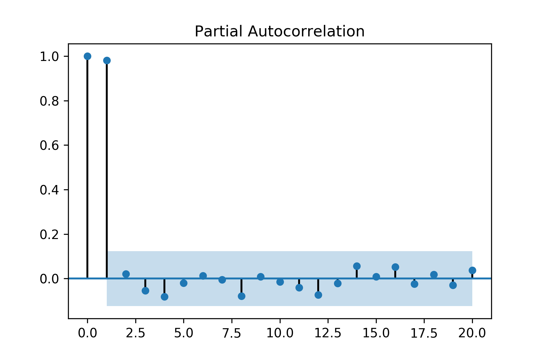
Figure 1.17: Partial autocorrelation of Dow Jones Industrial Average with 95% confidence intervals
The first partial autocorrelation at lag zero is always 1.0. As seen in the preceding figure, the partial autocorrelation only at lag one is statistically significant while for rest the lags it is within the 95% confidence intervals. Hence, for DJIA Close Values the order of AR models is one.