
In this section, we will conceptually explain the following special characteristics of time series data that requires its special mathematical treatment:
- General trend
- Seasonality
- Cyclical movements
- Unexpected variations
Most time series has of one or more of the aforementioned internal structures. Based on this notion, a time series can be expressed as xt = ft + st + ct + et, which is a sum of the trend, seasonal, cyclical, and irregular components in that order. Here, t is the time index at which observations about the series have been taken at t = 1,2,3 ...N successive and equally spaced points in time.
The objective of time series analysis is to decompose a time series into its constituent characteristics and develop mathematical models for each. These models are then used to understand what causes the observed behavior of the time series and to predict the series for future points in time.
When a time series exhibits an upward or downward movement in the long run, it is said to have a general trend. A quick way to check the presence of general trend is to plot the time series as in the following figure, which shows CO2 concentrations in air measured during 1974 through 1987:
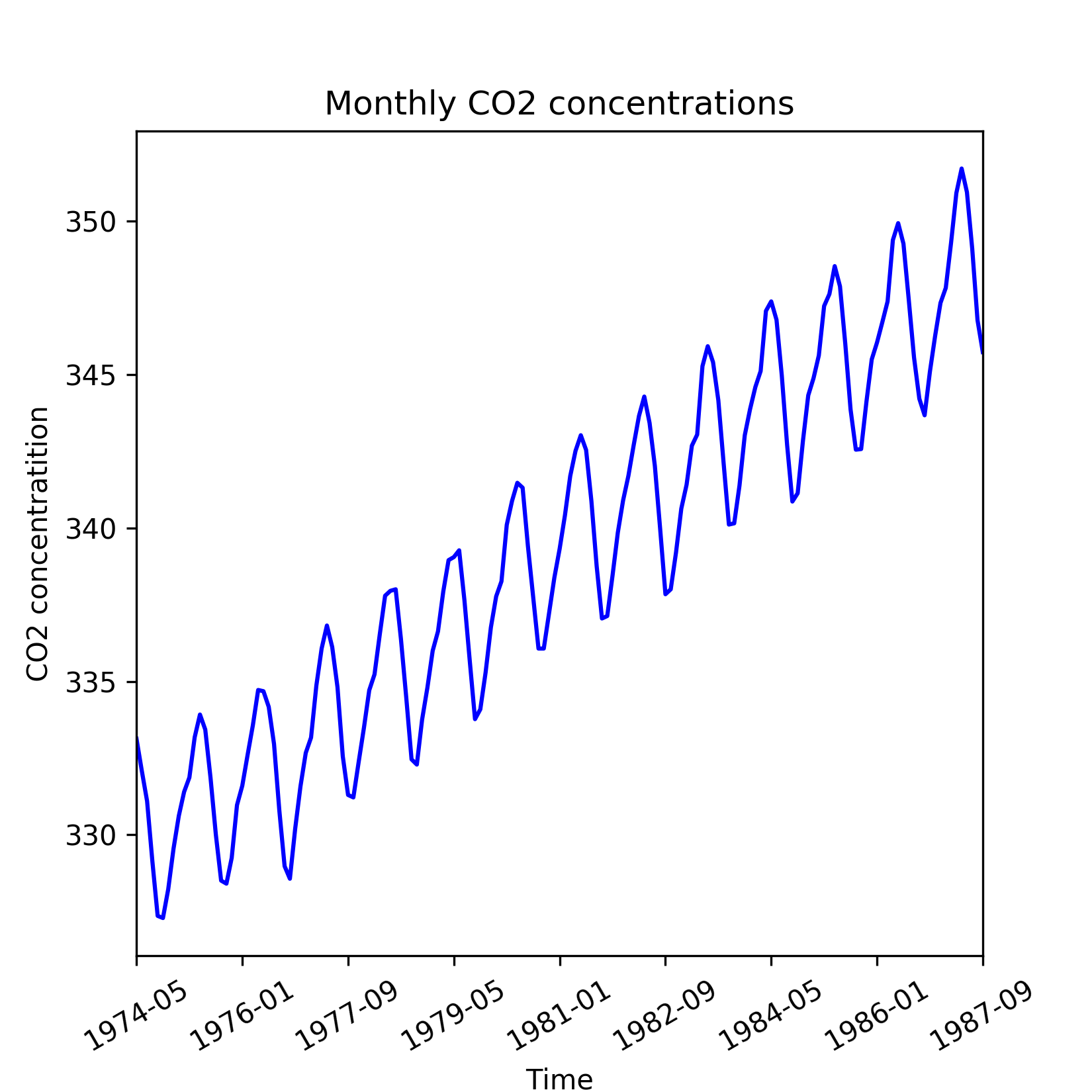
Figure 1.5: Time series of CO2 readings with an upward trend
However, general trend might not be evident over a short run of the series. Short run effects such as seasonal fluctuations and irregular variations cause the time series to revisit lower or higher values observed in the past and hence can temporarily obfuscate any general trend. This is evident in the same time series of CO2 concentrations when zoomed in over the period of 1979 through 1981, as shown in the following figure. Hence to reveal general trend, we need a time series that dates substantially back in the past.
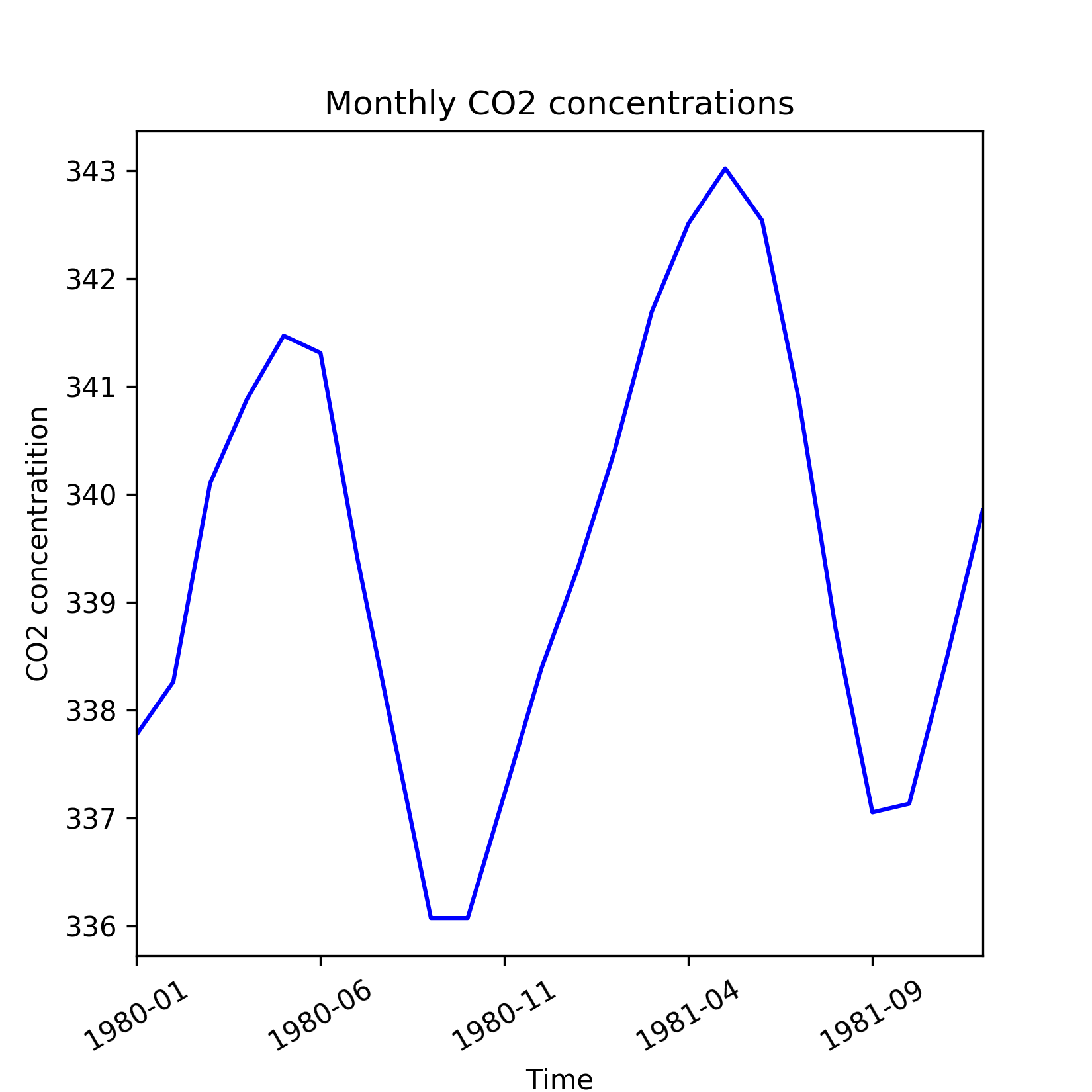
Figure 1.6: Shorter run of CO2 readings time series which is not able to reveal general trend
The general trend in the time series is due to fundamental shifts or systemic changes of the process or system it represents. For example, the upward movement of CO2 concentrations during 1974 through 1987 can be attributed to the gradual rise in automobiles and industrialization over these years.
A general trend is commonly modeled by setting up the time series as a regression against time and other known factors as explanatory variables. The regression or trend line can then be used as a prediction of the long run movement of the time series. Residuals left by the trend line is further analyzed for other interesting properties such as seasonality, cyclical behavior, and irregular variations.
Now, let us go through the code that generated the preceding plots on CO2 concentrations. We will also show how to build a trend model using linear regression on the time index (which in this case is the index of the year in the data) as explanatory variable and the CO2 concentration as the dependent variable. But first, let us load the data in a pandas.DataFrame.
Note
The data for this example is in the Excel file Monthly_CO2_Concentrations.xlsx under the datasets folder of the GitHub repo.
We start by importing the required packages as follows:
from __future__ import print_function
import os
import pandas as pd
import numpy as np
%matplotlib inline
from matplotlib import pyplot as plt
import seaborn as sns
os.chdir('D:\Practical Time Series')
data = pd.read_excel('datasets/Monthly_CO2_Concentrations.xlsx',                                  converters={'Year': np.int32, 'Month':  np.int32})
data.head()
We have passed the argument converters to the read_excel function in order to make sure that columns Year and Month are assigned the integer (np.int32) datatype. The preceding lines of code will generate the following table:
CO2 | Year | Month | |
0 | 333.13 | 1974 | 5 |
1 | 332.09 | 1974 | 6 |
2 | 331.10 | 1974 | 7 |
3 | 329.14 | 1974 | 8 |
4 | 327.36 | 1974 | 9 |
Before plotting we must remove all columns having missing values. Besides, the DataFrame is sorted in ascending order of Year and Month. These are done as follows:
data = data.ix[(~pd.isnull(data['CO2']))&\
               (~pd.isnull(data['Year']))&\
               (~pd.isnull(data['Month']))]
data.sort_values(['Year', 'Month'], inplace=True)
Finally, the plot for the time period 1974 to 1987 is generated by executing the following lines:
plt.figure(figsize=(5.5, 5.5))
data['CO2'].plot(color='b')
plt.title('Monthly CO2 concentrations')
plt.xlabel('Time')
plt.ylabel('CO2 concentratition')
plt.xticks(rotation=30)
The zoomed-in version of the data for the time period 1980 to 1981 is generated by after the DataFrame for these three years:
plt.figure(figsize=(5.5, 5.5))
data['CO2'].loc[(data['Year']==1980) | (data['Year']==1981)].plot(color='b')
plt.title('Monthly CO2 concentrations')
plt.xlabel('Time')
plt.ylabel('CO2 concentratition')
plt.xticks(rotation=30)
Next, let us fit the trend line. For this we import the LinearRegression class from scikit-learn and fit a linear model on the time index:
from sklearn.linear_model import LinearRegression
trend_model = LinearRegression(normalize=True, fit_intercept=True)
trend_model.fit(np.array(data.index).reshape((-1,1)), data['CO2'])
print('Trend model coefficient={} and intercept={}'.format(trend_model.coef_[0],
                                                           trend_model.intercept_)
      )
This produces the following output:
Trend model coefficient=0.111822078545 and intercept=329.455422234
The residuals obtained from the trend line model are shown in the following figure and appear to have seasonal behaviour, which is discussed in the next sub section.
The residuals are calculated and plotted in the preceding by the following lines of code:
residuals = np.array(data['CO2']) - trend_model.predict(np.array(data.index).reshape((-1,1)))
plt.figure(figsize=(5.5, 5.5))
pd.Series(data=residuals, index=data.index).plot(color='b')
plt.title('Residuals of trend model for CO2 concentrations')
plt.xlabel('Time')
plt.ylabel('CO2 concentratition')
plt.xticks(rotation=30)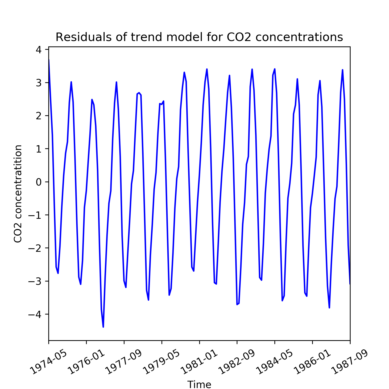
Figure 1.7: Residuals from a linear model of the general trend in CO2 readings
Seasonality manifests as repetitive and period variations in a time series. In most cases, exploratory data analysis reveals the presence of seasonality. Let us revisit the de-trended time series of the CO2 concentrations. Though the de-trended line series has constant mean and constant variance, it systematically departs from the trend model in a predictable fashion.
Seasonality is manifested as periodic deviations such as those seen in the de-trended observations of CO2 emissions. Peaks and troughs in the monthly sales volume of seasonal goods such as Christmas gifts or seasonal clothing is another example of a time series with seasonality.
A practical technique of determining seasonality is through exploratory data analysis through the following plots:
- Run sequence plot
- Seasonal sub series plot
- Multiple box plots
A simple run sequence plot of the original time series with time on x-axis and the variable on y-axis is good for indicating the following properties of the time series:
- Movements in mean of the series
- Shifts in variance
- Presence of outliers
The following figure is the run sequence plot of a hypothetical time series that is obtained from the mathematical formulation xt = (At + B) sin(t) + Є(t) with a time-dependent mean and error Є(t) that varies with a normal distribution N(0, at + b) variance. Additionally, a few exceptionally high and low observations are also included as outliers.
In cases such as this, a run sequence plot is an effective way of identifying shifting mean and variance of the series as well as outliers. The plot of the de-trended time series of the CO2 concentrations is an example of a run sequence plot.
For a known periodicity of seasonal variations, seasonal sub series redraws the original series over batches of successive time periods. For example, the periodicity in the CO2 concentrations is 12 months and based on this a seasonal sub series plots on mean and standard deviation of the residuals are shown in the following figure. To visualize seasonality in the residuals, we create quarterly mean and standard deviations.
A seasonal sub series reveals two properties:
- Variations within seasons as within a batch of successive months
- Variations between seasons as between batches of successive months
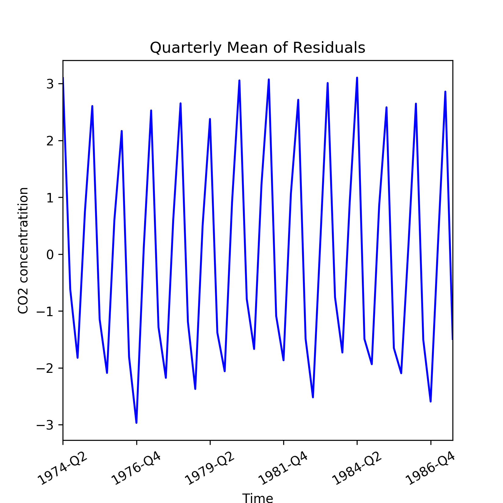
Figure 1.8: Quarterly mean of the residuals from a linear model of the general trend in CO2 readings
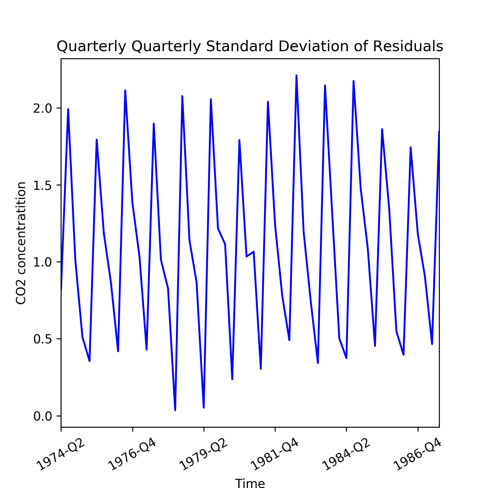
Figure 1.9: Quarterly standard deviation of the residuals from a linear model of the general trend in CO2 readings
Let us now describe the code used for generating the preceding plots. First, we need to add the residuals and quarter labels to the CO2 concentrations DataFrame. This is done as follows:
data['Residuals'] = residuals
month_quarter_map = {1: 'Q1', 2: 'Q1', 3: 'Q1',
                     4: 'Q2', 5: 'Q2', 6: 'Q2',
                     7: 'Q3', 8: 'Q3', 9: 'Q3',
                     10: 'Q4', 11: 'Q4', 12: 'Q4'
                    }
data['Quarter'] = data['Month'].map(lambda m: month_quarter_map.get(m))
Next, the seasonal mean and standard deviations are computed by grouping by the data over Year and Quarter:
seasonal_sub_series_data = data.groupby(by=['Year', 'Quarter'])['Residuals']\
                           .aggregate([np.mean, np.std])
This creates the new DataFrame as seasonal_sub_series_data, which has quarterly mean and standard deviations over the years. These columns are renamed as follows:
seasonal_sub_series_data.columns = ['Quarterly Mean', 'Quarterly Standard Deviation']
Next, the quarterly mean and standard deviations are plotted by running the following lines of code:
#plot quarterly mean of residuals
plt.figure(figsize=(5.5, 5.5))
seasonal_sub_series_data['Quarterly Mean'].plot(color='b')
plt.title('Quarterly Mean of Residuals')
plt.xlabel('Time')
plt.ylabel('CO2 concentratition')
plt.xticks(rotation=30)

#plot quarterly standard deviation of residuals
plt.figure(figsize=(5.5, 5.5))
seasonal_sub_series_data['Quarterly Standard Deviation'].plot(color='b')
plt.title('Quarterly Standard Deviation of Residuals')
plt.xlabel('Time')
plt.ylabel('CO2 concentratition')
plt.xticks(rotation=30)The seasonal sub series plot can be more informative when redrawn with seasonal box plots as shown in the following figure. A box plot displays both central tendency and dispersion within the seasonal data over a batch of time units. Besides, separation between two adjacent box plots reveal the within season variations:
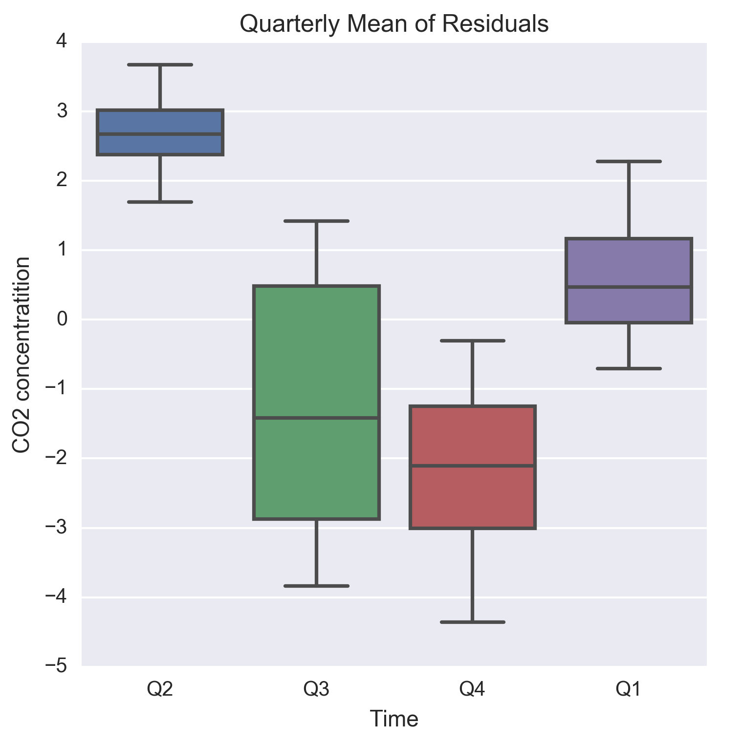
Figure 1.10: Quarterly boxplots of the residuals from a linear model of the general trend in CO2 readings
The code for generating the box plots is as follows:
plt.figure(figsize=(5.5, 5.5))
g = sns.boxplot(data=data, y='Residuals', x='Quarter')
g.set_title('Quarterly Mean of Residuals')
g.set_xlabel('Time')
g.set_ylabel('CO2 concentratition')
Cyclical changes are movements observed after every few units of time, but they occur less frequently than seasonal fluctuations. Unlike seasonality, cyclical changes might not have a fixed period of variations. Besides, the average periodicity for cyclical changes would be larger (most commonly in years), whereas seasonal variations are observed within the same year and corresponds to annual divisions of time such as seasons, quarters, and periods of festivity and holidays and so on.
A long run plot of the time series is required to identify cyclical changes that can occur, for example, every few years and manifests as repetitive crests and troughs. In this regard, time series related to economics and business often show cyclical changes that correspond to usual business and macroeconomic cycles such as periods of recessions followed by every of boom, but are separated by few years of time span. Similar to general trends, identifying cyclical movements might require data that dates significantly back in the past.
The following figure illustrates cyclical changes occurring in inflation of consumer price index (CPI) for India and United States over the period of 1960 through 2016. Both the countries exhibit cyclical patterns in CPI inflation, which is roughly over a period of 2-2.5 years. Moreover, CPI inflation of India has larger variations pre-1990 than that seen after 1990.
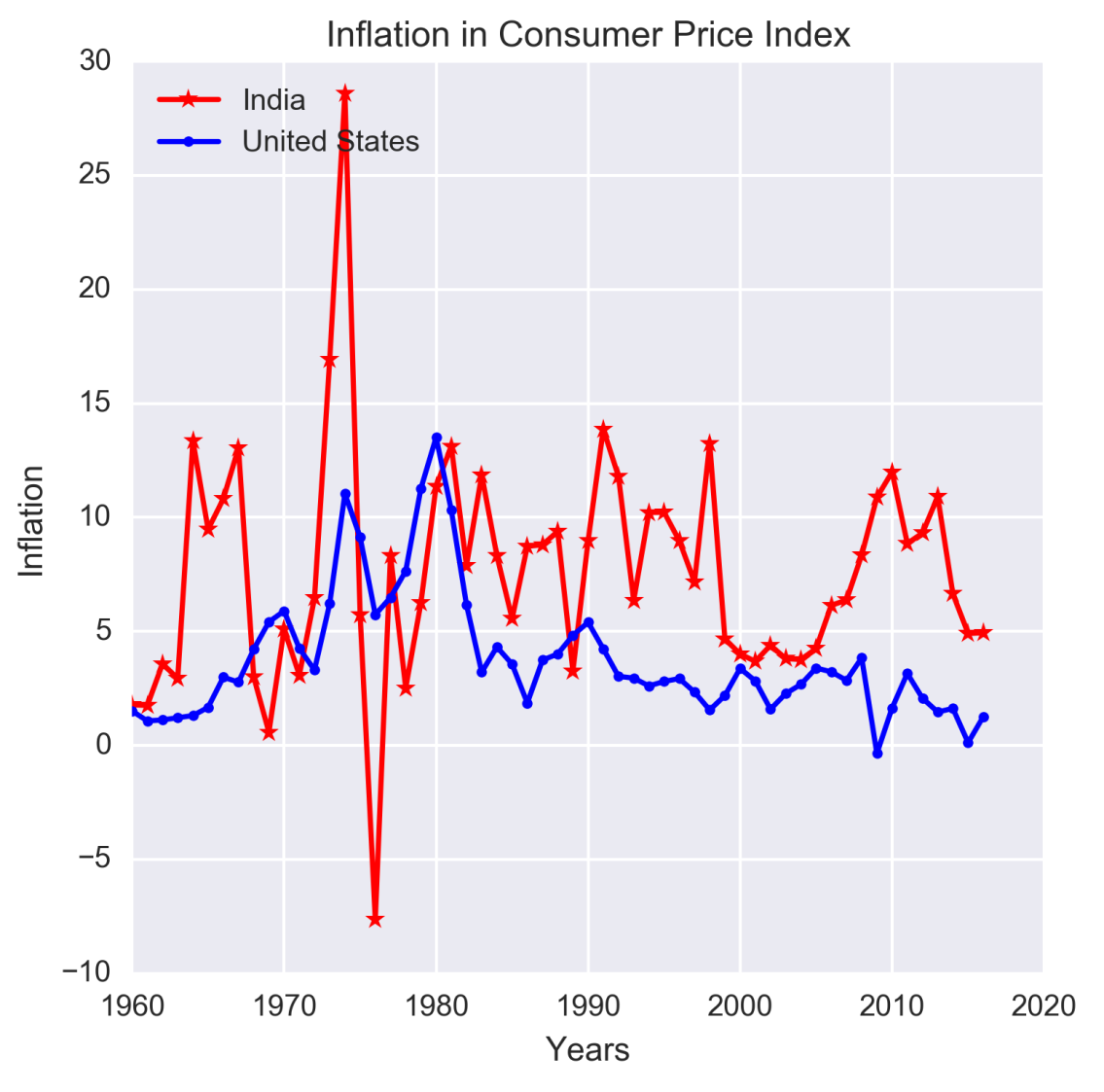
Figure 1.11: Example of cyclical movements in time series data
Source: The data for the preceding figure has been downloaded from http://datamarket.com, which maintains data on time series from a wide variety of subjects.
Note
You can find the CPI inflation dataset in file inflation-consumer-prices-annual.xlsx, which is in the datasetsfolder, on the GitHub repository.
The code written to generate the figure is as follows:
inflation = pd.read_excel('datasets/inflation-consumer-prices-annual.xlsx', parse_dates=['Year'])
plt.figure(figsize=(5.5, 5.5))
plt.plot(range(1960,2017), inflation['India'], linestyle='-', marker='*', color='r')
plt.plot(range(1960,2017), inflation['United States'], linestyle='-', marker='.', color='b')
plt.legend(['India','United States'], loc=2)
plt.title('Inflation in Consumer Price Index')
plt.ylabel('Inflation')
plt.xlabel('Years') Referring to our model that expresses a time series as a sum of four components, it is noteworthy that in spite of being able to account for the three other components, we might still be left with an irreducible error component that is random and does not exhibit systematic dependency on the time index. This fourth component reflects unexpected variations in the time series. Unexpected variations are stochastic and cannot be framed in a mathematical model for a definitive future prediction. This type of error is due to lack of information about explanatory variables that can model these variations or due to presence of a random noise.