Book Image

Implementing Splunk 7, Third Edition - Third Edition

Book Image

Implementing Splunk 7, Third Edition - Third Edition

Overview of this book

Splunk is the leading platform that fosters an efficient methodology and delivers ways to search, monitor, and analyze growing amounts of big data. This book will allow you to implement new services and utilize them to quickly and efficiently process machine-generated big data. We introduce you to all the new features, improvements, and offerings of Splunk 7. We cover the new modules of Splunk: Splunk Cloud and the Machine Learning Toolkit to ease data usage. Furthermore, you will learn to use search terms effectively with Boolean and grouping operators. You will learn not only how to modify your search to make your searches fast but also how to use wildcards efficiently. Later you will learn how to use stats to aggregate values, a chart to turn data, and a time chart to show values over time; you'll also work with fields and chart enhancements and learn how to create a data model with faster data model acceleration. Once this is done, you will learn about XML Dashboards, working with apps, building advanced dashboards, configuring and extending Splunk, advanced deployments, and more. Finally, we teach you how to use the Machine Learning Toolkit and best practices and tips to help you implement Splunk services effectively and efficiently. By the end of this book, you will have learned about the Splunk software as a whole and implemented Splunk services in your tasks at projects
Table of Contents (19 chapters)
Title Page
Packt Upsell
Contributors
Preface
Index

Using timechart to show values over time


The timechart option lets us show numerical values over time. It is similar to the chart command, except that time is always plotted on the x axis. Here are a couple of things to note:

  • The events must have a _time field. If you are simply sending the results of a search to the timechart, this will always be true. If you are using interim commands, you will need to be mindful of this requirement.
  • Time is always bucketed, meaning that there is no way to draw a point per event.

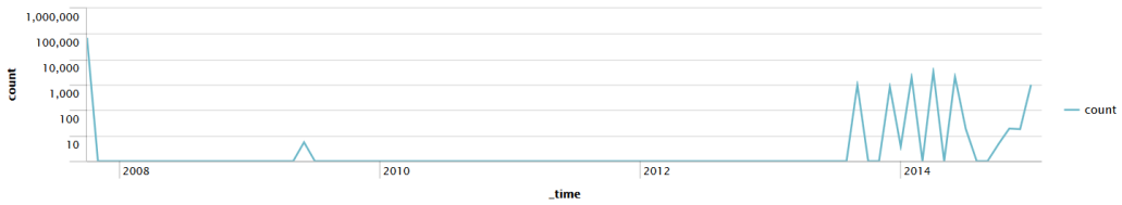
Let's see how many errors have been occurring:

sourcetype="tm1*" error | timechart count

The default chart will look something like this:

Now let's see how many errors have occurred per weekday over the same time period.

We simply need to add by user to the query:

sourcetype="tm1*" error | timechart count by date_wday

This produces the following chart:

As we stated earlier, the x axis is always time. The y axis can be:

  • One or more functions.
  • A single function with a by clause.
  • Multiple functions...