

Growing in popularity as a data visualization option, sparklines are inline charts that represent the general shape of a variation (typically over time) in some measurement (such as miles per gallon or home value), in a simple and highly condensed way. Splunk provides you the ability to add sparklines to stats and chart searches, improving their usefulness and overall information density.
Let's look at a simple Splunk search example like the following:
sourcetype=csv "0001" "USD" | chart AVG(Jan) by PERIOD
It creates the following results table:
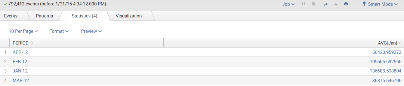
As you can see, the preceding example of search generates a table that shows average amounts by the field PERIOD—just two columns.
If you add the keyword sparkline to the search pipeline, you can have Splunk include sparklines with the results: