
ggplot2 is a visualization package in R. It was developed in 2005 and it uses the concept of the Grammar of Graphics to build a plot in layers and scales. This is the syntax used for the different components (aesthetics) of a geometric object. It also involves the grammatical rules for creating a visualization.
ggplot2 has grown in popularity over the years. It's a very powerful package, and its impressive scope has been enabled by the underlying grammar, which gives the user a very file level of control - making it perfect for a range of scenarios. Another great feature of ggplot 2 is that it is programmatic; hence, its visuals are reproducible. The ggplot2 package is open source, and its use is rapidly growing across various industries. Its visuals are flexible, professional, and can be created very quickly.
Note
Read more about the top companies using R at https://www.listendata.com/2016/12/companies-using-r.html. You can find out more about the role of a data scientist at https://www.innoarchitech.com/what-is-data-science-does-data-scientist-do/.
Other visualization packages exist, such as matplotlib (in Python) and Tableau. The matplotlib and ggplot2 packages are equally popular, and they have similar features. Both are open source and widely used. Which one you would like to use may be a matter of preference. However, although both are programmatic and easy to use, since R was built with statisticians in mind, ggplot2 is considered to have more powerful graphics. More discussion on this topic can be found in the chapter later. Tableau is also very powerful, but it is limited in terms of statistical summaries and advanced data analytics. Tableau is not programmatic, and it is more memory intensive because it is completely interactive.
Excel has also been used for data analysis in the past, but it is not useful for processing the large amounts of data encountered in modern technology. It is interactive and not programmatic; hence, charts and graphs have to be made with interactivity and need to be updated every time more data is added. Packages such as ggplot2 are more powerful in that once the code is written, ggplot is independent of increases in the data, as long as the data structure is maintained. Also, ggplot2 provides a greater number of advanced plots that are not available in Excel.
Note
Read more about Excel versus R at https://www.jessesadler.com/post/excel-vs-r/. Read more about matplotlib versus R at http://pbpython.com/visualization-tools-1.html. Read more about matplotlib versus ggplot at https://shiring.github.io/r_vs_python/2017/01/22/R_vs_Py_post.html.
So, before we go further, let's discuss visualization in more detail. Our first task is to load a dataset. To do so, we need to load certain packages in RStudio. Take a look at the screenshot of a typical RStudio layout, as follows:
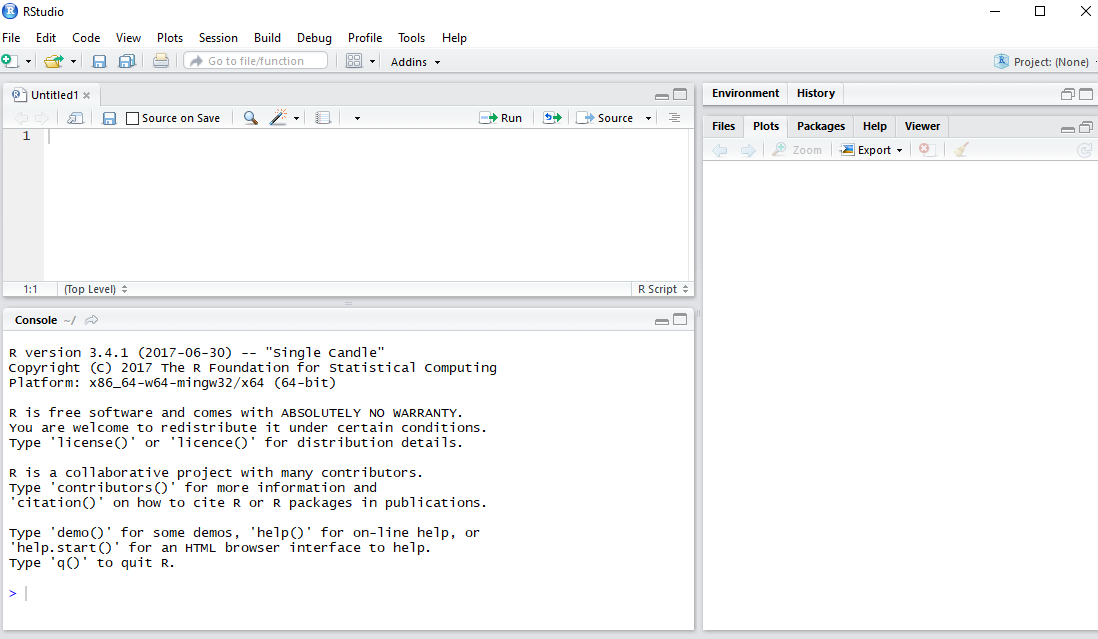
In this section, we'll load and explore a dataset using R functions. Before starting with the implementation, check the version by typing version in the console and checking the details, as follows:
Let's begin by following these steps:
- Install the following packages and libraries:
install.packages("ggplot2")
install.packages("tibble")
install.packages("dplyr")
install.packages("Lock5Data")- Get the current working directory by using the
getwd(".")command:
[1] "C:/Users/admin/Documents/GitHub/Applied-DataVisualization-with-ggplot2-and-R"
- Set the current working directory to
Chapter 1by using the following command:
setwd("C:/Users/admin/Documents/GitHub/Applied-DataVisualization-with-ggplot2-and-R/Lesson1")- Use the require command to open the
template_Lesson1.Rfile, which has the necessary libraries. - Read the following data file, provided in the data directory:
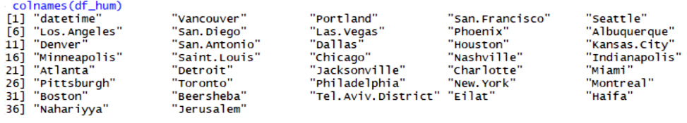
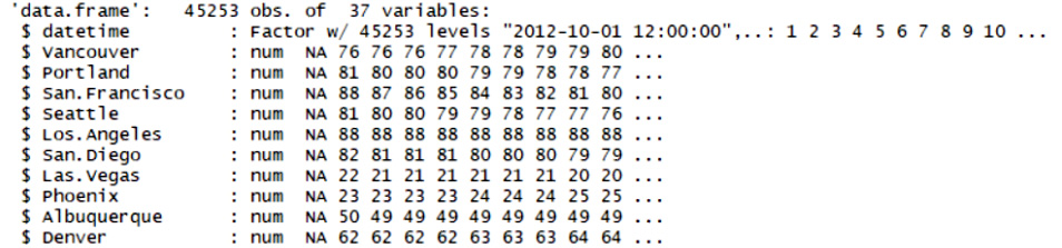
df_hum <- read.csv("data/historical-hourly-weather-data/humidity.csv")Note
When we used read.csv, a structure called a data frame was created in R; which we are all familiar with it. Let's type some commands to get an overall impression of our data.
Let's retrieve some parameters of the dataset (such as the number of rows and columns) and display the different variables and their data types.
The following libraries have now been loaded:
- Graphical visualization package:
require("ggplot2") - Build a data frame or list and some other useful commands:
require("tibble") Note
require("dplyr") -Reference: https://cran.r-project.org/web/packages/dplyr/vignettes/dplyr.html.
- A built-in dataset package in R:
require("Lock5Data") Note
Reference: https://cran.r-project.org/web/packages/Lock5Data/Lock5Data.pdf.
Use the following commands to determine the data frame details, as follows:
#Display the column names
colnames(df_hum)
Take a look at the output screenshot, as shown here:
Use the following command:
#Number of columns and rows
ndim(df_hum)
A summary of the data frame can be seen with the following code:
str(df_hum)
Take a look at the output screenshot, as shown here:
ggplot2 is based on two main concepts: geometric objects and the Grammar of Graphics. The geometric objects in ggplot2 are the different visual structures that are used to visualize data. We will be going over them one by one. The Grammar of Graphics is the syntax that we use for the different aesthetics of a graph, such as the coordinate scale, the fonts, the color themes, and so on. ggplot2 uses a layered Grammar of Graphics concept, which allows us to build a plot in layers. We will work on some aspects of the Grammar of Graphics in this chapter, and will go into further details in the next chapter.
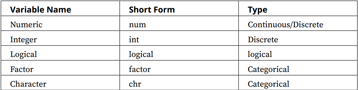
Variables can be of different types and, sometimes, different software uses different names for the same variables. So, let's get familiar with the different kinds of variables that we will work with:
- Continuous: A continuous variable can take an infinite number of values, such as time or weight. They are of the numerical type.
- Discrete: A variable whose values are whole numbers (counts) is called a discrete variable. For example, the number of items bought by a customer in a supermarket is discrete.
- Categorical: The values of a categorical variable are selected from a small group of categories. Examples include gender (male or female) and make of car (Mazda, Hyundai, Toyota, and so on). Categorical variables can be further categorized into ordinal and nominal variables, as follows:
- Ordinal categorical variable: A categorical variable whose categories can be meaningfully ordered is called ordinal. For example, credit grades (AA, A, B, C, D, and E) are ordinal.
- Nominal categorical variable: It does not matter which way the categories are ordered in tabular or graphical displays of the data; all orderings are equally meaningful. An example would be different kinds of fruit (bananas, oranges, apples, and so on).
- Logical: A logical variable can only take two values (T/F).
Note
You can read more about variables at http://www.abs.gov.au/websitedbs/a3121120.nsf/home/statistical+language+-+what+are+variables.
The following table lists variables and the names that R uses for them; make sure to familiarize yourself with both nomenclatures.
The variable names used in R are as follows:
In this section, we will use the built-in datasets to investigate the relationships between continuous variables, such as temperature and airquality. We'll explore and understand the datasets available in R.
Let's begin by executing the following steps:
- Type
data()in the command line to list the datasets available in R. You should see something like the following:
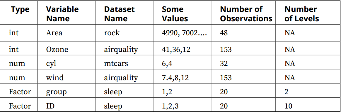
- Choose the following datasets:
mtcars,air quality,rock, andsleep.
- List two variables of each type, the dataset names, and the other columns of this table.
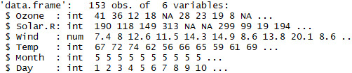
- To view the data type, use the
strcommand (for example,str(airquality)).
Take a look at the following output screenshot:
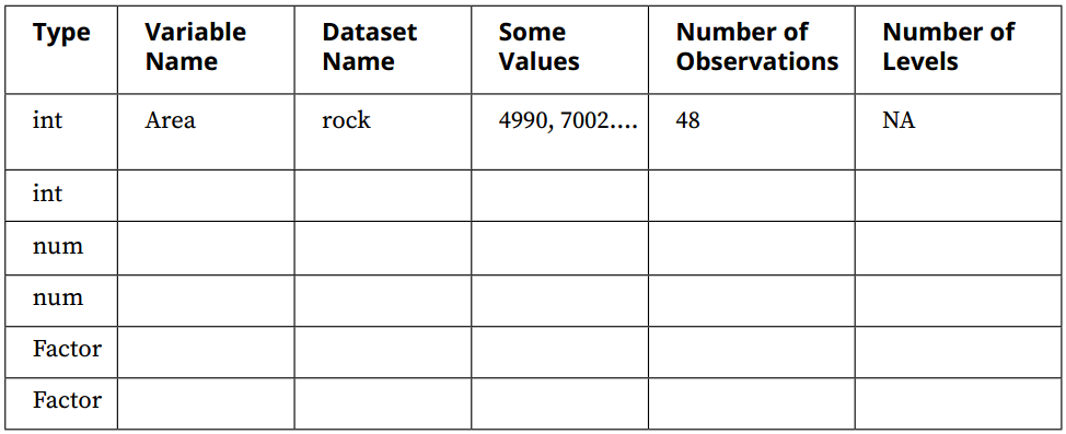
The outcome should be a completed table, similar to the following:
Note
More details about variables can be found at http://www.statisticshowto.com/types-variables/.
Suppose that we want to visualize some of the variables in the built-in datasets. A dataset can contain different kinds of variables, as discussed previously. Here, the climate data includes numerical data, such as the temperature, and categorical data, such as hot or cold. In order to visualize and correlate different kinds of data, we need to understand the nomenclature of the dataset. We'll load a data file and understand the structure of the dataset and its variables by using the qplot and R base package. Let's begin by executing the following steps:
- Plot the
temperaturevariable from theairqualitydataset, withhist(airquality$Temp).
Take a look at the following output screenshot:
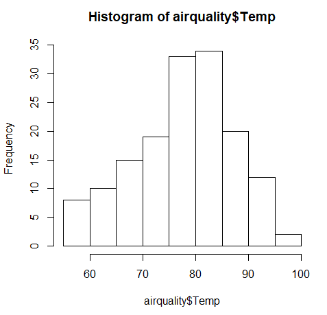
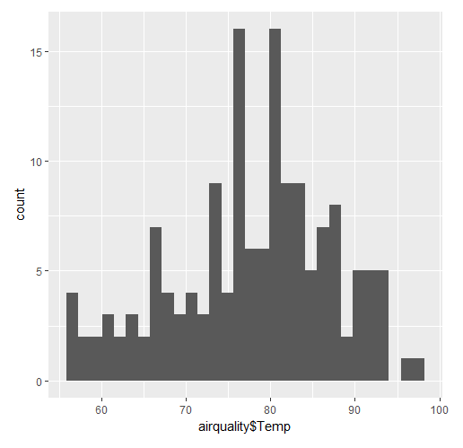
The first plot was made in the built-in graphics package in R, while the second one was made using qplot, which is a plotting command in ggplot2. We can see that the two plots look very different. The plot is a histogram of the temperature.
We will discuss geometric objects later in this chapter, in order to understand the different types of histograms.
The built-in graphics package in R does not have a lot of features, so ggplot2 has become the package of choice. For the next exercises, we will continue to investigate making plots using ggplot2.