Bar charts are a common staple of plotting package, and even matplotlib has them.
The dedicated function for bar charts is pyplot.bar(). We will enable this function by executing the following script:
import matplotlib.pyplot as plt

data = [5., 25., 50., 20.]

plt.bar(range(len(data)), data)
plt.show()
The preceding script will produce the following graph:
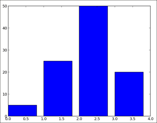
For each value in the list data, one vertical bar is shown. The pyplot.bar() function receives two arguments—the x coordinate for each bar and the height of each bar. Here, we use the coordinates 0, 1, 2, and so on, for each bar, which is the purpose of range(len(data)).
Through an optional parameter, pyplot.bar() provides a way to control the bar's thickness. Moreover, we can also obtain horizontal bars using the twin brother of pyplot.bar(), that is, pyplot.barh().
By default, a bar will have a thickness of 0.8 units. Because we put a bar at each unit length, we have a gap of 0.2 between them. You can, of course, fiddle with this thickness parameter. For instance, by setting it to 1:
import matplotlib.pyplot as plt

data = [5., 25., 50., 20.]

plt.bar(range(len(data)), data, width = 1.)
plt.show()
The preceding minimalistic script will produce the following graph:
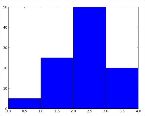
Now, the bars have no gap between them. The matplotlib bar chart function pyplot.bar() will not handle the positioning and thickness of the bars. The programmer is in charge. This flexibility allows you to create many variations on bar charts.
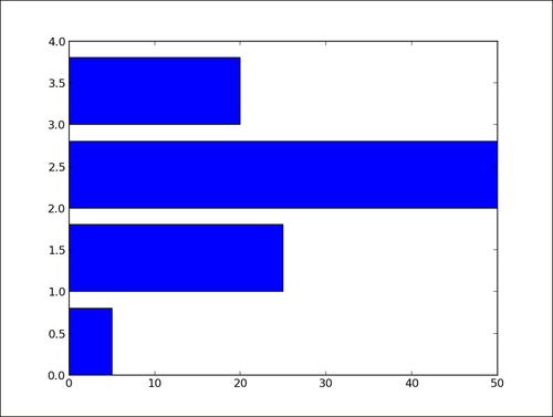
If you are more into horizontal bars, use the barh() function, which is the strict equivalent of bar(), apart from giving horizontal rather than vertical bars:
import matplotlib.pyplot as plt

data = [5., 25., 50., 20.]

plt.barh(range(len(data)), data)
plt.show()
The preceding script will produce the following graph: