Book Image

gnuplot Cookbook

By : Lee Phillips
Book Image

gnuplot Cookbook

By: Lee Phillips

Overview of this book

gnuplot is the world's finest technical plotting software, used by scientists, engineers, and others for many years. It is in constant development and runs on practically every operating system, and can produce output in almost any format. The quality of its 3d plots is unmatched and its ability to be incorporated into computer programs and document preparation systems is excellent. gnuplot Cookbook ñ it will help you master gnuplot. Start using gnuplot immediately to solve your problems in data analysis and presentation. Quickly find a visual example of the graph you want to make and see a complete, working script for producing it. Learn how to use the new features in gnuplot 4.4. Find clearly explained, working examples of using gnuplot with LaTeX and with your own computer programming language. You will master all the ins and outs of gnuplot through gnuplot Cookbook. You will learn to plot basic 2d to complex 3d plots, annotate from simple labels to equations, integrate from simple scripts to full documents and computer progams. You will be taught to annotate graphs with equations and symbols that match the style of the rest of your text, thus creating a seamless, professional document. You will be guided to create a web page with an interactive graph, and add graphical output to your simulation or numerical analysis program. Start using all of gnuplot's simple to complex features to suit your needs, without studying its 200 page manual through this Cookbook.
Table of Contents (18 chapters)
gnuplot Cookbook
Credits
About the Author
About the Reviewers
www.PacktPub.com
Preface
Finding Help and Information
Index

Coloring the axes


We showed back in Chapter 1, Plotting Curves, Boxes, Points, and more, how to use two different y-axes when plotting two functions or datasets that have dissimilar ranges. We can make it easier to see which curve goes with which axis by using color.

In the following figure, two curves are colored (shaded in print) to match corresponding colors on the vertical axes with which they are associated. The axis labels are colored to match, as well. This makes it easy to match the curves with their y-axes without having to use arrows or legends.

How to do it…

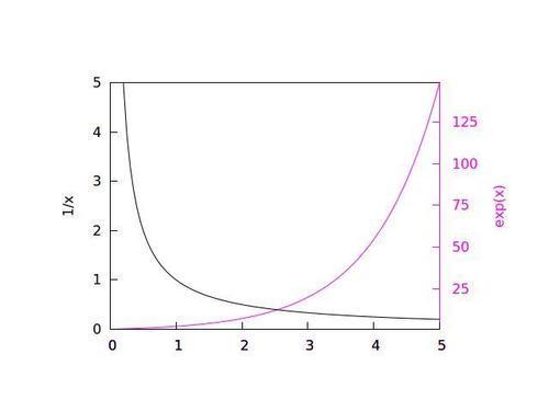
The following script created the previous figure:

set multi
set tmargin at screen .8
set rmargin at screen .8
set lmargin at screen .2
set bmargin at screen .2
unset key
set tics nomirror
set xrange [0:5]
set border 8
set border lt 4
set y2tics 0,25,150
unset ytics
set y2label "exp(x)" textcolor lt 4
plot exp(x) axis x1y2 lt 4
set border 7
set border lt -1
set ylabel "1/x" textcolor lt -1
unset y2label
set ytics 0,1,5
set tics...