Book Image

SAP BusinessObjects Dashboards 4.0 Cookbook

Book Image

SAP BusinessObjects Dashboards 4.0 Cookbook

Overview of this book

Xcelsius 2008 was recently included in SAP’s BusinessObjects 4.0 family, rebranding “Xcelsius Enterprise” as “SAP BusinessObjects Dashboards 4.0”. With features like flexible design and what-if scenarios, the powerful dashboarding software allows enterprises to make business decisions at a glance, and this book allows you to go far beyond the basics of these techniques. This cookbook full of practical and applicable recipes will enable you to use the full latest capabilities of Dashboard Design to visually transform your business data. A wide range of recipes will equip you with the knowledge and confidence to perform tasks like configuring charts, creating drill- downs, making component colors dynamic, using alerts in maps, building pop-up screens, setting up What-If scenarios, and many more.The recipes begin by covering best practices for using the Dashboard Design spreadsheet, the data-model, and the connection with the components on the canvas, later moving on to some from-the-trenches tricks for using Excel within Dashboard Design. The book then guides you through the exploration of various data visualization components and dashboard interactivity, as well as offering recipes on using alerts, dashboard connectivity, and making the most of the aesthetics of the dashboard. Finally, the recipes conclude by considering the most important add-ons available for Dashboard Design and enabling you to perform relevant and useful tasks straight away.
Table of Contents (22 chapters)
SAP BusinessObjects Dashboards 4.0 Cookbook
Credits
Foreword
About the Authors
Acknowledgement
Acknowledgement
About the Reviewers
www.PacktPub.com
Preface
Index

Making component colors dynamic


Dashboard Design 2008 allows users to fully control the coloring of their components based on whatever event they desire. For example, if a major alert were to happen I could dynamically change my background to red in order to signal an emergency. This is extremely useful because developers can not only dynamically control the color of bars on a chart but also the rest of the chart components such as the background and text as well.

How to do it...

  1. On the cell highlighted in yellow E2, we have a COUNTIF statement that will set the bar color to red, if any of the regions has their number of items sold below 40. Otherwise the bar color will be set to blue as shown in the following screenshot:

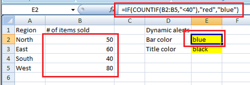
  2. On the chart properties go to the Color tab and click on the square colored box in the fill column. On the bottom of the color palette, choose the Bind to Color option and bind to the cell with the color control (E2, in our case).

  3. Go to the Text tab of the chart properties...