
The following are all the tools that work with GP and are considered native or out-of-the-box as they come with GP or are a part of the Microsoft stack of technology. Some of these tools are included in the price of GP and others must be purchased separately.
We won't use all of these tools in this book, no one has that much time! We do want to make sure that you are aware of their existence and understand what each tool does. The tools are in no particular order; this isn't a beauty pageant or a top ten list.
This is a metric or Key Performance Indicator (KPI) tool that comes with Microsoft Dynamics GP. This tool is role based and includes over 150 reports out-of-the-box. These reports or metrics can be run from within GP, outside of GP, on a Microsoft Surface via an app from the Microsoft App Store, and even on an iPad with the Business Analyzer app.
Business Analyzer uses reports that are built-in and can be edited with Microsoft SQL Server Reporting Services. Business Analyzer with SQL Security is secure and easy to use. Reports can be displayed as a dashboard, chart, or tabular with drill back right into GP data:

Management Reporter reports and Excel reports can even be added to the Windows App and iPad App versions. This tool is best used for dashboards where the data can be represented in small charts or graphs along with the Management Reporter reports representing what you want to see.
SQL Server Reporting Services (SSRS) is a report-writing tool based directly on the data coming from Microsoft SQL Server. Reports can be created using tabular, graphical, or free form format.
Reports can be launched in Business Analyzer, on the GP home page within many GP cards and transaction windows, or in Microsoft SharePoint. The following screenshot shows six SSRS (out-of-the-box with GP) reports being used to make the home page (for this user only) dashboard. This makes the home page in GP a custom experience for each and every user, providing the user with the information that is important to them:

Like Business Analyzer, SSRS is a great tool for repetitive analysis. It's not as useful for ad hoc analysis.
Although Microsoft Excel is not included with Microsoft Dynamics GP, it is likely to be a tool you already own and like using. Microsoft Dynamics GP includes Excel-based reports that are connected to be completely refreshable with new data with just a click. This means no more exporting to Excel and then formatting, only repeating the task the next time you need the report.
Now, you can pull the data into Excel and then format and save it. The next time you need the report, open the Excel file, select Data and Refresh (or even have it auto refresh) with formatting intact and with no extra effort. This allows Excel to be your report writer with data integrated automatically, so there is no need to balance Excel with GP. Quit thinking of Excel as a big calculator, and focus on its analytical power. Excel is incredibly powerful for both repetitive and ad hoc analyses. Excel is really less of a tool and more like a hardware store.
We are by no means suggesting that a large number of Excel reports become your BI. Instead, we are suggesting that you use Excel to extract data from the source, using it as a formatting tool and data delivery tool. The following screenshot is an example of using Excel to format refreshable data into a dashboard, using Excel as a report delivery tool. The following report is actually the first report we will build in Chapter 2, Business Intelligence for the General Ledger:

PowerPivot is a tool in Excel 2013—Office Professional Plus that enables you to perform data mashups (combining data from two or more sources, such as GP and Microsoft CRM) and data exploration, using billions of rows of data at a super fast speed. We refer to this as pivot tables on steroids! This is accomplished through the use of the data model.
The data model is an in-memory data storage device with row based compression. That data is stored as a part of the file but is not visible in the Excel spreadsheet, unless you choose to display it (or a part of it). This is how a single Excel file can handle billions of rows, bypassing the normal row and column limitations of the Excel spreadsheet.
The data model can also receive data from multiple sources, allowing you to make custom links, and even custom fields, by using Data Analysis Expressions (DAX). It is through PowerPivot's data model that Excel can create a single pivot table/chart on the data from multiple sources. This is a great tool when you want to share data offline with others:

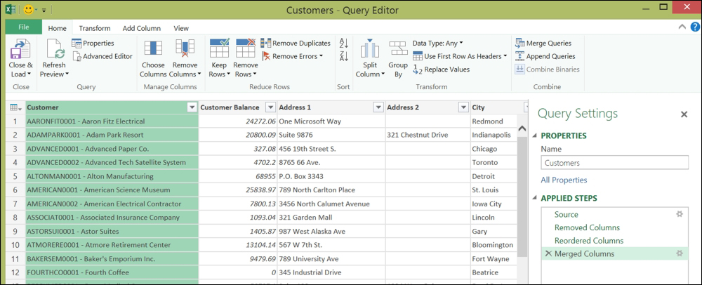
Power Query is a great new tool that allows you to conform, combine, split, merge, and mash up your data from GP and other sources, including public websites (such as Wikipedia and some government sites) and even some private websites. These queries can then be shared with other users via Microsoft Power BI for Office 365. Think of it as SmartList objects outside of Dynamics GP.
Power Query uses an Excel spreadsheet and/or the data model from PowerPivot to hold the data it captures and cleanses. What makes this an exciting tool is its ability to gather all kinds of data from all kinds of sources, combine it, and use it in Excel. PowerPivot can import data and contain it, while Power Query can import or link to data and use PowerPivot to contain it. Why is this small difference important? Power Query is more flexible in the types of connections it can make.
Also, Power Query is the data editing tool of the new Power BI dashboard-ing tool:
Power Map is a great way to visually see and even fly across your data as a 3D geographical representation. Why is this considered a BI tool? Imagine seeing your sales represented on a map, showing total sales or gross margin. Does one product or product line sell better in the North than the South? Does it sell better in the fall in the East and in summer in the West? Where should you put your new warehouse in order for it to be close to your customer base?
Power Maps are not always the best fit for your BI, but when they do fit, you can sure learn a lot about your data.
The following screenshot shows sales leads and their estimated value by the salesperson from Microsoft CRM data:

Microsoft Power BI is a stand-alone website/dashboard tool that allows you to create your own dashboard, with refreshable links from a large variety of data sources. Included with this tool is a free App that displays the data from the website.
One of the most amazing features of Microsoft Power BI is the Q&A feature. If you upload an Excel table into the dashboard, you can ask questions about the data, in natural language, just like you do in Microsoft Bing. The results of your questions will be a visual representation of the answer. It could be a graph, chart, table, map, and so on. If this is something you ask a lot, you can simply pin it to the dashboard as a new chart.
This tool is amazing for managers, executives, owners, and board members alike. It gives a quick insight into timely data, right at their fingertips:

Power View is a tool in Excel 2013—Office Professional Plus that enables you to represent your data in a more graphic representation than those of a traditional pivot table or chart. For example, you can graph your sales for each state on an actual map of the U.S., highlighting visually where your biggest sales come from without reading any numbers.
This is a simple dashboard tool that allows for easy filtering. This tool works very well for those individuals who want to see data in a dashboard format, with the ability to filter either a single part of the dashboard or the entire dashboard.
Power View can use data from an Excel spreadsheet, or data in a PowerPivot data model. Again, this allows for multiple data sources and large amounts of data to be used on a single dashboard:

This module in GP allows you to organize your data into analysis cubes that allows users to evaluate or create reports from different angles or formats using pivot tables. The same chunk or cube of data can be used to evaluate inventory sold, sales revenue, sales commission, returns of items, profitability of sales, and so on. These cubes are designed specifically to analyze the GP database, using the SQL Server Analysis Services (SSAS) or Online Analytical Processing (OLAP) database.
Analysis Cubes create a warehouse of data from GP for the purpose of reporting. Reporting from the cubes rather than from the production data, frees the server's resources for GP activity.
Modifying cubes or connecting them to additional data sources will often require expert help:

SmartList is an ad hoc query tool that comes with Microsoft Dynamics GP. It is in a tabular format and can be exported to Excel or Word. Custom SmartList objects can be created using the GP tool SmartList Designer.
Although SmartList is an invaluable tool for GP use, for BI purposes, we prefer to go directly to Excel. SmartList exports of large datasets are painfully slow; a root canal level of pain. Excel reports are fast and easily reusable. If you create a SmartList and export it to Excel for each use, you will need to reformat the Excel document each and every time. There are ways to avoid reformatting, but even those take a lot of effort.
SmartList Designer allows users to create and build their own SmartList objects. Although there are many great SmartList objects already built-in, they do not always fit your needs exactly. A good example of this would be Payables Transactions. All documents display as a positive amount since it is a list of documents. Many users want to see the document and its effect on the AP account itself (for example, returns are negatives and invoices are positive). If this is how you want your list to be displayed, you can do this through SmartList Designer:

We often become so focused on using Management Reporter (or FRx) for balance sheets, profit and loss statements, and cash flow statements that we forget the value already built in our financial statement tool.
Imagine taking your profit and loss statement (or statement of activities for not-for-profits) and removing the budget column, or splitting MTD into weeks and comparing each week of the month, or even week 1 of this month to week 1 of last month. All this would take is a new column format and "poof"—access to a new and amazing trend reporting!
The following illustration is a Weekly Material Usage Report from Management Reporter. From this report, managers can see a giant spike in the last week of January that would not be visible in a report that only displayed month-to-date information:

Microsoft SharePoint is server software (and does not come with GP) or an online tool in Office 365 that creates a central point for work to be shared and collaboration to occur. This product is what it is named, SharePoint, a point for sharing. Anyway…
This is a good spot to have BI content exist for version control and sharing. The Microsoft social networking tool, Yammer, extends SharePoint into an even better collaboration tool.
There is a large variety of additional BI tools available through the SharePoint arena which are awesome. However, we wanted to stick with tools that you'll likely already own, or can obtain easily and take off running on your own. So, we'll leave SharePoint off the table for this book.
In Microsoft SharePoint for Office 365, you can create a custom workspace using Dynamics GP 2013 R2 or higher. Here, you can store your reports, creating a truly collaborative environment. We'll not be getting into this much in this book, but we did want to give it a shout out. It's a great storage place for your reports and an excellent starting spot.