

I am not a big fan of using pie charts for many segments. The more segments that there are, the less easy it is to see the data. As the segments get smaller, even the labels get smudged into each other.
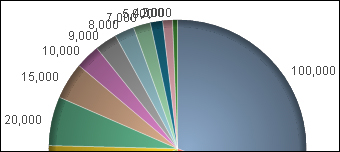
If you absolutely, positively must create this type of chart, you need to have a better strategy for the labels.
Load the following script:
LOAD * INLINE [
    Country, Sales
    USA, 100000
    Canada, 50000
    Mexico, 25000
    UK, 70000
    Germany, 20000
    Brazil, 15000
    France, 10000
    Japan, 9000
    China, 8000
    Australia, 7000
    South Korea, 5000
    New Zealand, 4000
    Italy, 2000
];Follow these steps to create a pie chart with staggered labels:
Create a new pie chart.
On the Expressions tab, add the following expression:
Dual(
  Country & '-' &
  Num(sum(Sales), '#,##0') &
  Repeat(chr(13)&chr(10), rank(Sum(Sales))-6),
  sum(Sales)
)
Select the Values on Data Points option.
On the Sort tab, select the Y-Value option. Confirm Descending as the direction.
On the Presentation tab, deselect the Show Legend option.
Click on Finish.

The magic here is the Repeat function:
Repeat(chr(13)&chr(10), rank(Sum(Sales))-6)
The ASCII characters 13 and 10 give us a carriage return and line feed. Note that there is a Rank()-6 here. Basically, the repeat doesn't kick in until you get to the seventh ranked value in the dimension. There is no reason to start staggering for the earlier values.