
There are many different types of datasets that a visualization scientist encounters in their work. This book's aim is to prepare an enthusiastic beginner to delve into the world of data visualization. Certainly, we will not comprehensively cover each and every visualization technique out there. Our aim is to learn to use Mathematica as a tool to create interactive visualizations. To achieve that, we will focus on a general classification of datasets that will determine which Mathematica functions and programming constructs we should learn in order to visualize the broad class of data covered in this book.
The table is one of the most common data structures in Computer Science. You might have already encountered this in a computer science, database, or even statistics course, but for the sake of completeness, we will describe the ways in which one could use this structure to represent different kinds of data. Consider the following table as an example:
|
Attribute 1 |
Attribute 2 |
… | |
|---|---|---|---|
|
Item 1 | |||
|
Item 2 | |||
|
Item 3 |
When storing datasets in tables, each row in the table represents an instance of the dataset, and each column represents an attribute of that data point. For example, a set of two-dimensional Cartesian vectors can be represented as a table with two attributes, where each row represents a vector, and the attributes are the x and y coordinates relative to an origin. For three-dimensional vectors or more, we could just increase the number of attributes accordingly.
Tables can be used to store more advanced forms of scientific, time series, and graph data. We will cover some of these datasets over the course of this book, so it is a good idea for us to get introduced to them now. Although we will describe them in depth in the upcoming chapters, here we explain the general concepts.
There are many kinds of scientific dataset out there. In order to aid their investigations, scientists have created their own data formats and mathematical tools to analyze the data. Engineers have also developed their own visualization language in order to convey ideas in their community. In this book, we will cover a few typical datasets that are widely used by scientists and engineers. We will eventually learn how to create molecular visualizations and biomedical dataset exploration tools when we feel comfortable manipulating these datasets.
In practice, multidimensional data (just like vectors in the previous example) is usually augmented with one or more characteristic variable values. As an example, let's think about how a physicist or an engineer would keep track of the temperature of a room. In order to tackle the problem, they would begin by measuring the geometry and the shape of the room, and put temperature sensors at certain places to measure the temperature. They will note the exact positions of those sensors relative to the room's coordinate system, and then, they will be all set to start measuring the temperature.
Thus, the temperature of a room can be represented, in a discrete sense, by using a set of points that represent the temperature sensor locations and the actual temperature at those points. We immediately notice that the data is multidimensional in nature (the location of a sensor can be considered as a vector), and each data point has a scalar value associated with it (temperature). Such a discrete representation of multidimensional data is quite widely used in the scientific community. It is called a scalar field. The following screenshot shows the representation of a scalar field in 2D and 3D:
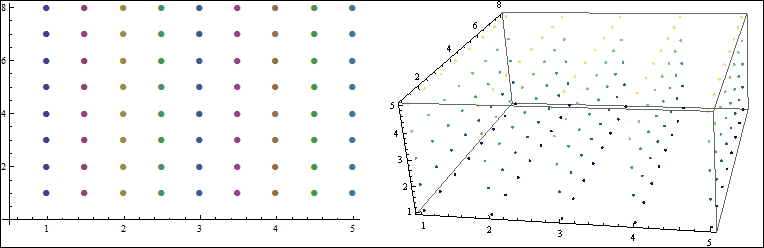
Figure 1.3 In practice, scalar fields are discrete and ordered
Figure 1.3 depicts how one would represent an ordered scalar field in 2D or 3D. Each point in the 2D field has a well-defined x and y location, and a single temperature value gets associated with it. To represent a 3D scalar field, we can think of it as a set of 2D scalar field slices placed at a regular interval along the third dimension. Each point in the 3D field is a point that has {x, y, z} values, along with a temperature value.
A scalar field can be represented using a table. We will denote each {x, y} point (for 2D) or {x, y, z} point values (for 3D) as a row, but this time, an additional attribute for the scalar value will be created in the table. Thus, a row will have the attributes {x, y, z, T}, where T is the temperature associated with the point defined by the x, y, and z coordinates. This is the most common representation of scalar fields.
A widely used visualization technique to analyze scalar fields is to find out the isocontours or isosurfaces of interest. We will cover this in detail in Chapter 3, Time Series and Scientific Visualization. However, for now, let's take a look at the kind of application areas such analysis will enable one to pursue. Instead of temperature, one could think of associating regularly spaced points with any relevant scalar value to form problem-specific scalar fields. In an electrochemical simulation, it is important to keep track of the charge density in the simulation space. Thus, the chemist would create a scalar field with charge values at specific points.
For an aerospace engineer, it is quite important to understand how air pressure varies across airplane wings; they would keep track of the pressure by forming a scalar field of pressure values. Scalar field visualization is very important in many other significant areas, ranging from from biomedical analysis to particle physics. In this book, we will cover how to visualize this type of data using Mathematica.
Another widely used data type is the time series. A time series is a sequence of data points that are measured usually over a uniform interval of time. Time series arise in many fields, but in today's world, they are mostly known for their applications in Economics and Finance. Other than these, they are frequently used in statistics, weather prediction, signal processing, astronomy, and so on. It is not the purpose of this book to describe the theory and mathematics of time series data. However, we will cover some of Mathematica's excellent capabilities for visualizing time series, and in the course of this book, we will construct our own visualization tool to view time series data.
Time series can be easily represented using tables. Each row of the time series table will represent one point in the series, with one attribute denoting the time stamp—the time at which the data point was recorded, and the other attribute storing the actual data value. If the starting time and the time interval are known, then we can get rid of the time attribute and simply store the data value in each row. The actual timestamp of each value can be calculated using the initial time and time interval.
Nowadays, graphs arise in all contexts of computer science and social science. This particular data structure provides a way to convert real-world problems into a set of entities and relationships. Once we have a graph, we can use a plethora of graph algorithms to find beautiful insights about the dataset. Technically, a graph can be stored as a table. However, Mathematica has its own graph data structure, so we will stick to its norm.
Sometimes, visualizing the graph structure reveals quite a lot of hidden information. As we will see in Chapter 4, Statistical and Information Visualization, graph visualization itself is a challenging problem, and is an active research area in computer science. A proper visualization layout, along with proper color maps and size distribution, can produce very useful outputs. In Chapter 4, Statistical and Information Visualization, we will demonstrate how to convert a dataset into a graph structure, how to create the graph in Mathematica, and how to visualize it with different layouts interactively.
The most common form of data that we encounter everywhere is text. Mathematica does not provide any specific visualization package for state-of-the-art text visualization methods, but we will create a small and effective tool in Chapter 4, Statistical and Information Visualization, which shows the evolution and frequency of words in a document.
As mentioned before, map visualization is one of the ancient forms of visualization known to us. Nowadays, with the advent of GPS, smartphones, and publicly available country-based data repositories, maps are providing an excellent way to contrast and compare different countries, cities, or even communities.
Cartographic data comes in various forms. A common form of a single data item is one that includes latitude, longitude, location name, and an attribute (usually numerical) that records a relevant quantity. However, instead of a latitude and longitude coordinate, we may be given a set of polygons that describe the geographical shape of the place. The attributable quantity may not be numerical, but rather something qualitative, like text. Thus, there is really no standard form that one can expect when dealing with cartographic data. Fortunately, Mathematica provides us with excellent data-mining and dissecting capabilities to build custom formats out of the data available to us. We will cover maps in Chapter 5, Maps and Aesthetics.