Book Image

R for Data Science Cookbook (n)

By : Yu-Wei, Chiu (David Chiu)
Book Image

R for Data Science Cookbook (n)

By: Yu-Wei, Chiu (David Chiu)

Overview of this book

This cookbook offers a range of data analysis samples in simple and straightforward R code, providing step-by-step resources and time-saving methods to help you solve data problems efficiently. The first section deals with how to create R functions to avoid the unnecessary duplication of code. You will learn how to prepare, process, and perform sophisticated ETL for heterogeneous data sources with R packages. An example of data manipulation is provided, illustrating how to use the “dplyr” and “data.table” packages to efficiently process larger data structures. We also focus on “ggplot2” and show you how to create advanced figures for data exploration. In addition, you will learn how to build an interactive report using the “ggvis” package. Later chapters offer insight into time series analysis on financial data, while there is detailed information on the hot topic of machine learning, including data classification, regression, clustering, association rule mining, and dimension reduction. By the end of this book, you will understand how to resolve issues and will be able to comfortably offer solutions to problems encountered while performing data analysis.
Table of Contents (19 chapters)
R for Data Science Cookbook
Credits
About the Author
About the Reviewer
www.PacktPub.com
Preface
Index

Introduction


When analyzing data, our primary goal is to efficiently and precisely deliver the findings to our audience. An easy way to present data is to display it in a table format. However, for larger datasets, it becomes challenging to visualize data in this format.

For example, the following table contains regional sales data:

Region

Jul-12

Aug-12

Sep-12

Oct-12

Nov-12

Dec-12

Alberta

22484.08

65244.19

15946.36

38593.39

34123.56

34753.98

British Columbia

23785.05

51533.77

44508.33

57687.6

19308.37

43234.77

In table format, it is hard to see which region's sales performed best. Thus, to make the data easier to read, it may be preferable to present the data in a chart or other graphical format. The following figure is a graph of the data from the table, which makes it much easier to determine which region performed best each month in terms of sales:

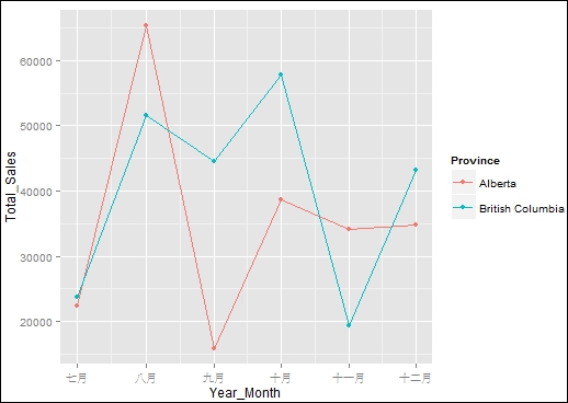
Figure 1: Sales amount by region

One of the most attractive features of R is that it already has many visualization packages...