

With the combination chart you can use both columns and lines to visualize data in one single chart.
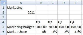
Open a new file in SAP BusinessObjects Dashboards and enter the data, as shown in the following screenshot, into the spreadsheet:
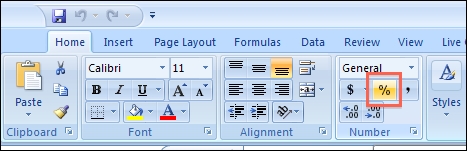
In the Number section of the Home tab of the toolbar, use the % option to convert the market share values into percentages:
Drag a Combination Chart component to the canvas.
Bind the Chart field to cell A1 and the Subtitle field to cell B2.
Bind the By Range field to the spreadsheet range from A4 to E6.
Select By Series and select the Market share series. Select the option to Plot Series On: Secondary Axis:

As you can see now, both axes are populated with values:
