

A scatter plot chart can display values that consist of two variables. The chart shows a set of points, each of which refer to a combination of a value on the x-axis and a value on the y-axis.
Note
In previous versions of SAP BusinessObjects Dashboards (before 4.1) the scatter plot chart component was called XY-chart component.
Open a new file in SAP BusinessObjects Dashboards and enter the data, as shown in the following screenshot, into the spreadsheet:
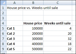
Bind the data By Range to spreadsheet cells B5 until C9.
Bind the Chart field to cell A1 and delete the subtitle.
Bind the Value (X) Axis field to cell B4 and the Value (Y) Axis field to cell C4. Now it is clear what the implication of each axis is.
Go to the Behavior tab and select the Scale sub-tab. Now select Fixed Label Size.
Click on the Preview button to try the dashboard.
