
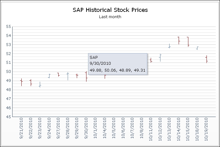
The OHLC chart and candlestick chart are both designed to show the movement of a stock price over time. OHLC stands for Open, High, Low, and Close. These four stock price values are illustrated for each time unit.
Both components work in exactly the same way, so you can use both the OHLC chart component and the candlestick chart component for this recipe. The only difference between them is the graphical visualization. The following screenshot displays an OHLC chart:
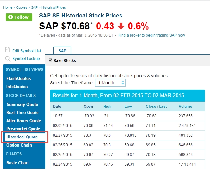
For this recipe, we need some historical stock data. Open your browser and go to http://www.nasdaq.com/ and look for historical quotes on the SAP AG stock as shown in the following screenshot:
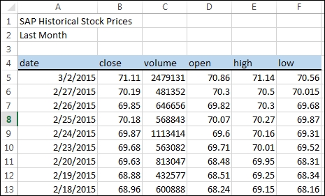
Select a timeframe of one month and copy and paste the quotes to the spreadsheet of a new SAP BusinessObjects Dashboards file, as shown in the following screenshot: