Book Image

Tableau Cookbook - Recipes for Data Visualization

By : Shweta Sankhe-Savale
Book Image

Tableau Cookbook - Recipes for Data Visualization

By: Shweta Sankhe-Savale

Overview of this book

Data is everywhere and everything is data! Visualization of data allows us to bring out the underlying trends and patterns inherent in the data and gain insights that enable faster and smarter decision making. Tableau is one of the fastest growing and industry leading Business Intelligence platforms that empowers business users to easily visualize their data and discover insights at the speed of thought. Tableau is a self-service BI platform designed to make data visualization and analysis as intuitive as possible. Creating visualizations with simple drag-and-drop, you can be up and running on Tableau in no time. Starting from the fundamentals such as getting familiarized with Tableau Desktop, connecting to common data sources and building standard charts; you will walk through the nitty gritty of Tableau such as creating dynamic analytics with parameters, blended data sources, and advanced calculations. You will also learn to group members into higher levels, sort the data in a specific order & filter out the unnecessary information. You will then create calculations in Tableau & understand the flexibility & power they have and go on to building story-boards and share your insights with others. Whether you are just getting started or whether you need a quick reference on a “how-to” question, This book is the perfect companion for you
Table of Contents (18 chapters)
Tableau Cookbook – Recipes for Data Visualization
Credits
About the Author
About the Reviewer
www.PacktPub.com
Customer Feedback
Preface
Index

Creating a Side by Side Bar chart


A Side by Side Bar chart is an extension of the Blended axes chart. It helps us compare values side by side. Let us follow the steps in the following recipe to quickly create a Side by Side Bar chart

Getting ready

Since this is an extension of the Blended axes, we will first duplicate the Blended axes sheet and then modify it. Let us follow the following steps and create a Side by Side Bar chart.

How to do it…

  1. Firstly, we will duplicate the Blended axes sheet and rename it to Side by Side Bar chart.

  2. Next, we will drag Measure Names from the Dimensions pane and drop it into the Columns shelf, just after the MY(Order Date) field. Refer to the following screenshot:

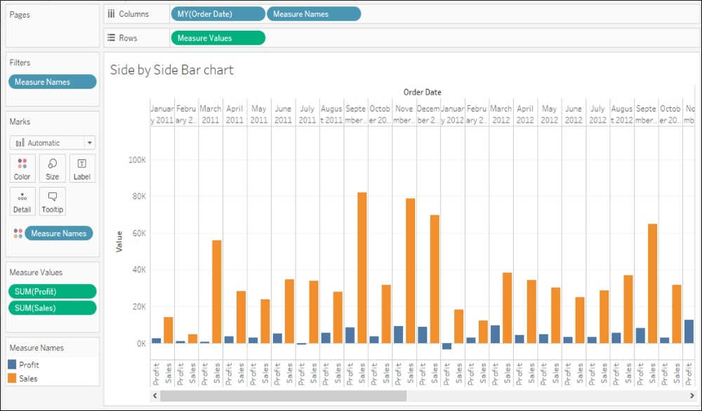
  3. This is a Side by Side Bar chart. However, you'll notice a horizontal scroll bar below the view. This is because; there are a lot of values that are placed horizontally. To remove the scroll, click on the dropdown in the toolbar which currently says Standard, and change it to Entire View. Refer to the...