
Q-Q plots provide a great way to compare a measured, empirical distribution to a theoretical normal distribution. If we'd like to compare two or more empirical distributions with each other, we can't use Incanter's Q-Q plot charts. We have a variety of other options, though, as shown in the next two sections.
Box plots, or box and whisker plots, are a way to visualize the descriptive statistics of median and variance visually. We can generate them using the following code:
(defn ex-1-22 []
  (-> (c/box-plot (->> (honest-baker 1000 30)
                       (take 10000))
                  :legend true
                  :y-label "Loaf weight (g)"
                  :series-label "Honest baker")
      (c/add-box-plot (->> (dishonest-baker 950 30)
                           (take 10000))
                      :series-label "Dishonest baker")
      (i/view)))
This creates the following plot:
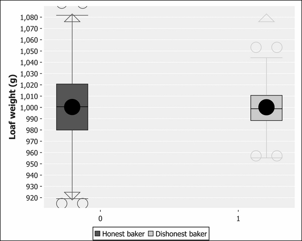
The boxes in the center of the plot represent the interquartile range. The median is the line across the middle of the box, and the mean is the large black dot. For the honest baker, the median passes through the centre of the circle, indicating the mean and median are about the same. For the dishonest baker, the mean is offset from the median, indicating a skew.
The whiskers indicate the range of the data and outliers are represented by hollow circles. In just one chart, we're more clearly able to see the difference between the two distributions than we were on either the histograms or the Q-Q plots independently.
Cumulative distribution functions, also known as CDFs, describe the probability that a value drawn from a distribution will have a value less than x. Like all probability distributions, they value between 0 and 1, with 0 representing impossibility and 1 representing certainty. For example, imagine that I'm about to throw a six-sided die. What's the probability that I'll roll less than a six?
For a fair die, the probability I'll row a five or lower is  . Conversely, the probability I'll roll a one is only
  . Three or lower corresponds to even odds—a probability of 50 percent.
The CDF of die rolls follows the same pattern as all CDFs—for numbers at the lower end of the range, the CDF is close to zero, corresponding to a low probability of selecting numbers in this range or below. At the high end of the range, the CDF is close to one, since most values drawn from the sequence will be lower.
Note
The CDF and quantiles are closely related to each other—the CDF is the inverse of the quantile function. If the 0.5 quantile corresponds to a value of 1,000, then the CDF for 1,000 is 0.5.
Just as Incanter's s/quantile function allows us to sample values from a distribution at specific points, the s/cdf-empirical function allows us to input a value from the sequence and return a value between zero and one. It is a higher-order function—one that will accept the value (in this case, a sequence of values) and return a function. The returned function can then be called as often as necessary with different input values, returning the CDF for each of them.
Let's plot the CDF of both the honest and dishonest bakers side by side. We can use Incanter's c/xy-plot for visualizing the CDF by plotting the source data—the samples from our honest and dishonest bakers—against the probabilities calculated against the empirical CDF. The c/xy-plot function expects the x values and the y values to be supplied as two separate sequences of values.
To plot both distributions on the same chart, we need to be able to provide multiple series to our xy-plot. Incanter offers functions for many of its charts to add additional series. In the case of an xy-plot, we can use the function c/add-lines, which accepts the chart as the first argument, and the x series and the y series of data as the next two arguments respectively. You can also pass an optional series label. We do this in the following code so we can tell the two series apart on the finished chart:
(defn ex-1-23 []
  (let [sample-honest    (->> (honest-baker 1000 30)
                              (take 1000))
        sample-dishonest (->> (dishonest-baker 950 30)
                              (take 1000))
        ecdf-honest    (s/cdf-empirical sample-honest)
        ecdf-dishonest (s/cdf-empirical sample-dishonest)]
    (-> (c/xy-plot sample-honest (map ecdf-honest sample-honest)
                   :x-label "Loaf Weight"
                   :y-label "Probability"
                   :legend true
                   :series-label "Honest baker")
        (c/add-lines sample-dishonest
                     (map ecdf-dishonest sample-dishonest)
                     :series-label "Dishonest baker")
        (i/view))))
The preceding code generates the following chart:
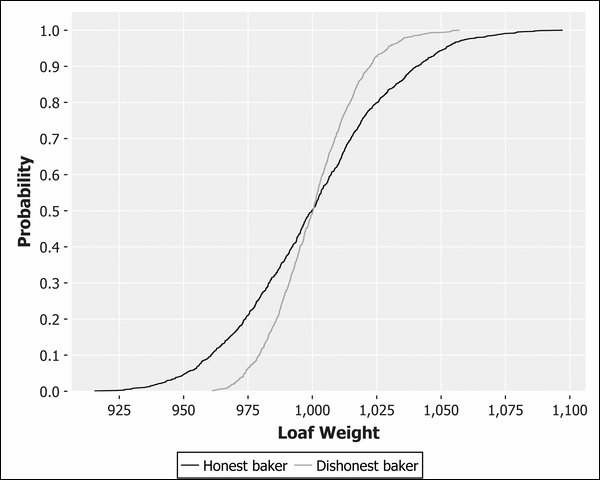
Although it looks very different, this chart shows essentially the same information as the box and whisker plot. We can see that the two lines cross at approximately the median of 0.5, corresponding to 1,000g. The dishonest line is truncated at the lower tail and longer on the upper tail, corresponding to a skewed distribution.