Book Image

Practical Business Intelligence

Book Image

Practical Business Intelligence

Overview of this book

Business Intelligence (BI) is at the crux of revolutionizing enterprise. Everyone wants to minimize losses and maximize profits. Thanks to Big Data and improved methodologies to analyze data, Data Analysts and Data Scientists are increasingly using data to make informed decisions. Just knowing how to analyze data is not enough, you need to start thinking how to use data as a business asset and then perform the right analysis to build an insightful BI solution. Efficient BI strives to achieve the automation of data for ease of reporting and analysis. Through this book, you will develop the ability to think along the right lines and use more than one tool to perform analysis depending on the needs of your business. We start off by preparing you for data analytics. We then move on to teach you a range of techniques to fetch important information from various databases, which can be used to optimize your business. The book aims to provide a full end-to-end solution for an environment setup that can help you make informed business decisions and deliver efficient and automated BI solutions to any company. It is a complete guide for implementing Business intelligence with the help of the most powerful tools like D3.js, R, Tableau, Qlikview and Python that are available on the market.
Table of Contents (16 chapters)
Practical Business Intelligence
Credits
About the Author
About the Reviewer
www.PacktPub.com
Customer Feedback
Preface

Building a sales dashboard in Tableau


There are many ways to get started with visualizing in Tableau. One convenient way is to build out several separate visualizations in sheets and then connect them together on a single dashboard canvas later on.

Building a Crosstab

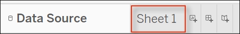
Next to the Data Source tab, click on the tab called Sheet1 to get started visualizing our first component, as seen in the following screenshot:

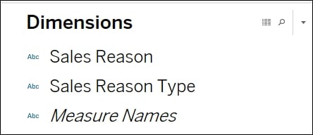
As we get started with our first visualization, we will primarily see a blank canvas along with access to dimensions, measures, and visualization options. Any object that comes through as a non-numeric field from the data will be labeled under the Dimensions header and can be accessed from the upper left-hand side, as seen in the following screenshot:

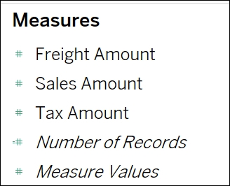
Subsequently, any object that comes through from the data as a numeric field will be interpreted as a measure and will fall under the Measures header, as seen in the following screenshot:

And finally, if you are looking to see what the...