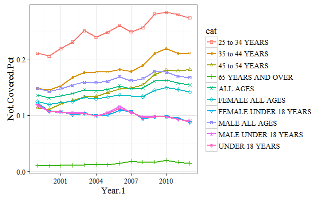

Sometimes, it's nice to plot all of the lines on one graph rather having them as separate plots. To achieve this, we will alter the syntax a bit, so that the categories show up as stacked lines. Again, we can see the percentage of uninsured aligns across ages, with the under 18 group having the lowest uninsured rate, and the 25-54 group having the highest:
library(ggplot2)
### plot all on one graph

.df <- x3[order(x3$Year.1), ]
.plot <- ggplot(data = .df, aes(x = Year.1, y = Not.Covered.Pct, colour = cat,shape = cat))
+ geom_point()
+ geom_line(size = 1)
+ scale_shape_manual(values = seq(0,15))
+ ylab("Not.Covered.Pct")
+ labs(colour = "cat", shape = "cat")
+ theme_bw(base_size = 14,base_family = "serif")
print(.plot)